Article
6 minutes
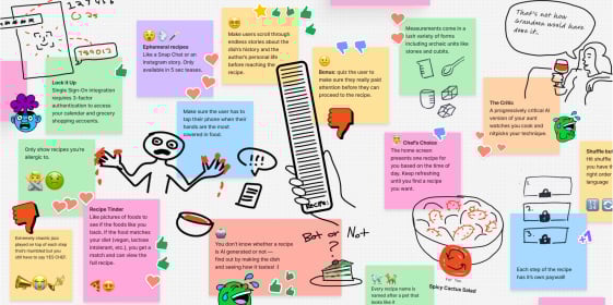
Chaos Concepts: Why Designing Terrible Experiences Leads to Better Products
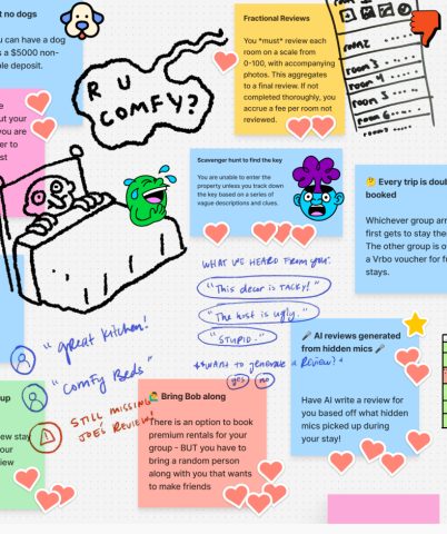
Stuck on a design challenge? Try making it worse.

Blink articles, videos, podcasts, and events covering the latest in UX research, strategy, and design.
6 minutes
Stuck on a design challenge? Try making it worse.

7 minutes
Essential practices for building user-focused products and aligning business goals with real user needs.
5 minutes
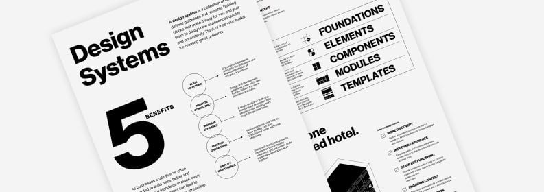
10 practical tips for building a mature, scalable design system in the rapidly evolving landscape of AI.

5 min
Using metaphors to elevate a design project from good to unforgettable.

6 min
Realizing the potential of AI-powered tools starts with uncovering how you can — and should — use them.
10 min
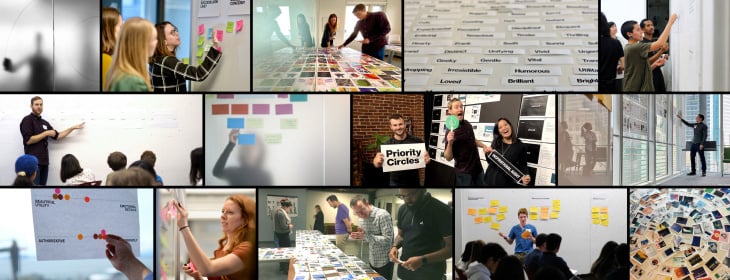
Say goodbye to awkward and clunky design workshops. Here are our tips to ensure your team leaves every UX workshop focused, inspired, and aligned.

5 minutes
Our stance at Blink remains the same: DEI is essential to excellence.

5 minutes
The five pillars of accessibility that UX leaders need to know

6 minutes
Why frameworks like Jobs to be Done provide crucial framing for successful product design

5 minutes
The gap between the AI gold rush and the user experience is huge. Here’s how we bridge it

5 minutes
How design thinking went from corporate inspiration to cringe-inducing jargon
7 minutes
Why evaluative research is make-or-break for designing successful products.

7 minutes
AI-powered design is improving user accessibility for all.
6 minutes
Stuck on a design challenge? Try making it worse.

7 minutes
Essential practices for building user-focused products and aligning business goals with real user needs.

5 minutes
10 practical tips for building a mature, scalable design system in the rapidly evolving landscape of AI.

7 minutes
Conduct effective studies with children and teens by incorporating hands-on tools, segmenting by age, and creating playful environments that suit your user’s developmental differences.
3 minutes
How better customer and employee experiences positively impact utilities’ bottom line.

6 minutes
Our tips for using automation to create efficient, personalized experiences that meet patient needs.

8 minutes
Here are five key UX opportunity areas healthcare systems are looking at for improving the patient/provider experience.

less than 1 minute
Blink has worked with a variety of healthcare providers over the last several years to understand the users of their websites. The results of this work have been research-based recommendations and design solutions that address many common challenges. Today, we are publishing a whitepaper that summarizes the challenges providers face online, and how a research-based approach to user experience can help meet the needs of their patients and employees.

3 min
NASA honored with 2024 Webby Awards for the reimagined NASA.gov website and the new streaming service, NASA+.

1 min
Producing HTML, CSS, and Javascript for browser-based experiences such as websites and web applications.
4 minutes
From chatbots to intelligent assistants, conversation interfaces are changing the way that people interact with their computers, and designers have a unique opportunity to shape this medium at the ground level. Like all emerging tech, best practices are still being developed, but here at Blink we’ve had the opportunity to design a few of our own and learned a lot along the way.

9 minutes
In this follow-up we’ll be diving deeper into some of the specifics of what makes a great user experience for IoT products, focusing on the critical areas of onboarding, support, and security.
10 minutes
Smart homes. IoT. Connected devices. VR. What happens when buzzy, emerging technologies begin to infiltrate the everyday? Will consumers face a frustrating gunfight-style showdown with new products, or will they discover a frictionless setup process and experience a product that enhances their life? It all depends on how much effort you put into UX.

5 min
Using metaphors to elevate a design project from good to unforgettable.

7 min
How to get the most value from your current tech investments, lower costs, and increase customer satisfaction with better UX.
3 min
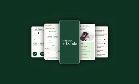
Behind the scenes of our illustrations for nonprofit, Partner to Decide

5 min
How to bridge the future with the here and now and generate the product vision necessary for being a leader in your sphere.

3 min
Lessons from industry leaders on what makes a successful UX career.

6 min
Realizing the potential of AI-powered tools starts with uncovering how you can — and should — use them.
2 min
Design systems are powerful for teams who want to save time and money in their design process. Here's why we love them, and how NASA used a Blink design system to unify its web experience.
10 min
Say goodbye to awkward and clunky design workshops. Here are our tips to ensure your team leaves every UX workshop focused, inspired, and aligned.

6 min
Definition, benefits, and examples of mixed methods research.

5 minutes
It can be tricky to make participants feel comfortable in challenging study environments. Use these tips to help them give their best feedback.
4 min
Why investing in customer research makes sense for your brand and business.
10 min
With multiple data sets, it can be hard to know where to start. Connect your research findings and define your customer experience KPIs with a CX measurement framework.

5 minutes
Secondary research, like desk research, is a powerful tool for practitioners to add to their research toolkits. Here’s why you should consider adding it to your next project.

3 min
A look at evaluative research and how you can use it to improve your products and services.
6 min
Learn more about Blink’s pro bono client, Partner to Decide, directly from the founder.
6 min
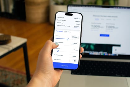
Your guide to creating a modernized mobile banking or investment app experience — based on our latest banking research.
4 minutes
Want to improve your customers’ experience across all channels? Building a UX framework and cross-branch ambassador program can help. Here’s how to get started.

5 minutes
Data shows that global populations are tipping the demographic scale toward adults over 65. With age-inclusive design, product adoption and reach could spread like wildfire.
5 minutes
Understanding your website as a product will set your company apart from competitors.

7 minutes
We set design objectives for creating engaging products that will keep a user’s attention, encourage task completion, and be enjoyable to use. However, of those objectives, we find “enjoyable to use” the hardest to design for and measure. This is in large part because humans perceive experiences differently – what one person thinks is clever and clear, someone else may see as complex and opaque.

3 minutes
So how do we get together and collaborate on ideas when a project is top secret? When only one person at Blink knows what the client is working on, and only a handful of employees at the client’s company even know what it is?

4 minutes
A TX business strategy can help companies increase employee experience and customer experience quickly and efficiently.

4 minutes
We answer the question, "What is B2E UX?" and discuss three reasons why adopting easy-to-use technology for your employees will enrich your company.
8 min
A look at our continued journey toward a more diverse, inclusive, and equitable company.
4 min
Learn more about our pro bono program.

14 min
Want to design more inclusive products? Learn how, plus, get started with free resources as a guide.
6 minutes
A look at how our DEI efforts came to life in the last year.
8 minutes
Accessible content leads to a more inclusive website, and by following web accessibility best practices, you can also improve search engine optimization (SEO).
6 minutes
I met with Blake, one of Blink’s assistive device specialists, to discuss the challenges of his mobility impairment and his tips for creating inclusive app and web designs.
6 minutes
These are our first steps toward cultivating a more equitable workplace for our employees, clients, and community.

4 minutes
A positive company culture requires the same careful curation, management, and rigor as any other aspect of a business. At Blink, we consciously design our culture to ensure that employees have the structure and guidance they need to fully develop their skills and abilities for a happy and rewarding career.

2 minutes
Learn how Blink teams prioritize accessibility at each phase of product development and how your teams can do the same.

5 minutes
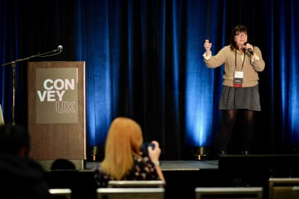
Accessibility in the UX industry and at Blink In October studio manager Lynsey Lacher interviewed Joe Welinske, accessibility director and ConveyUX program manager for National Disability Awareness Month.

9 minutes
Banks are bottom-line driven, so if you work in the banking or finance industry, you'll want to be aware of what the top digital banking transformation trends are, how to develop a mobile banking app, and what the future of the banking industry looks like.

4 min
Digital debt impacts innovation, drains employee energy, and challenges organizational productivity. Could AI be the solution?
1 min
Our process for creating products and experiences people love.
2:21
From automatic power reroutes during outages to personalized banking experiences, and real-time education support, AI is revolutionizing industries. See how AI is making waves in utilities, finance, education and healthcare with Blink's VP of Design, Scott Lambridis.
3 min
Developing a strategy for online grocery shopping.
1 min
Blink researchers and designers share what we do best.
2 min
Creating a new online destination for car shopping.
3 min
Developing a smart baby warmer for the U.S. market.
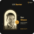
Sep 24, 2024
25 min
Ben Shown, Head of Design at Blink UX, joins the UX Banter podcast where they dive into his journey, his expertise in human-centered design, and how he approaches creating seamless digital experiences.
Aug 20, 2023
38 Episodes
Conversations with the people who are making digital products and services more accessible.
May 30, 2023
34 min
Blink's Head of Design, Byron Baker, joins "There's A Device For That" to share his experience leading a team of design experts as they create user experiences that truly enhance the value and impact of devices.

Apr 11, 2023
21 min
Blink’s Chief Design Office and Avangrid’s Head of CX and Digital Transformation join The CX Cast to share their experience building a CX function at Avangrid.
Apr 18, 2023
22 min
Blink and Avangrid continue their conversation about the role of design in creating quality experiences at Avangrid.
Upcoming

Apr 13, 2026
Join us for the 14th annual ConveyUX conference, with sponsors including Blink UX
Past
Jan 29, 2026
May 21, 2025
Feb 25, 2025
Insights on AI Interface Design: Scaling Lessons from High-Growth Companies
Feb 24, 2025
Seattle's premier UX research and design conference

Oct 24, 2024
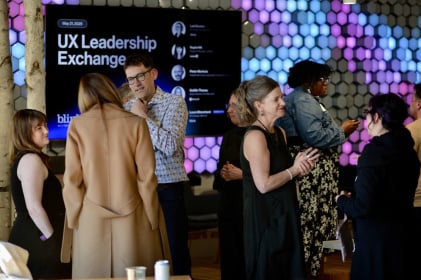
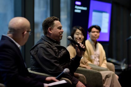
You’re invited to UX Leadership Exchange New York, hosted by Blink UX, an Mphasis company—an interactive panel event for leaders shaping the future of digital experiences.
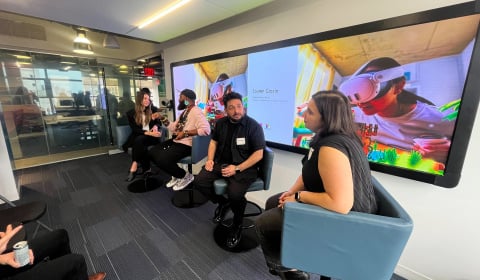
Jun 27, 2024
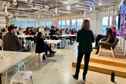
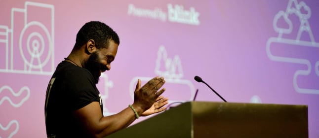
Blink hosted the latest in-person UX Leadership Exchange in Seattle.
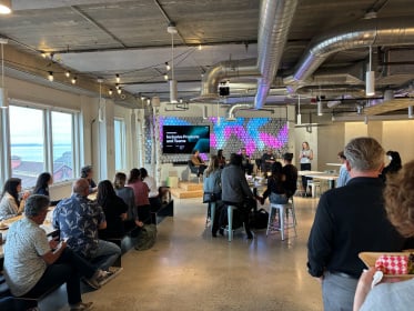
May 9, 2024
Blink hosted our first in-person New York City UX Leadership Exchange.

Apr 18, 2024
We hosted a virtual UX Leadership Exchange on Thursday, April 18.
Feb 27, 2024
12th annual event in Seattle by Blink UX
Jan 25, 2024

Sep 22, 2022
Blink hosted a DEI in Design Virtual Roundtable on September 22, 2022, as part of San Diego Design Week (SDDW) presented by Mingei International Museum.

1 min
NASA released its updated website last month after two years of rigorous user experience research, strategy, and design in collaboration with Blink UX.

6 min
Blink ranked by Puget Sound Business Journal on its annual list of best midsize workplaces.
5 minutes
Blink was recognized for its work with Applied Training Solutions and HERO Index.

3 minutes
Mphasis, (BSE: 526299; NSE: MPHASIS), an Information Technology (IT) solutions provider specializing in cloud and cognitive services, announced today, its acquisition of Blink UX, a User Experience research, strategy, and design firm that works with the world’s leading companies to create transformative digital products, brands, and experiences.

2 minutes
Blink's title was awarded based on results from the 2021 statewide employee survey conducted by the Puget Sound Business Journal.

2 minutes
For the fifth time, Blink appears on the Inc. 5000, ranking No. 2283 with three-year revenue growth of 45% percent.
4 minutes
Blink was recognized for our design work with the Special Olympics.
2 minutes
The 2020 report cites Blink’s work with NASA.
4 minutes
SBA Administrator Jovita Carranza has appointed three small-business leaders from Washington state, including Blink’s Karen Clark Cole, to the U.S. Small Business Administration Federal Regulatory Fairness Board, representing Region 10.

2 minutes
Blink ranks #1 of over 200 companies to win Top-Ranked Overall Culture at annual Tech Culture Awards.

2 minutes
UX research and design firm Blink UX is pleased to announce that Accessibility Director Joe Welinske has been appointed to King County Metro’s Access Paratransit Advisory Committee (APAC).

3 minutes
Blink was recognized among the vendors in the 2020 report

Newsletter sign-up
Join our list for event updates, UX insights, tips for great customer experiences, and more.