

By Ben Shown
This article first appeared as a talk and workshop titled The Workshop Workshop. The inaugural Workshop Workshop was presented by Leslie Ferguson at AIGA Into the Woods in 2016, with subsequent presentations by Ben Shown at the Seattle Interactive Conference, ConveyUX, Design Thinkers of RTP, and at various universities, including the University of Washington, Harvard Graduate School of Design, RISD, and Northeastern University.
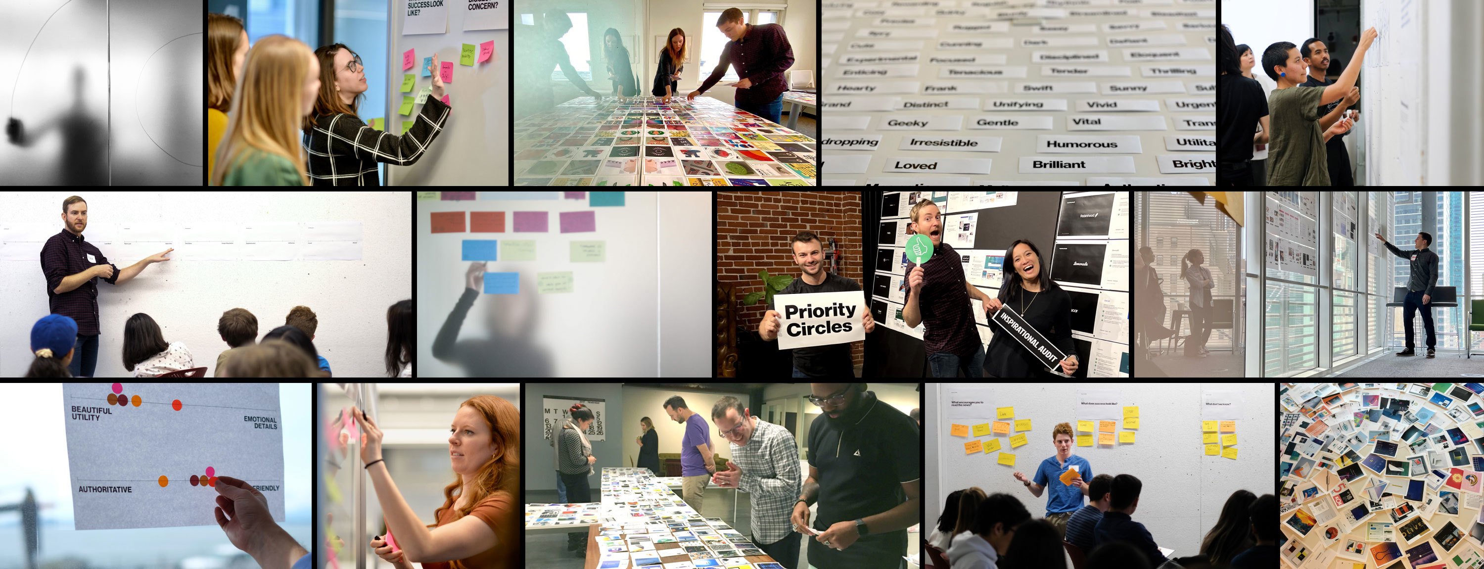
When we started our work with NASA to redesign NASA.gov (read the case study), we conducted a user expeirence design workshop marked by high stakes and ambitious goals. In this article, I’ll share the five fundamental activities we used in the workshop and some of the artifacts that came from it.
These activities, paired with a strong alignment of workshop benefits, provide a blueprint for how to run a UX workshop where designers are empowered, stakeholders are psyched, and teams are aligned.
The workshop I detail can take a variety of names: strategy workshop, discovery workshop, kickoff workshop, or just a design workshop. No matter what you call it, the most important piece is that your workshop happens early in your project and kicks off your design exploration.
The benefits of a design workshop
Go broad by surfacing ideas, concerns, issues, and plot holes. The goal isn’t to develop a singular design direction but to yield as many directions as possible.
Go deep by drilling into ideas and topics. This way, you and your team can move past expected directions and trendy solutions.
Empower people. Inviting folks from different disciplines who aren’t often part of the creative process gives you diverse perspectives. If your workshop is filled with just designers, there’s room to improve. Counterparts in engineering, marketing, and product management are great additions. We’ve also seen fantastic contributions from folks in customer service, finance, and HR.
Form a bond. Establishing trust and camaraderie with your team is the biggest benefit of running a workshop. Did you have fun and leave feeling inspired? Did you start to have a healthy back-and-forth with your collaborators? Regardless of the outcomes, your bond with your team will make collaboration and design problem-solving more impactful in the long run.
Five key activities for running a great kickoff UX workshop
There’s no shortage of compelling workshop activities out there. These are the five I find to be the most effective and impactful. Running these activities in person is great, but I’ve also seen a lot of success in virtual sessions using tools like FigJam, Mural, or Miro.
Hybrid workshops — with some folks in person and some joining remotely — can be logistically challenging but are gaining a lot of traction and may soon become the default. Taking the time to figure out your workshop's physical and virtual needs can go a long way.
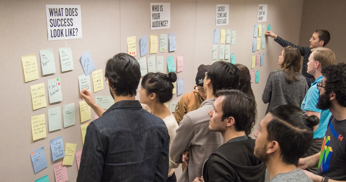
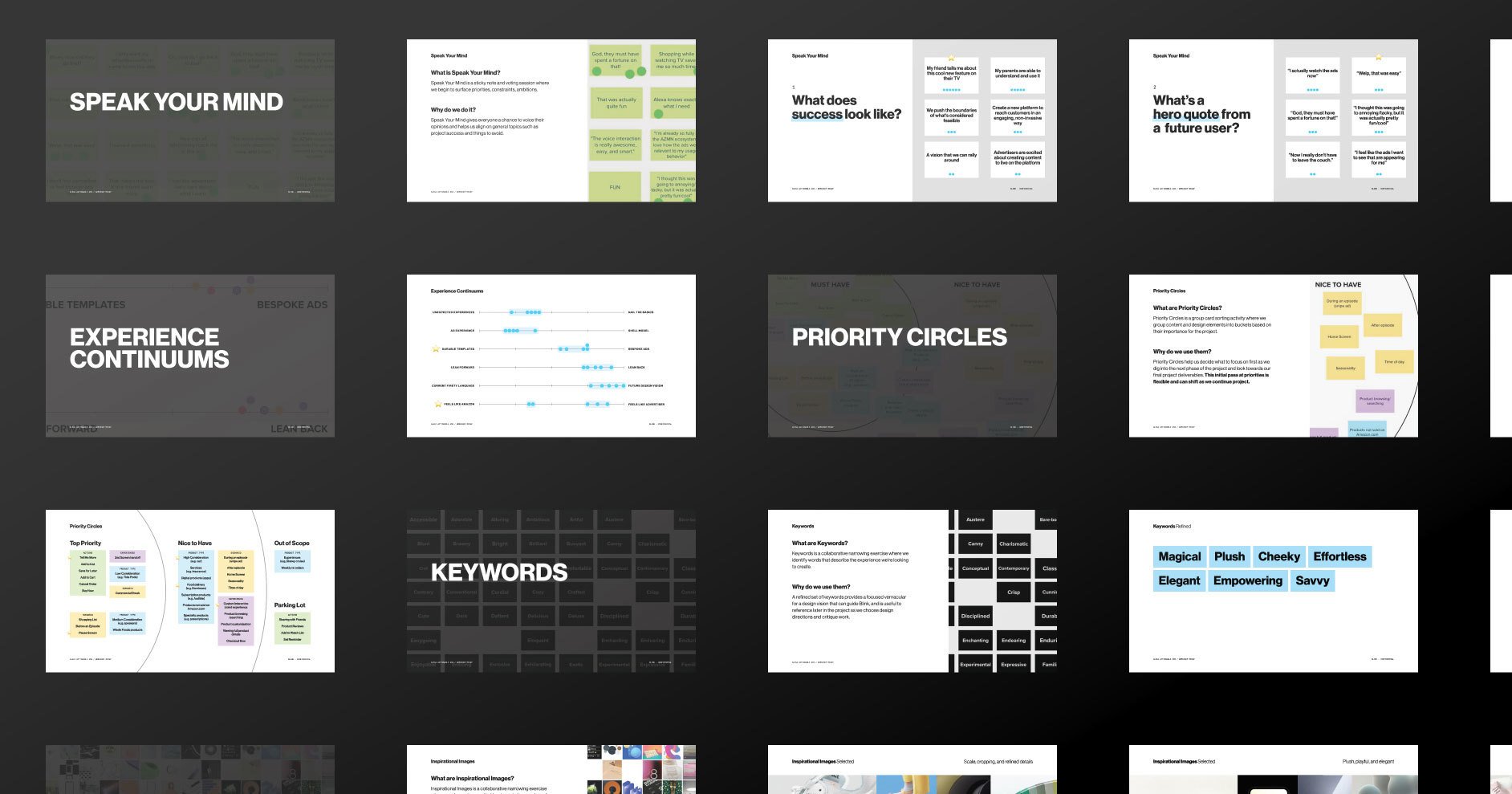
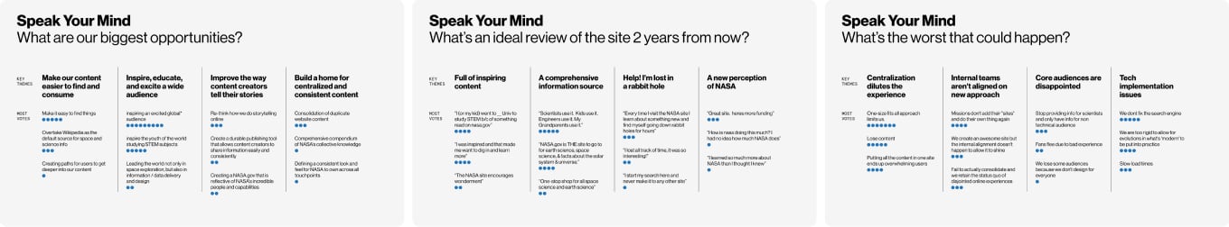
Activity #1: Speak Your Mind
Estimated time
45 minutes
Materials needed
Post-it notes, paper, dot stickers, an open wall or whiteboard
What it's good for
Speak Your Mind is part ice-breaker, part information-gathering. Through a set of open-ended prompts, you’ll get folks talking about their hopes and fears for the project. It’s also a great way to re-articulate a creative brief and the “Statement of Work” in a more actionable way.
Prep + execution
Choose your prompts before the workshop. These are my go-tos:
- What does success look like?
- What’s a hero quote from a future customer/user?
- What’s off-limits or a red flag?
- What’s the worst that could happen?
These are great for getting into the mindset of a user, finding quippy language to describe the ideal user experience, and surfacing specifics about what to avoid.
Next, write each question on a piece of paper and set them up around the room. Give each person a stack of Post-its to write their answers and set a timer for around 15 minutes for participants to fill out the Post-its and place them under the questions. I often encourage folks to pitch their responses as they add them to the board.
Conclude with a round of dot voting by giving each person five dot stickers to vote on the answers that resonate with them most. The live data visualization from the dot-voting will spur great conversations and debate on where the group sees project opportunities.
Across these activities, but especially for Speak Your Mind, your role as a workshop facilitator is to listen and absorb various perspectives and ask questions that get folks to uncover motivations and rationale.
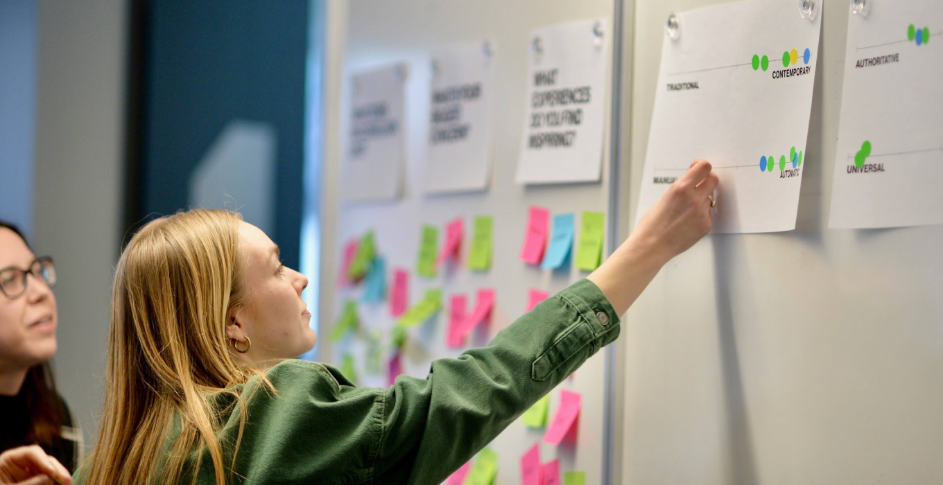
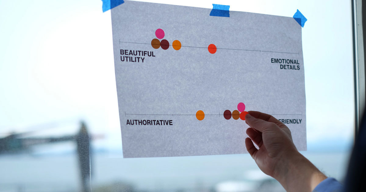
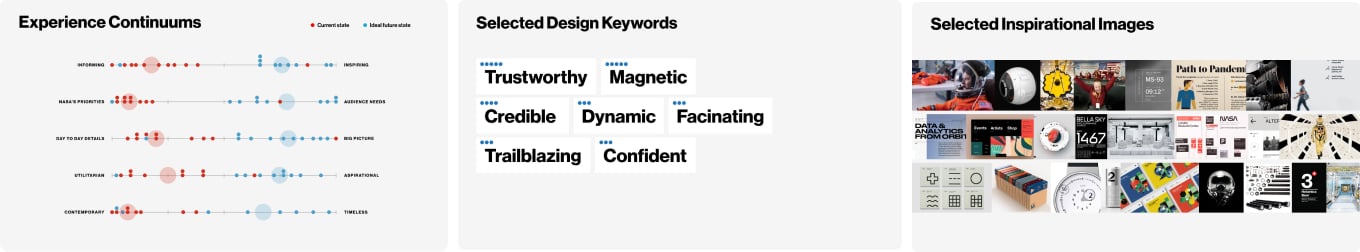
Activity #2: Experience Continuums
Estimated time
30 minutes
Materials needed
Dot stickers, paper for continuums
What it’s good for
Continuums are a dot voting activity that can have a significant impact with little effort. It’s an easy alignment activity that helps teams understand project aspirations and appetite. There aren’t many materials to prep, participant voting happens fast, and you can quickly get into nuanced discussions around key aspects of your project.
Prep + execution
Before your workshop, create up to six continuums worthy of discussion related to your project. We love coming up with custom continuums that speak to project specifics, but we also like to leverage these favorites: Professional vs. Playful, Rich/Lush vs. Open/Airy, Lean Forward vs. Lean Back, Classic/Timeless vs. Contemporary/Hip, Simple vs. Powerful, Evolution vs. Revolution
Place your continuums around the room and ask participants to place a dot on each continuum where they think the ideal future state of the experience should be. You’ll quickly see a live data visualization of the votes. The results might show that everyone agrees on one end, that opinions are spread evenly, or that some participants have wildly different views of the future design than others. One of our favorite results is a large cluster of dots with one or two outliers on the other end of the continuum.
Discuss. Asking the outlier folks to explain their differing rationale leads to a great discussion. Overall, this activity spurs excellent conversations and gets people talking about design opinions they hold near and dear. Ideally, you’ll come away with shared alignment in certain areas and known disagreement in others.
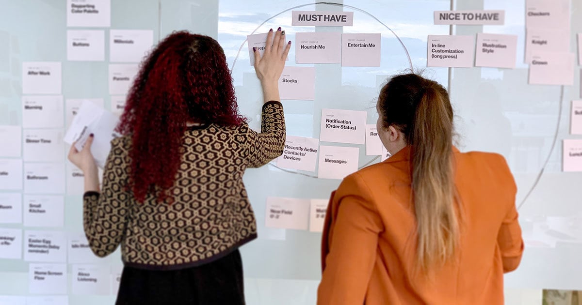
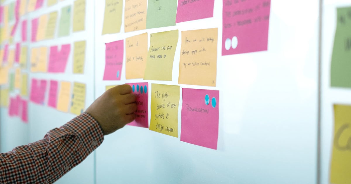
Activity #3: Priority Circles
Estimated time
30-45 minutes
Materials needed
Post-it notes, a whiteboard or a sheet of large paper, a marker, or a pen
What it’s good for
Priority Circles is a group card sorting activity used to organize content and design elements into buckets based on their importance for the project.
Priority circles will help you decide what aspects of the work to prioritize and help you answer questions like, will we create a desktop experience or a mobile app? Will we tackle global navigation, search, or user onboarding first? Will we prioritize stakeholder interviews, foundational user interviews, or usability testing?
This activity works best when it focuses on tangible pieces and parts of a design, like key user scenarios, features, key screens, and even design process activities, whereas previous workshop activities are better suited for prioritizing goals and ambitions.

Prep + execution
Pre-make your Post-it notes by filling out each with different user actions, key scenarios, key screens, design elements, and process activities. Consider using specifics from the creative brief and the “Statement of Work” as a starting point and adding additional items you think will spur conversation. Stay tactical (e.g., nouns, people/places/things); avoid abstract goals.
Stick your bank of Post-it notes on a big piece of paper or a whiteboard, and then draw three concentric circles with the labels “must-have,” “nice-to-have,” and “could have.”
Ask the team to organize each Post-it note collaboratively into one of the three circles. You can also encourage participants to write and add their own Post-it notes with items you didn’t initially include.
After folks have sorted through the Post-its and filled out the circles, lead a discussion on the results. Why did certain things get put into the must-have circle? Where are there disagreements within the group? Do we agree on the out-of-scope items? Quite often, the must-have circle is brimming with Post-it notes. Inevitably, folks are hungry to have it all. When that’s the case, you’ll want to do additional prioritization of the must-have items. You can do this with a round of dot-voting or through conversation.
Activity #4: Design Audit
Estimated time
60 minutes
Materials needed
Green sticker dots, red sticker dots, printouts from your design audit
What it’s good for
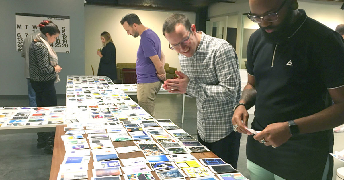
A successful design audit will have your team talking, discussing, and critiquing applicable design examples across a competitive and comparative landscape. Audits inform your team’s initial design explorations and help folks align on points of friction, best practices, and potential areas for differentiation.
Prep + execution
Start by conducting an in-depth design audit before the workshop — check out our step-by-step guide.
This is another activity to break out the dots — green-yes-dots and red-no-dots. Present your audit and give the team time to vote on what resonates with them. Encourage folks to use the red-no-dots by asking, “What here do you want to avoid for this project? What’s not resonating?”
Discuss the top vote-getters, both positive and negative.
Activity #5: Keywords and Inspirational Images
Estimated time
45-60 minutes
Materials needed
Paper for keywords, paper for images, a large table or flat surface
What it’s good for
Keywords and Inspirational Images are about exploring a design project's abstract and aspirational aspects. It’s great for designing a new brand, but we love running this for our core product and UX projects. You’ll walk away with a shared perspective on the mood and vibe you want your new design to embody.
This activity has two parts. First, you’ll choose keywords to identify design personality characteristics. Then, you’ll select aspirational images that match your chosen keywords.
The net result is a set of keywords and images that evoke the design’s mood and vibe that you can use to create moodboards following a workshop. Learn more with our tips for better moodboards.
Prep + execution
First up, keywords.
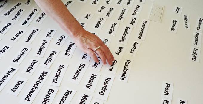
Select and print 200+ keywords and spread them over a large table.
Ask the group, “If this product was your friend, how would you describe their personality?” Have the team choose the keywords that fit. Avoid words that tactically describe what the product does or why it’s important. Instead, focus on words that evoke a look, a feel, a mood, and a vibe. They should be aspirational and emotional as opposed to practical or pragmatic. The keywords you select are not marketing or customer-facing but rather internal-facing keywords you’ll use as criteria to drive design critiques in later phases of your project.
After folks choose 20-25 keywords, whittle them down to the best 5-7 as a team. Some of our favorite keywords from past projects have been crisp, durable, rhythmic, lush, welcoming, and enchanting.
Next, inspirational images.
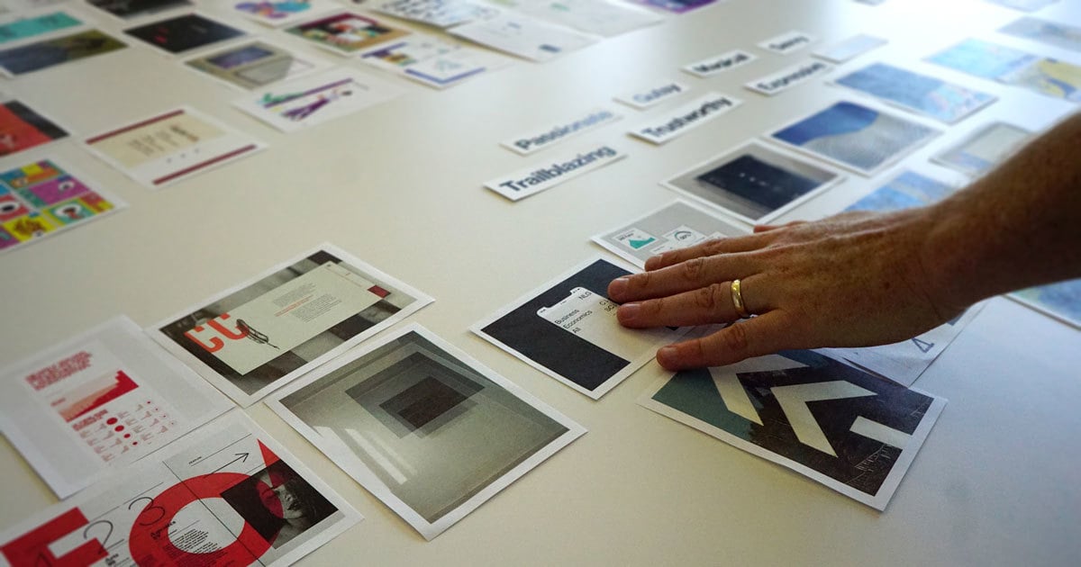
Prepare, collect, and curate images that inspire you. Unlike design audit images that are highly applicable to the project, these images should be abstract, weird, wild, and wide-ranging. One of the best ways to gather a great set of images is to explore parallel creative disciplines like fashion, architecture, and various forms of fine art. Other fruitful areas include museum wayfinding, data visualization, and nature photography.
If you’re conducting your workshop in person, flood the tables, get all the images out, and talk about what inspires people from a visual point of view.
You'll then use your 5-7 keywords as a lens to select images. For example, if you decided on lush as a keyword, what image represents lush to you? This activity results in 5-7 keywords and 10-12 inspirational images that will provide your team with a visual design inspiration foundation.
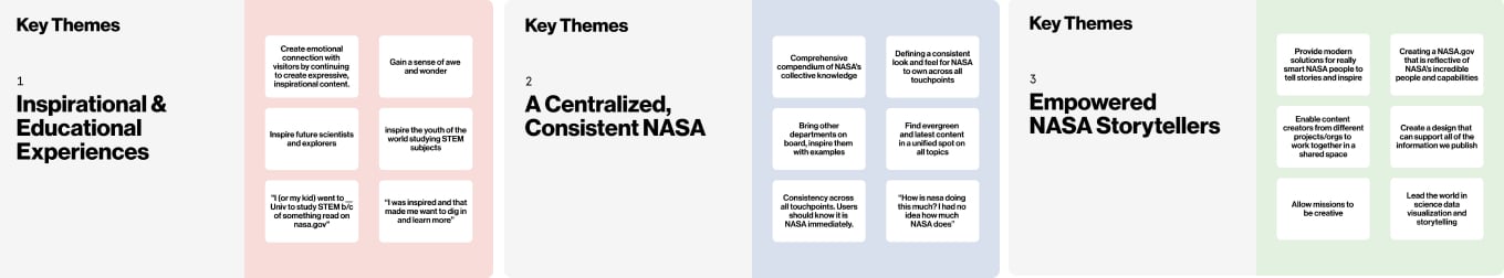
Final step: Summarize your findings
Take the results of each activity and re-articulate them in a workshop recap presentation for the team. Be sure to highlight key themes and points of contention your team uncovered in the workshop. When you run a successful workshop, your team will be eager and motivated to jump into the next phase of your project.
How we used our kickoff workshop in redesigning NASA.gov
We partnered with NASA on an ambitious project to reimagine NASA.gov and create a design system grounded in UX research and built to empower NASA content creators to tell their stories of space exploration and scientific breakthroughs (read the case study).
Our design workshop took place after a robust phase of foundational user research and immediately prior to a broad design exploration phase. This selection of slides shows our summarized findings from our NASA design workshop:
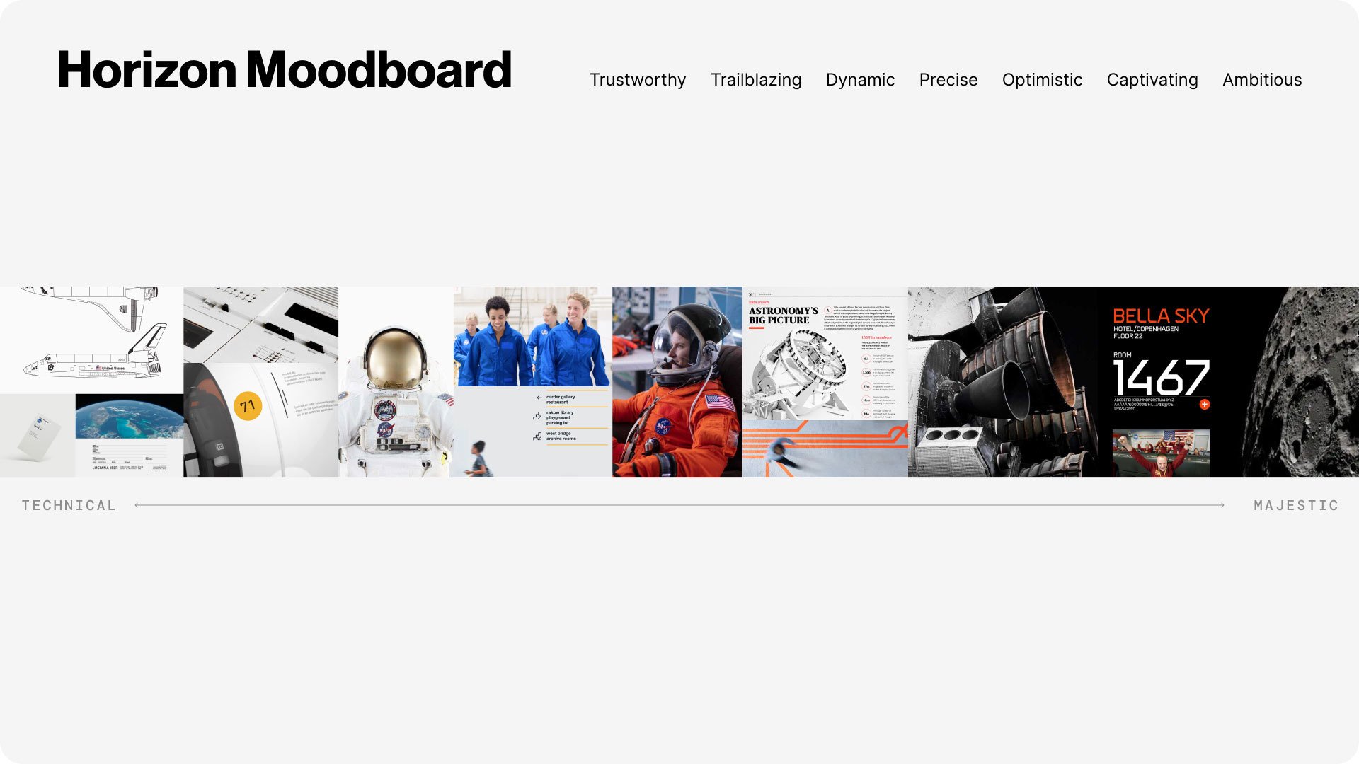
The Horizon Design System moodboard
One key artifact that can result from a successful workshop is a moodboard. Particularly for projects with visual design and brand experience ambitions, a moodboard can help inspire and align designers and provide stakeholders with references to inform critique throughout the project.
Using the results from the Keywords and Inspirational Images activity from our NASA workshop, the Blink team crafted the Horizon Design System moodboard. Throughout our work with NASA, we would reference this moodboard to create compelling design solutions that emphasize NASA’s technical prowess, the majestic awe of space exploration, and everything in between.
As Head of Design at Blink UX, Ben Shown leads product envisioning and brand experience projects with ambitious partners, including Amazon, Cisco, Microsoft, NASA, and The New York Times. He also heads up Blink’s Boston studio in Cambridge, Massachusetts, and is a lecturer at Northeastern University teaching design process. And when given the chance, he’ll gladly talk to you about design workshops, design systems, typography, and Murphy beds.