Reimagining NASA.gov to Tell Earth’s Most Important Stories
How Blink collaborated with NASA to launch a user-centered web experience.
NASA knew revamping its digital platforms would require the same rigor it takes to build a spaceship — years of preparation, planning, research, design, testing, and refinement.
When NASA embarked on a journey to transform NASA.gov, the agency turned to Blink with a two-part mission: inspire the American public through a unified web experience and empower content creators to tell their stories with a user-friendly, optimized content management system.
Employee Experience
User Research
SEO & Data Analytics
UX Strategy
UX Design
Usability Testing
Visual Design
Design System
Government
Science & Technology
NASA believes a unified NASA.gov experience will allow them to build a broader, more engaged audience around the world and inspire the next generation of scientists.
A challenge of cosmic scale
Content creators
NASA stakeholders and the U.S. Congress
Separate websites
The challenge
Thousands of websites in need of consistency
By 2021, NASA had over 3,000 major websites that housed important scientific information for scientists, students, educators, parents, science enthusiasts, and government officials.
With thousands of sites and minimal guidelines for publishing, visual styles, and site structures, NASA’s digital content became inconsistent and hard to manage.
Each website incurred costs for hosting and development, and due to inconsistencies in writing, editing, and SEO strategies, the sites competed with each other, lowering the effectiveness of the NASA brand. Important scientific discoveries weren’t reaching the American public.
Planning for a successful launch
Weeks of collaboration
Work streams
Project phases
Our approach
Research to inform design
Our researchers conducted a national quantitative survey, engaged in hundreds of qualitative one-on-one feedback sessions, interviewed NASA employees at all levels of the agency, completed accessibility research, and ran more than 250 usability testing sessions.
Our research found that website visitors wanted better ways to explore NASA’s scientific and educational content. Many were unaware of the breadth of NASA’s work, and finding information was difficult for those with disabilities. These, and many more insights, laid the foundation for a unified web experience and optimized publishing system.
From there, we spent several months testing and refining the website’s information architecture, content strategy, and interaction design to ensure the new site would meet the audience’s needs and make it intuitive and enjoyable to discover and engage with NASA's diverse content.
The rigorous research behind NASA.gov
Quantitative survey participants
1-on-1 qualitative research sessions
Interviews with NASA stakeholders
Inspiration for a new visual direction
When Blink began designing the new visual identity for the site, our team used mood boards to explore different visual styles and treatments. This mood board continuum has become a valuable tool for NASA's content creators to help them think through the visual story for a wide range of topics.
Connect with usThe solution
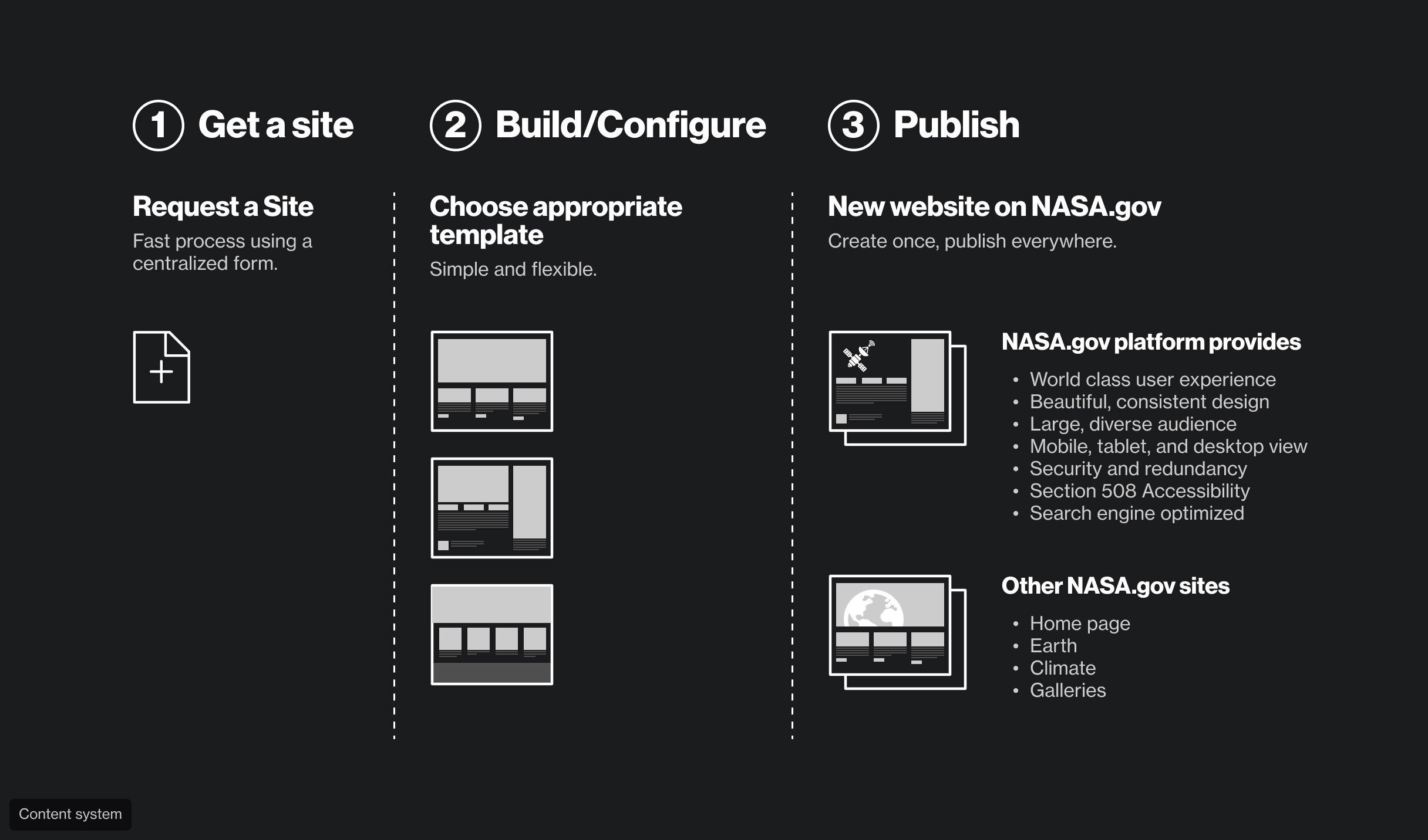
A system to unify NASA’s digital footprint
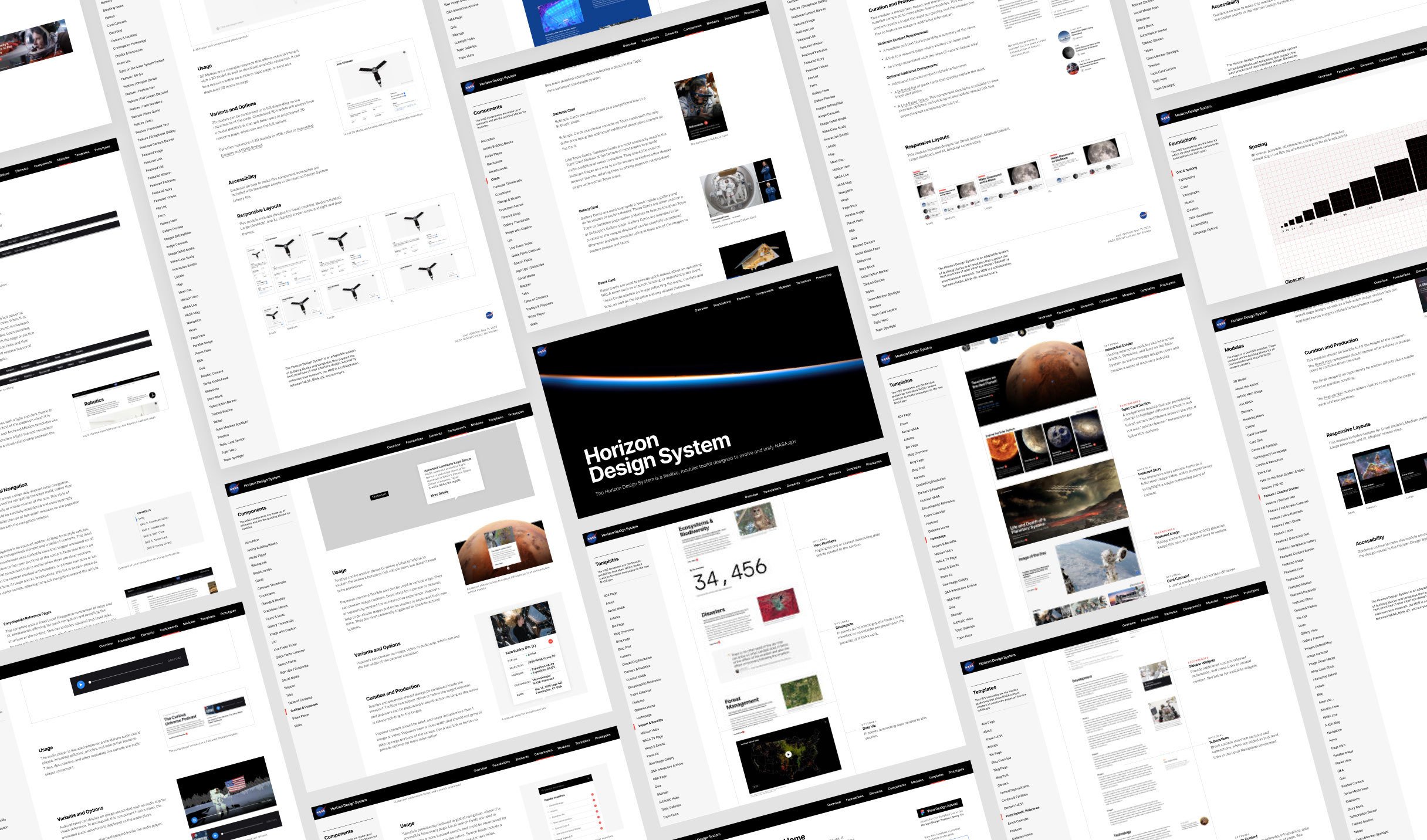
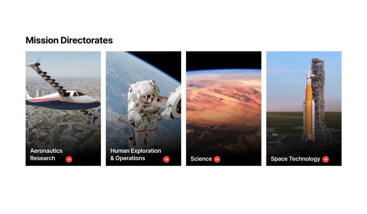
Based on the mood board work, site structure design, research insights, and a collaborative client team, the Horizon Design System — known as the HDS — was born. This modernized digital system is complete with a new topic-driven site structure, enhanced interaction design, integrated navigation, visual guidelines, and tools for simple, consistent content publishing.
Now, the agency can quickly create beautiful, functional web pages for any topic. Because of the HDS's ability to scale, NASA’s digital platforms will be connected and ever-expanding for decades to come.
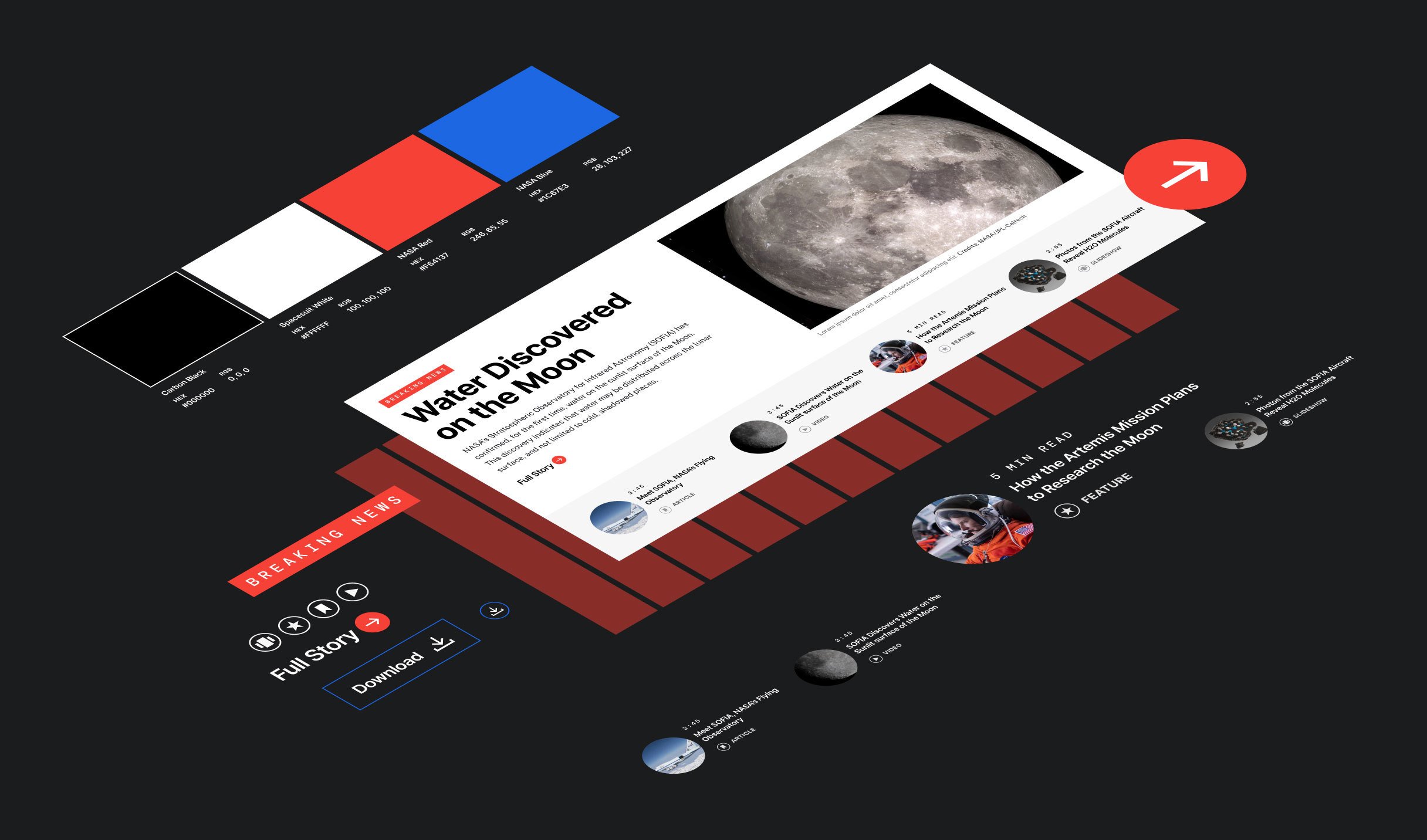
Benefits of a design system:
A unified look and feel
New webpages are consistent, on-brand, and optimized for search engines, enhancing the overall user experience.
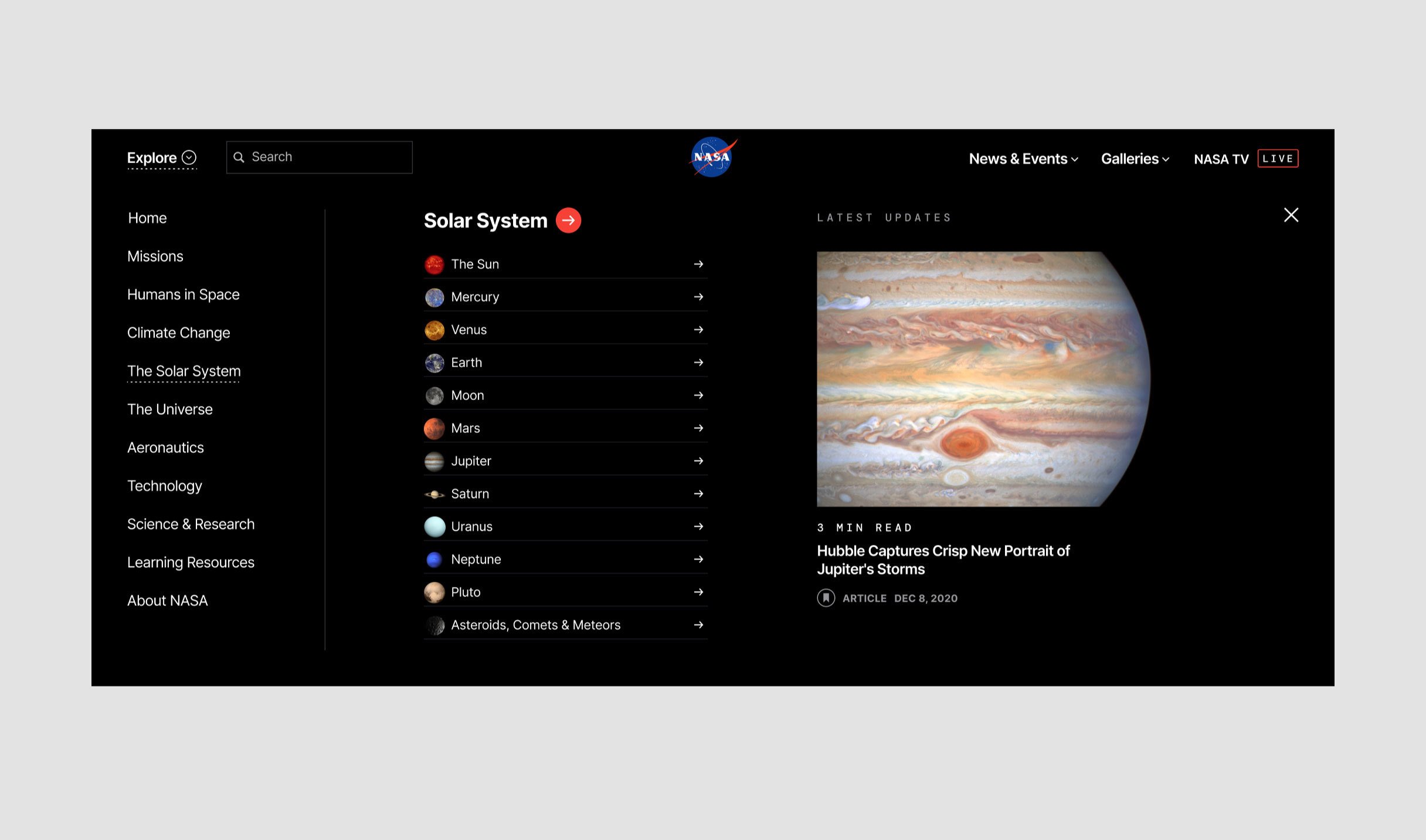
Intuitive browsing
A new topic-driven site structure makes it easy for website visitors to find the information they’re looking for.
Seamless publishing
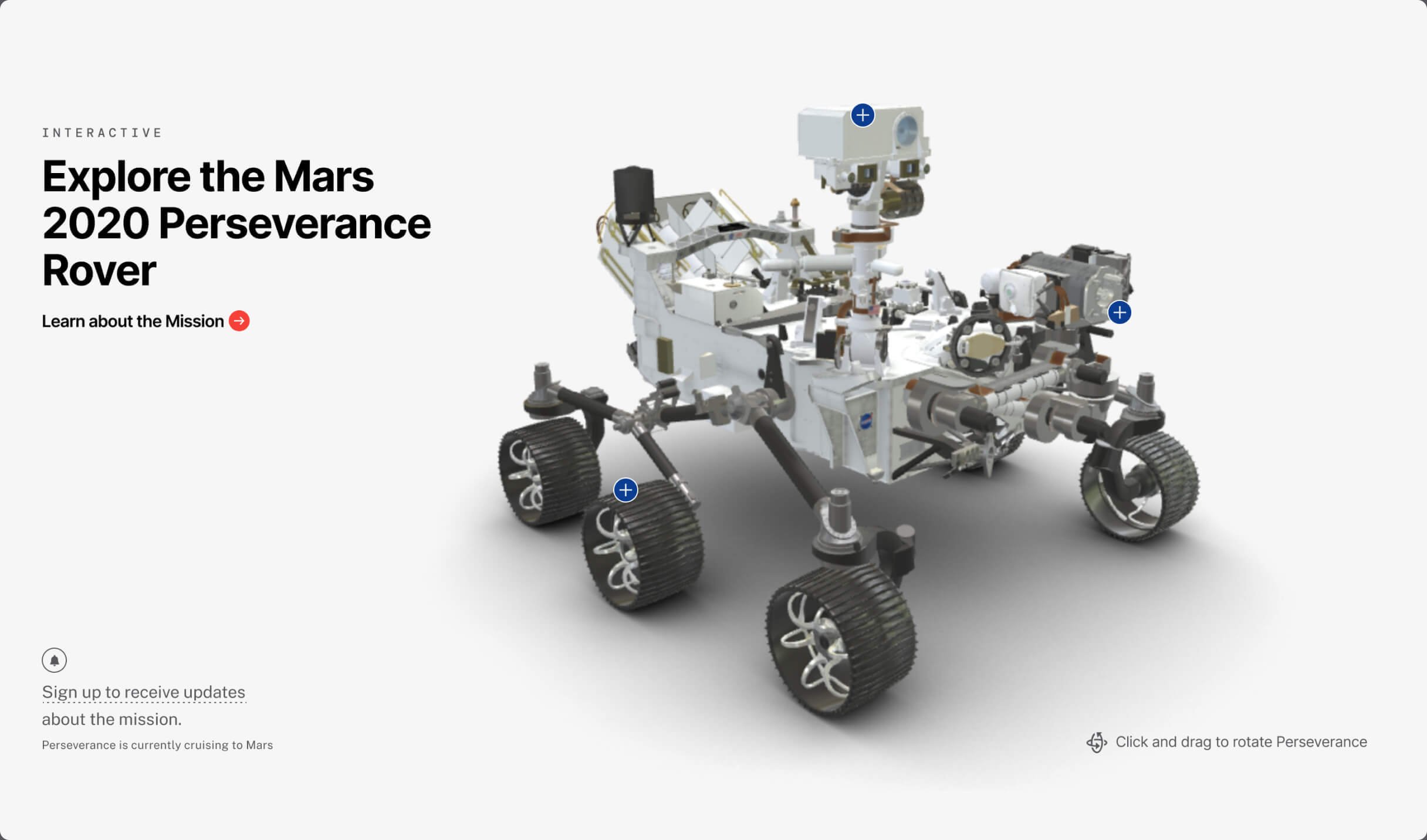
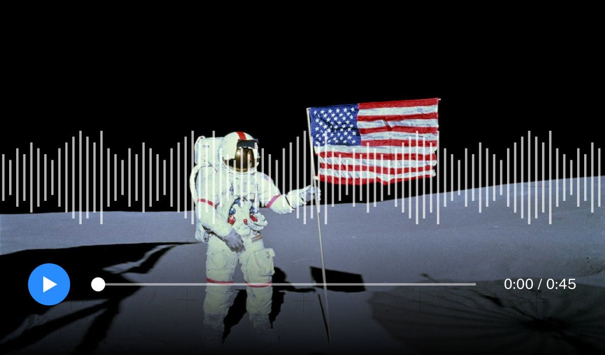
New content formats empower creators to craft engaging web pages with flexible building blocks and unique layouts.
The impact
A better experience for website visitors and content creators
Each NASA webpage is now on-brand, forward-thinking, and compliant with industry standards. The content is immediately discoverable to the public, beautifully branded, and accessible to all visitors.
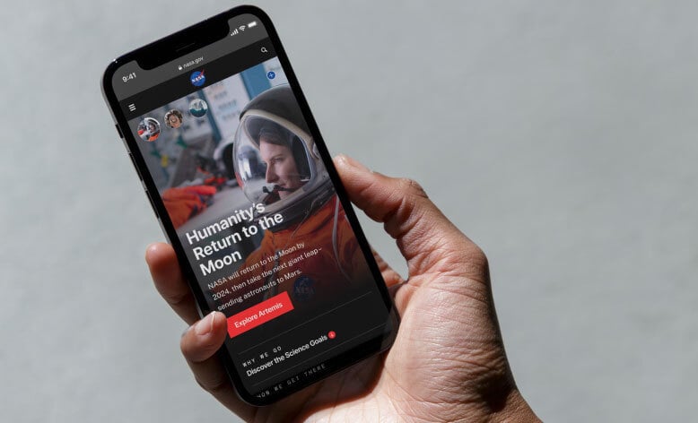
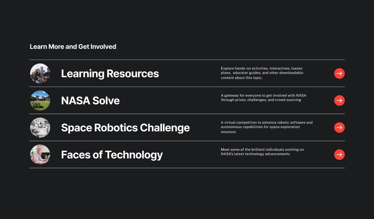
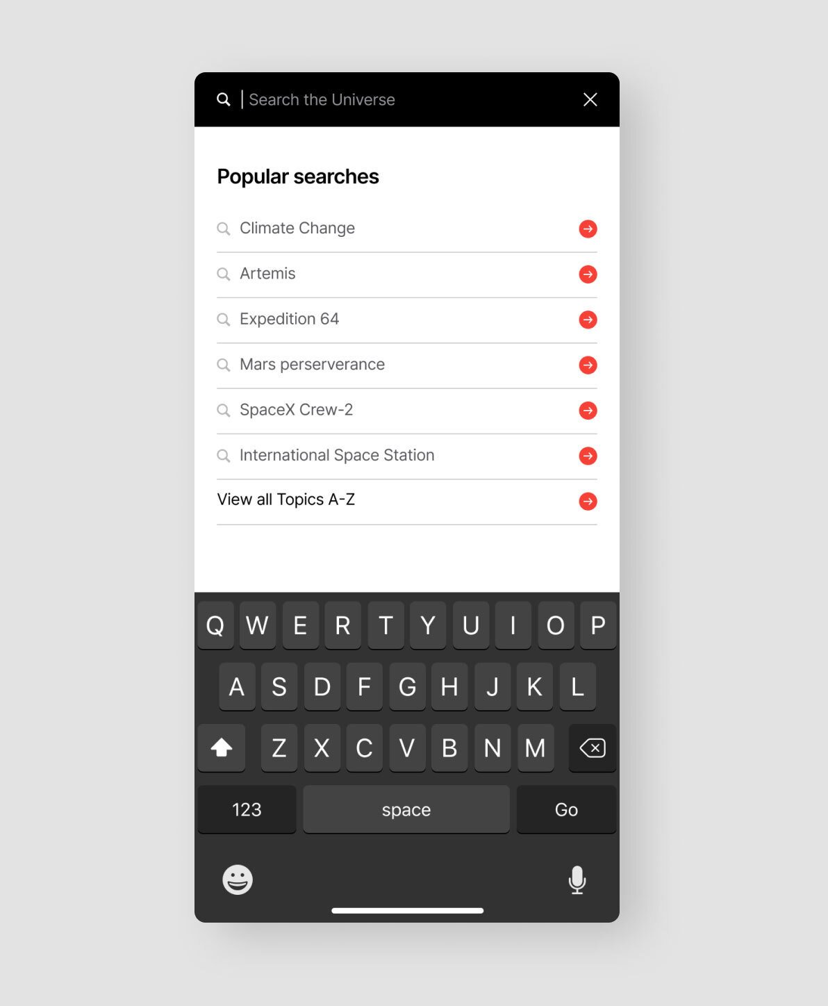
The updated site offers a user-friendly, topic-driven experience featuring a powerful search engine, easy navigation, and an improved content publishing system that will enable content creators to tell consistent, engaging stories that will captivate the American public and inspire the next generation of scientists.
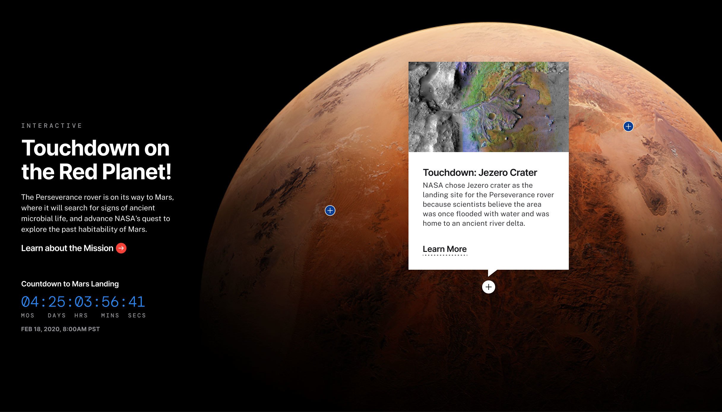
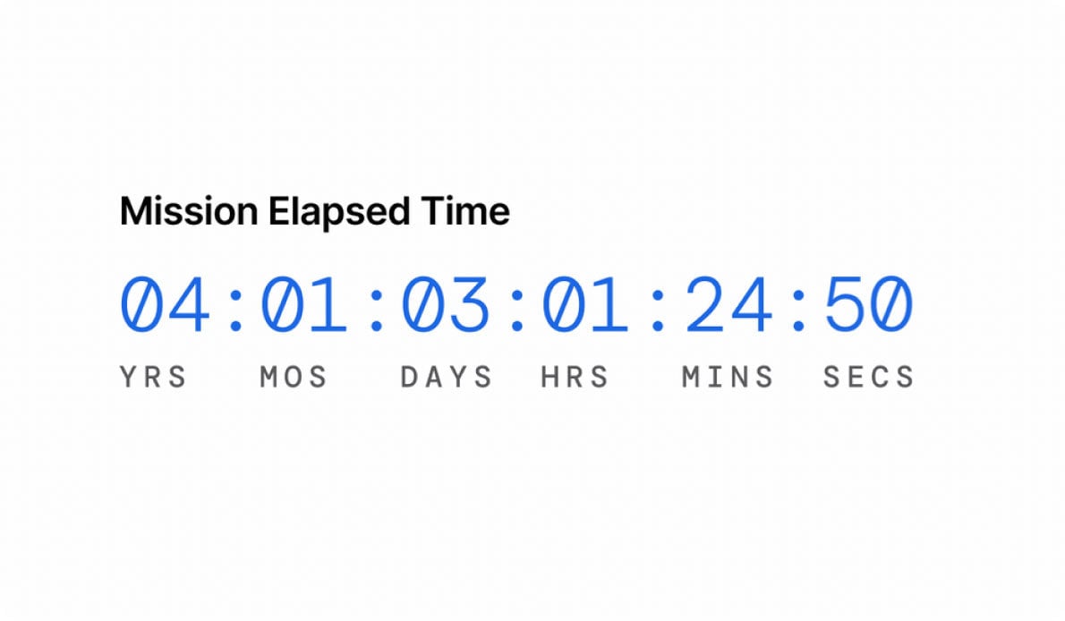
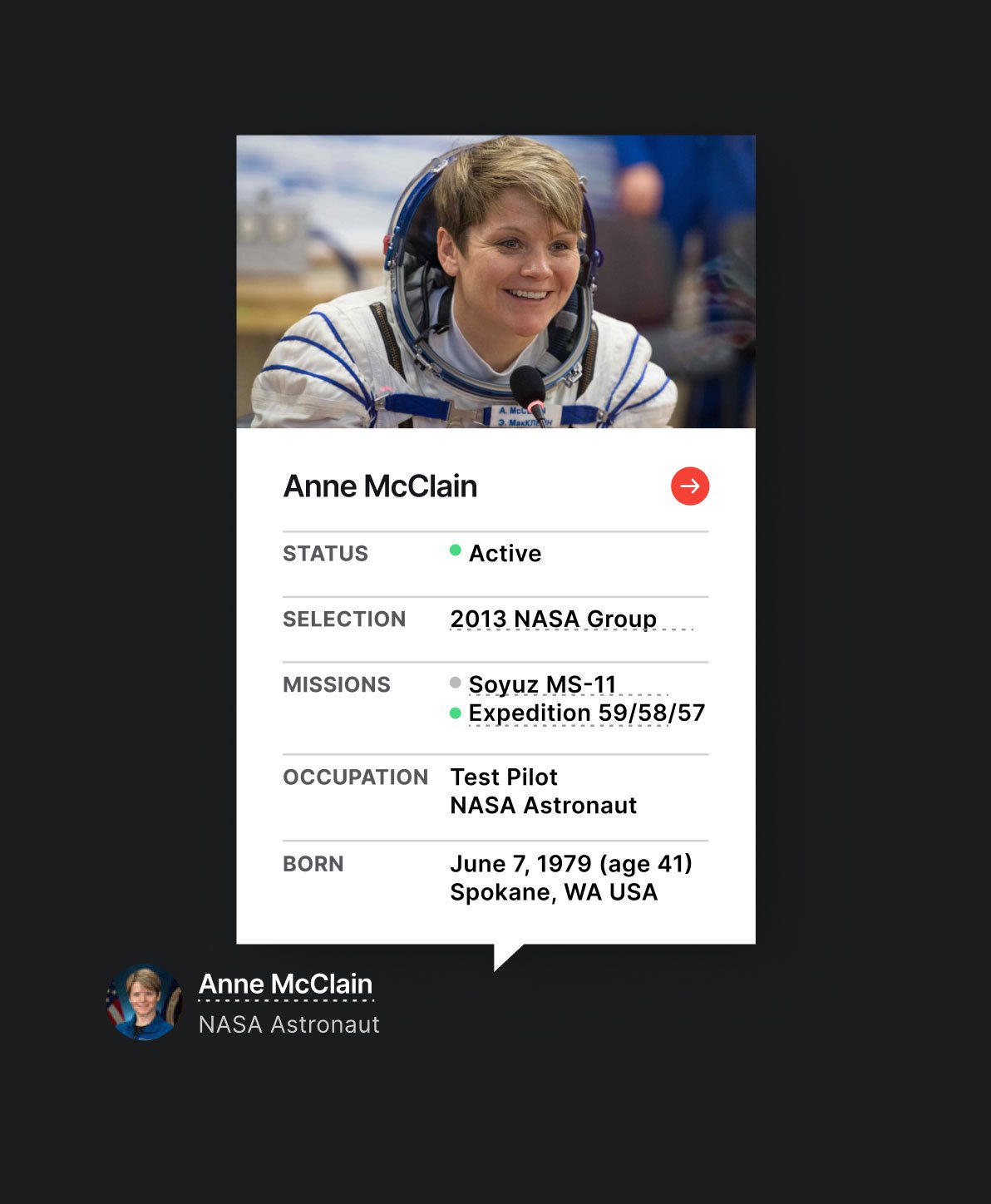
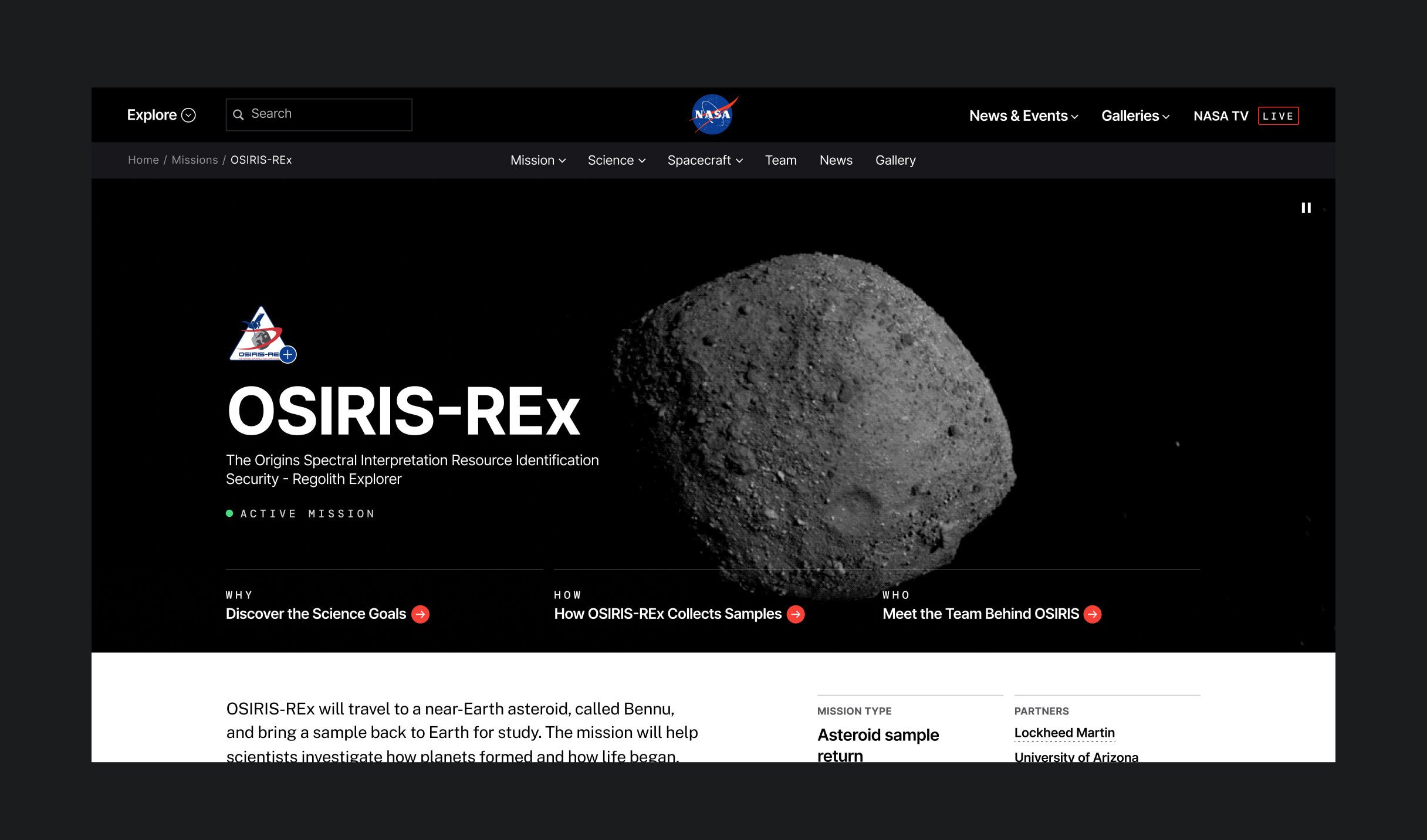
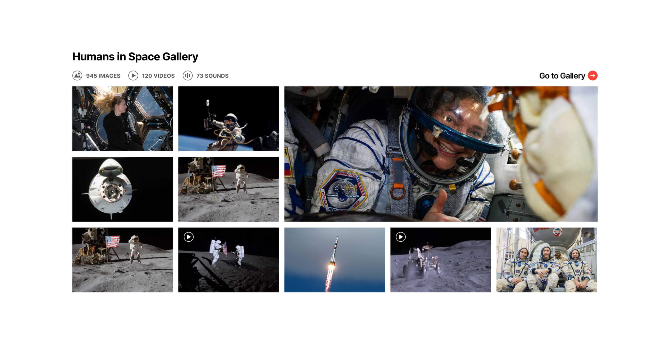
A visual tour through the Horizon Design System
Expanding horizons with continued collaboration
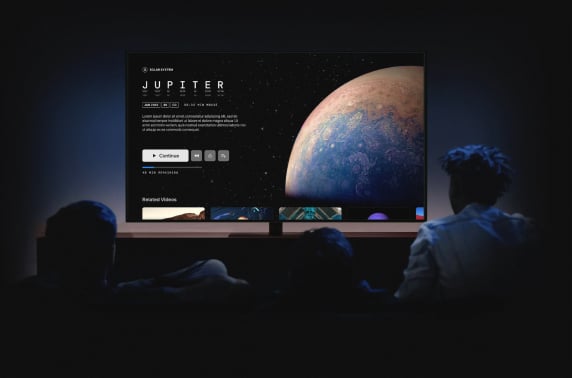
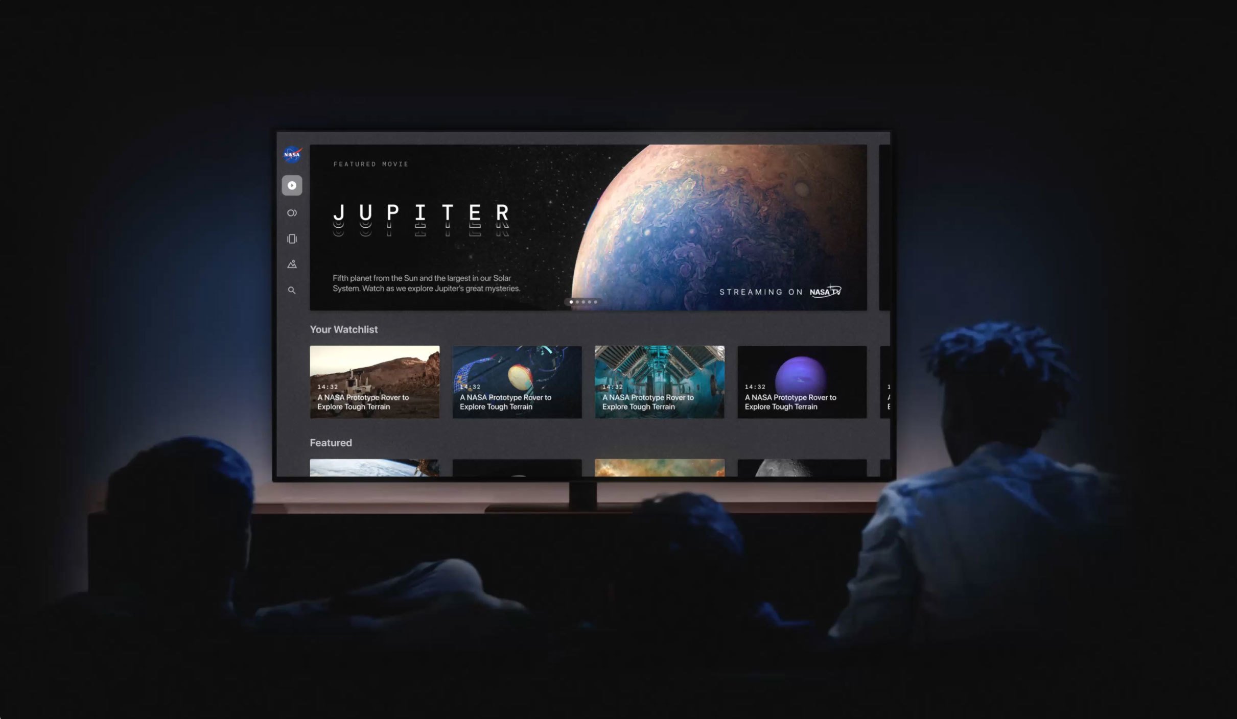
Blink and NASA have partnered over the past decade to make scientific data and educational content more accessible and user-friendly. Additional Blink projects, such as NASA + and NASA's Eyes on the Solar System, have further enhanced the NASA brand and its positive impact on humanity.
Want to create better experiences for your users? Let's talk!


