Gesa Credit Union
How Blink helped Gesa create a user experience strategy and member-first experience that increased profits and lowered application abandonment rates by 50%.
The challenge
A new experience for members
Gesa noticed a decline in new member acquisitions and wanted to launch a best-in-class digital experience that makes it easy for members to open accounts and apply for products and services.
Our approach
Discovering user needs and aligning on goals
Our design workshop and stakeholder interviews enabled Blink and Gesa to align on a vision for success. Foundational research helped our teams uncover member needs and find opportunities to elevate Gesa’s member-first community.


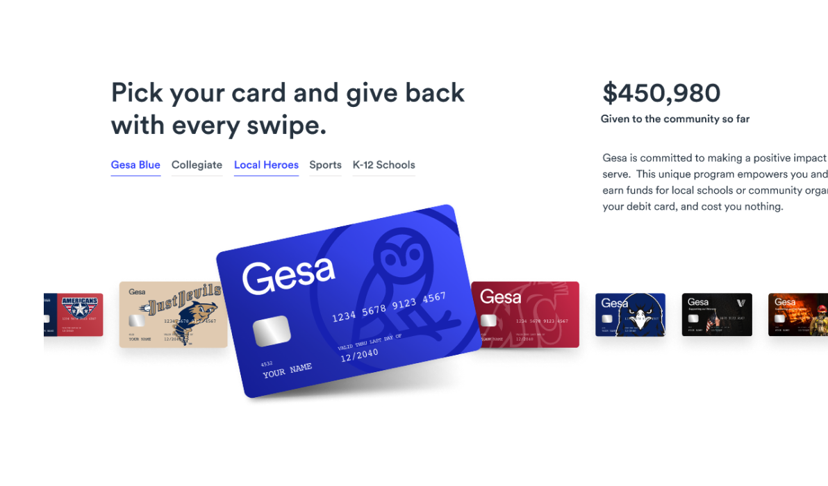
Signature Product Experiences
Expert Instructors
Gain valuable insights with comprehensive, modularized content created by industry experts.
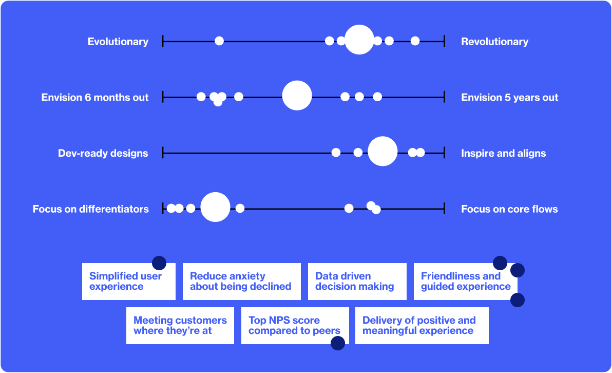
Kickoff workshop
Workshop activities—like Continuums—facilitated conversation between our teams to help us align on project goals.
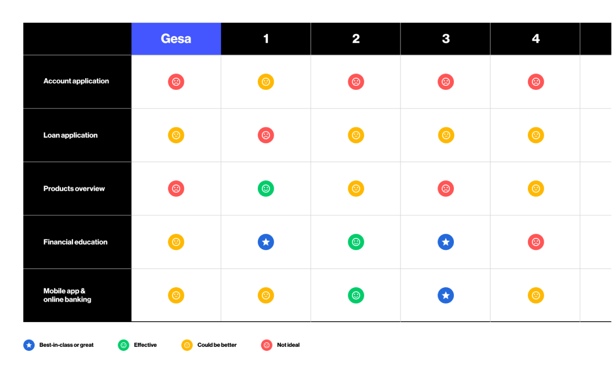
Competitive analysis
Scorecards enabled us to identify where Gesa’s current member experience landed among competitors.
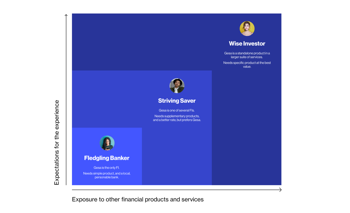
Member profiles
Creating unique profiles for each type of member helped us uncover their expectations for a modern experience.
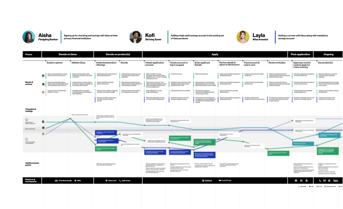
Journey mapping
We used journey mapping to identify and visualize member steps and pain points throughout the new account and loan application process.
The solution
Adding value where it counts
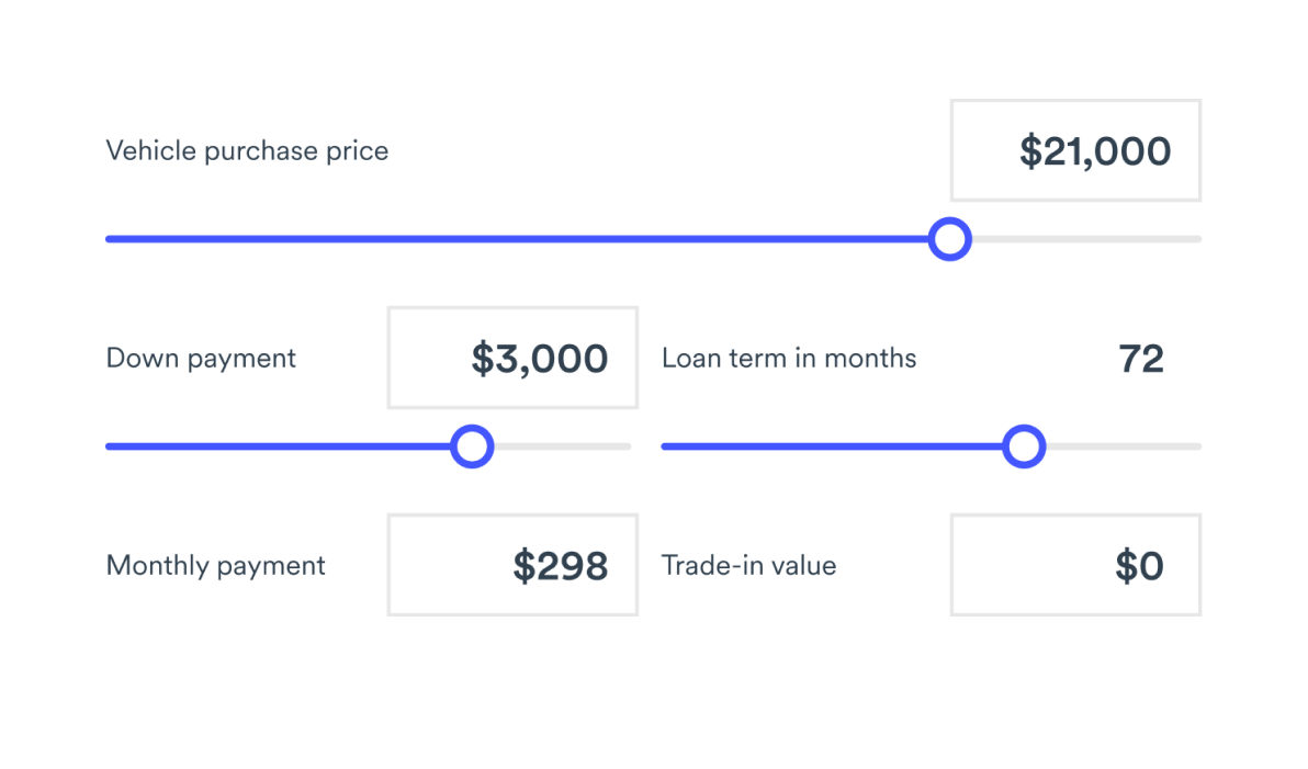
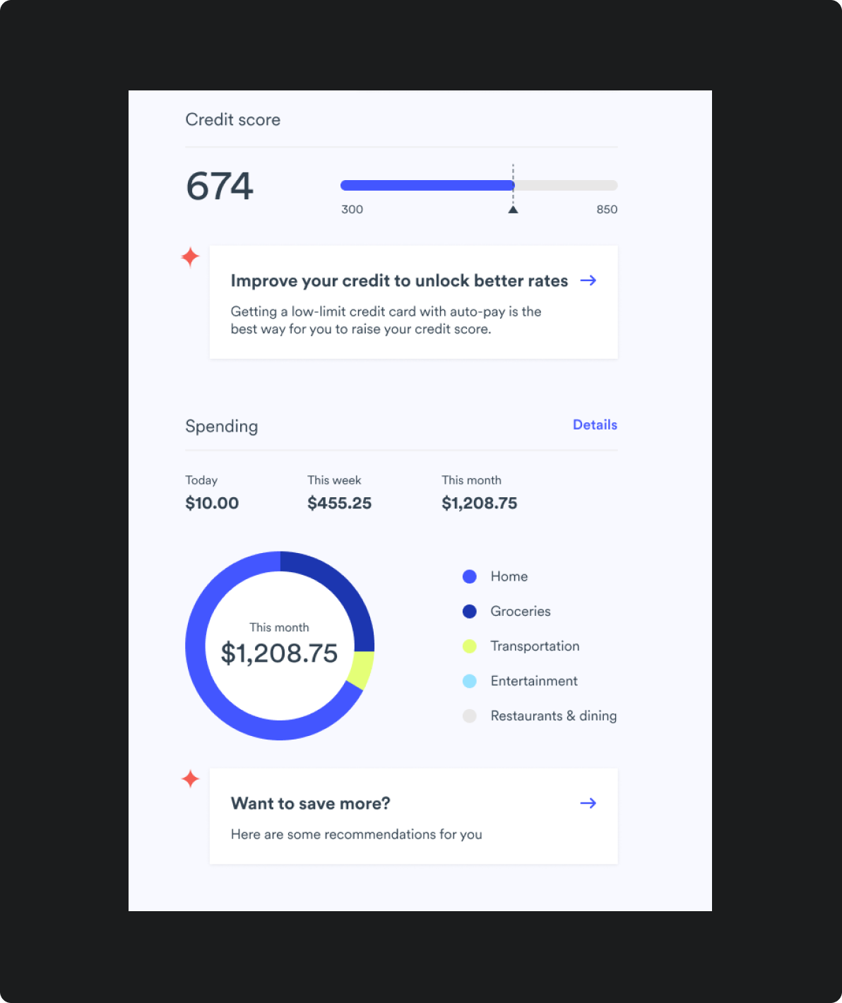
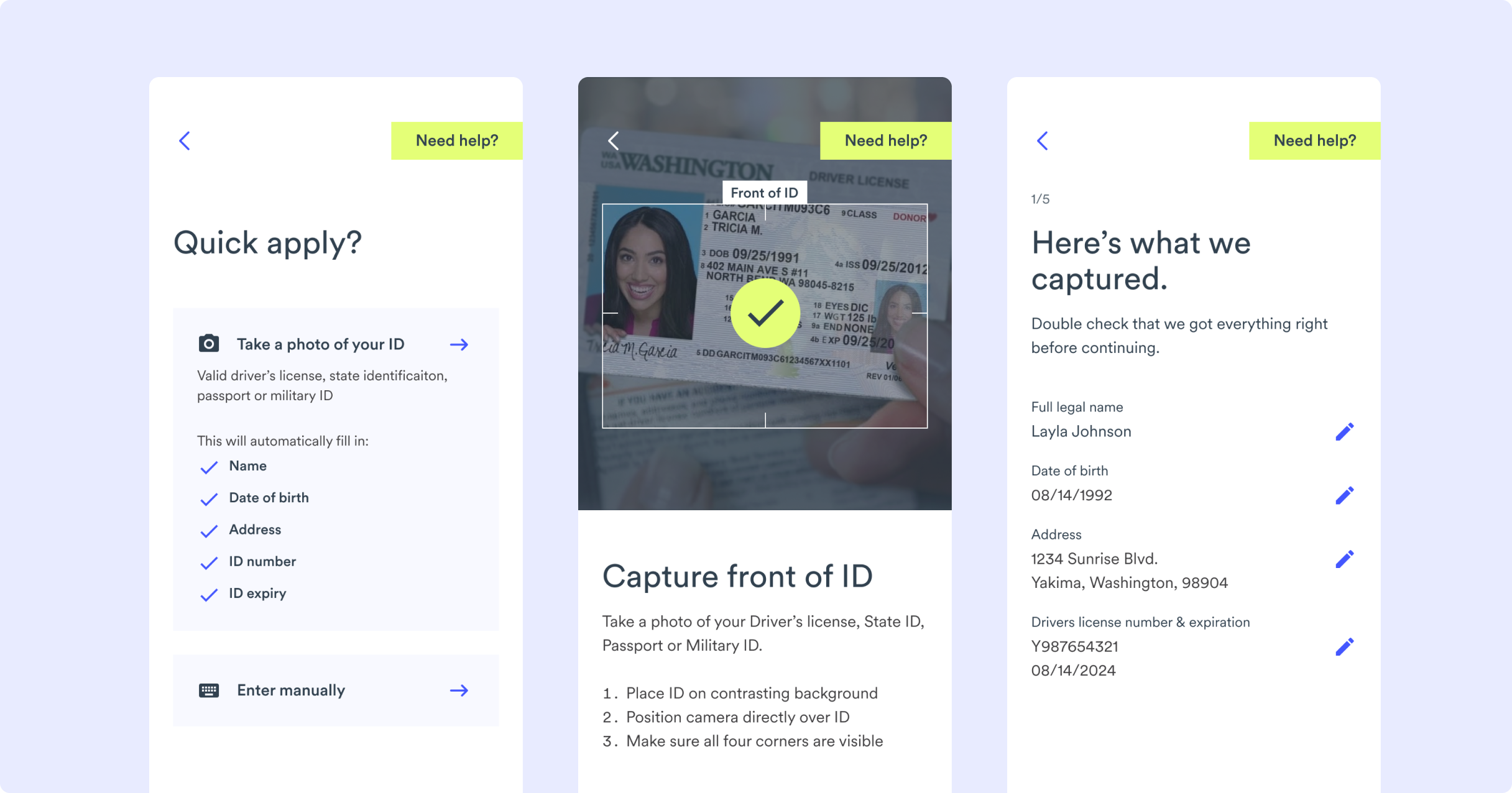
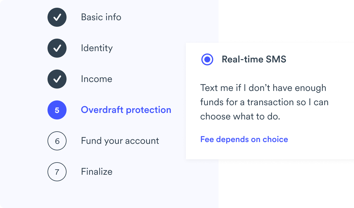
Using our Evidence-driven Design™ process, we created a simple, easy-to-navigate banking platform that gives members education when needed and turns upsells into moments of real value and delight.


A strategic roadmap for the future
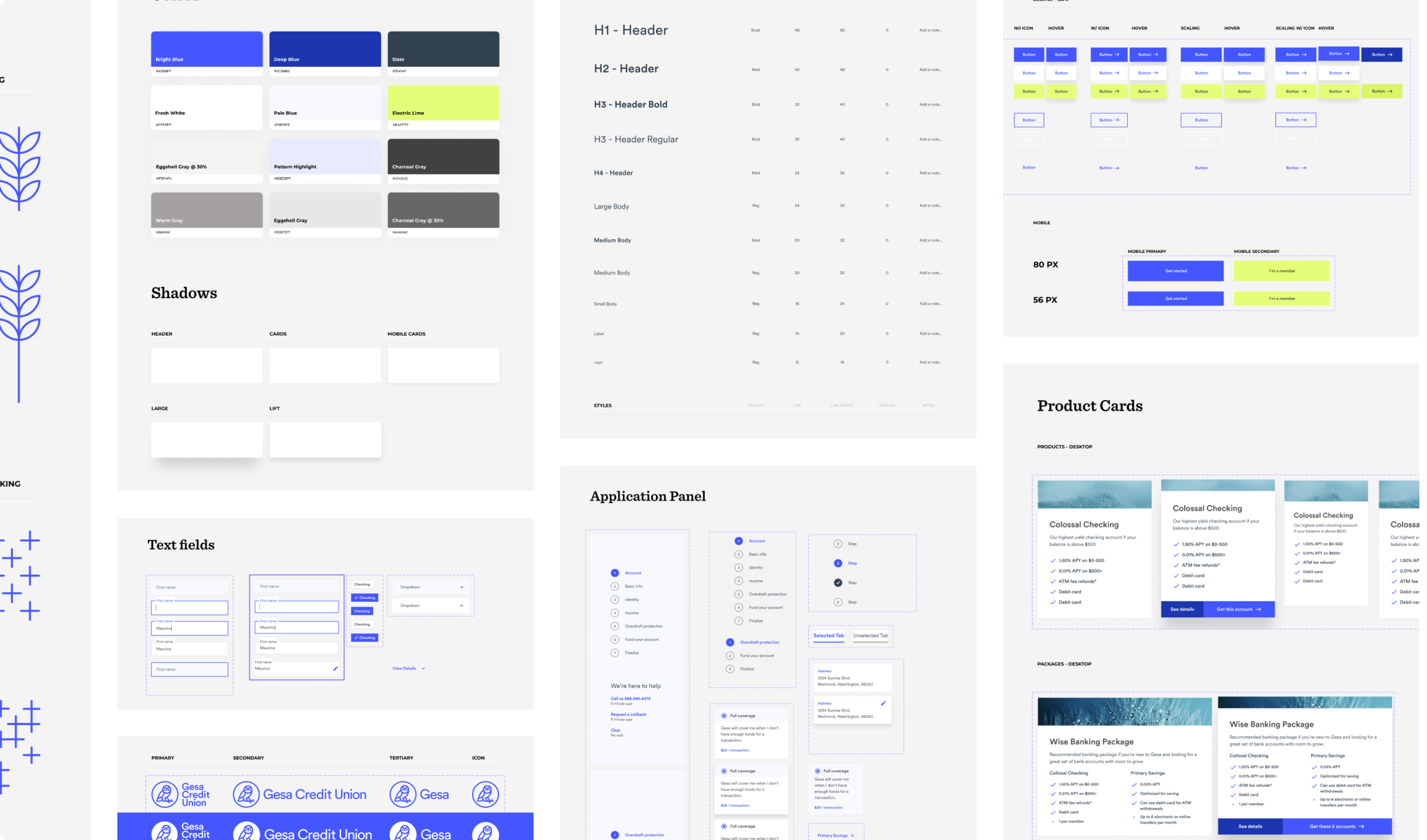
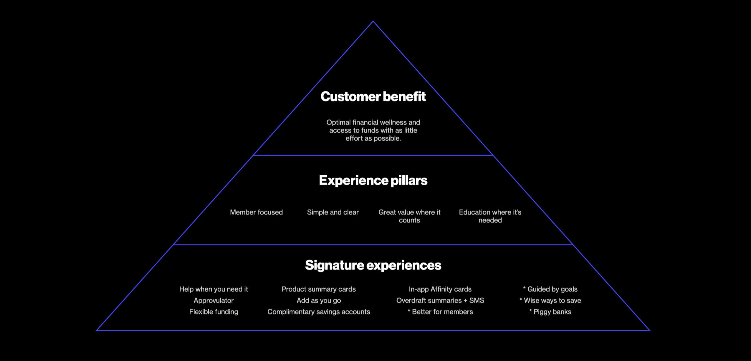
Along with a new user-friendly platform, we set Gesa up with a UX framework that the team can use to build consistent, member-first products and features for years to come. Gesa expanded this experience framework across the entire organization with its new Brand Ambassador Program.
The result
Success by the numbers
After collaborating with Blink, Gesa’s new member application abandonment rate fell from 89% to 39% and significantly contributed to an increase in managed assets.
Gesa also advanced from one of the lowest-ranked credit unions to 23rd overall in Digital Experience in the annual 2023 Credit Union Digital Experience Report by Finalytics.
“
Blink was amazing at simplifying everything, looking at the actual data, and looking at actual feedback from our customers on how to fix things.

Chad Langford, VP Marketing, Gesa Credit Union
Want to create better experiences for your customers? Let’s talk!
Connect with our client relations lead
Blink Teams
- Practitioners
- Tim Brigham
- Siri Mehus
- Research
- Tim Brigham
- Siri Mehus
- Lauren Javor
- Scott Lambridis
- Dan Kellett
- Brian Ledford
- Kendall Dargitz


