The research that transformed a luxury brand into a market leader
How three years of research empowered a high-end appliance brand to outrank its competition.
Concept Evaluation
Customer Experience
Hardware Research
Usability Testing
The background
Strengthening products with evidence
Our client believed its high-end, smart refrigerator was leading the market and wanted to make minor improvements before its next release. They partnered with Blink UX to test the refrigerator with potential buyers and asked us to report back with our recommendations for improvement.
For three years, we conducted multiple rounds of research to help the brand design a unique luxury refrigerator that delights customers and stands out from competitors.


Research by the numbers
Research participants
In-lab research hours
Insights & recommendations
Phase 1 | Usability testing
Goal: Collect feedback
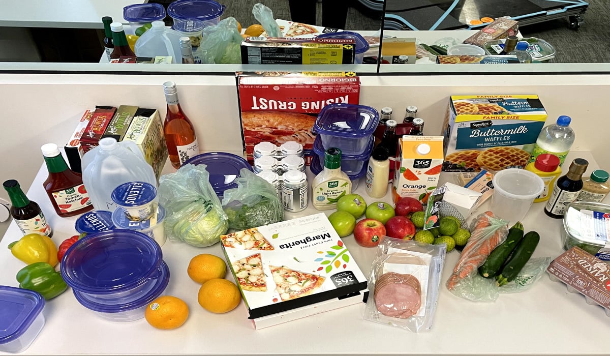
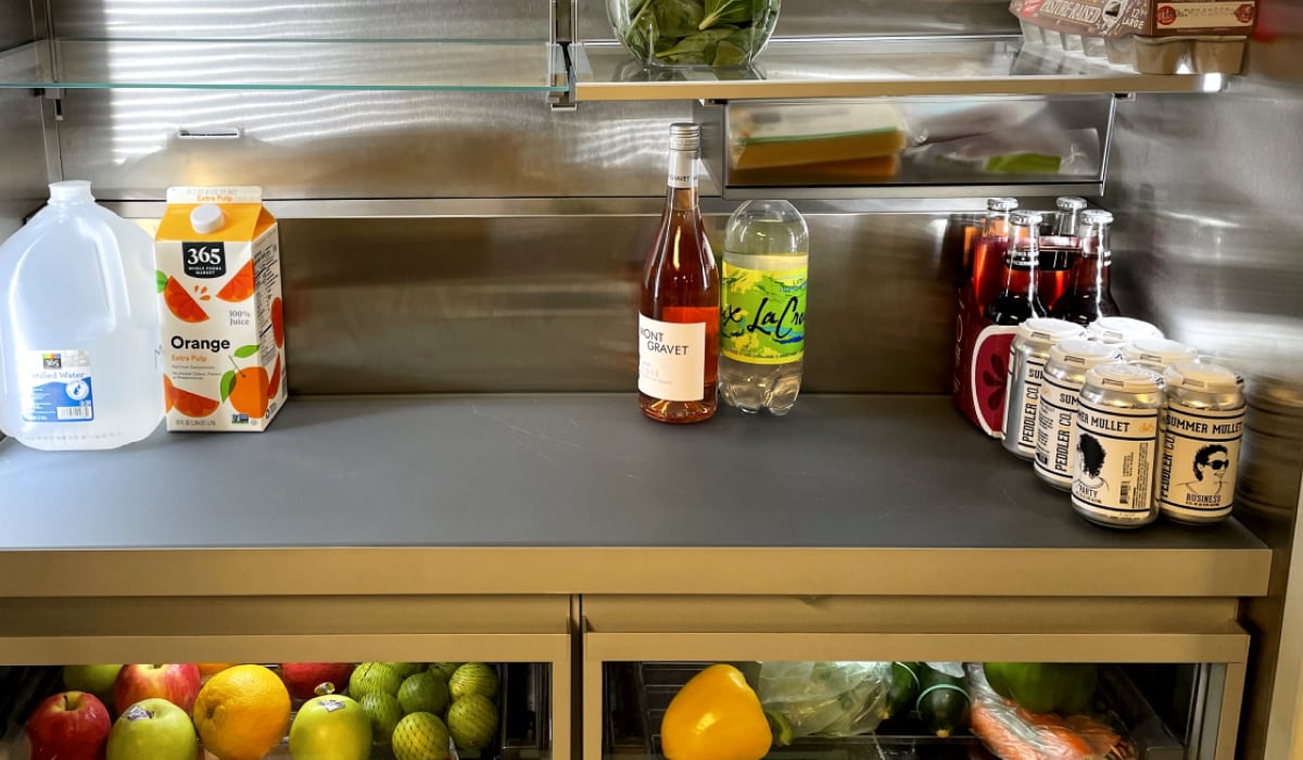
First, we needed to test the prototype with customers to understand the usability of the refrigerator’s hardware and gather feedback on specific smart-fridge concepts. To do this, we observed participants stocking and organizing food in the refrigerator just like they would do at home.
We know people have a lot of opinions about the products they use, and when it came to refrigerators, the findings followed suit. As participants sorted their groceries, they told us what they liked about the prototype and where it didn’t quite meet their expectations.
What we learned

People were split on usability...
Several participants found issues with the height of the shelves and door bins, for example.
+


...and preferred more practical solutions.
Participants found more value in simple concepts compared to novel solutions such as voice control.
Phase 2 | Competitive research
Goal: Rank against the competition
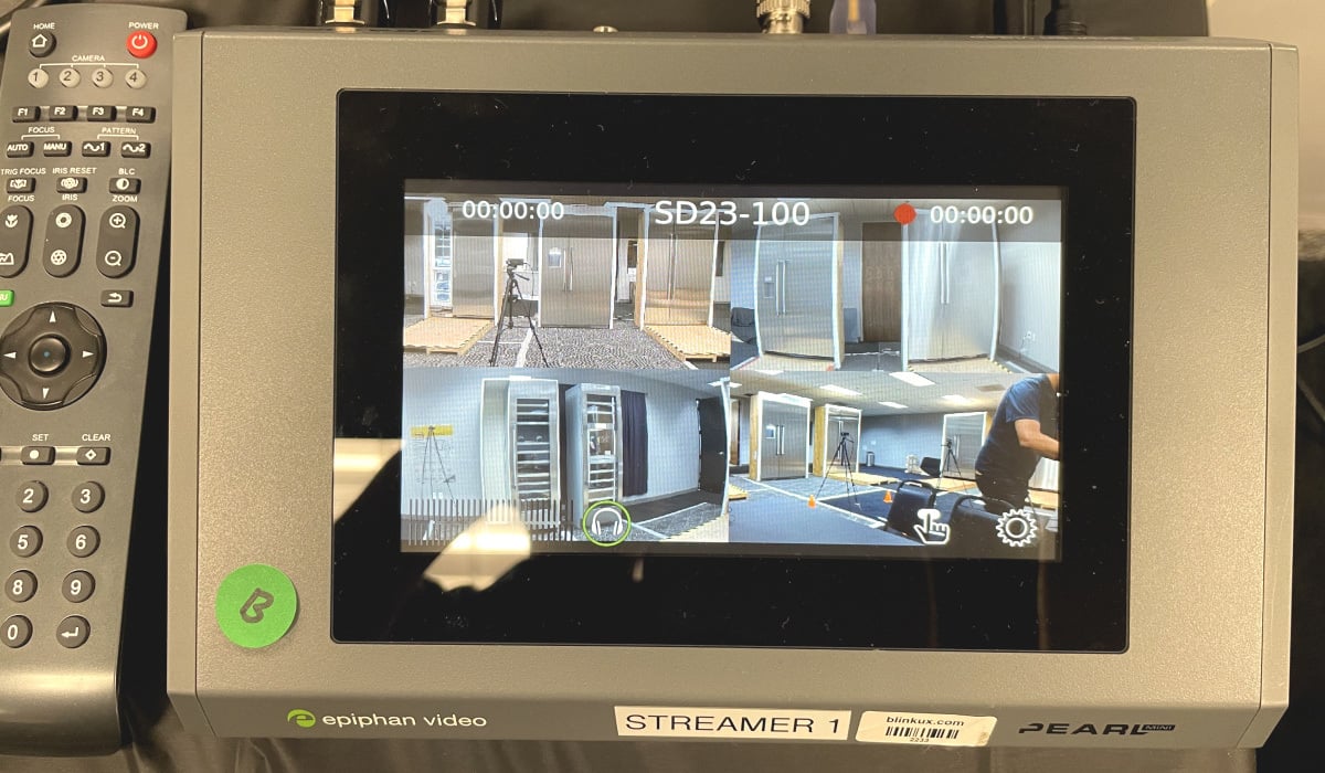
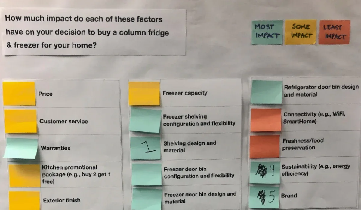
For our first competitive study, we set up an in-lab showroom so participants could walk around and compare refrigerators from competing brands. Each participant evaluated five refrigerators, discussing their preferences and the factors impacting their purchase decisions.
We asked them to pay extra attention to each product's aesthetics and practicality, including their thoughts on key product elements such as door bins, interior and exterior finishes, shelving, drawers, and ice dispensers.
“
This study woke me up [to the fact that] we are just accepting the basic stuff, it’s the basic stuff that’s killing us.
Product manager, Client
The findings
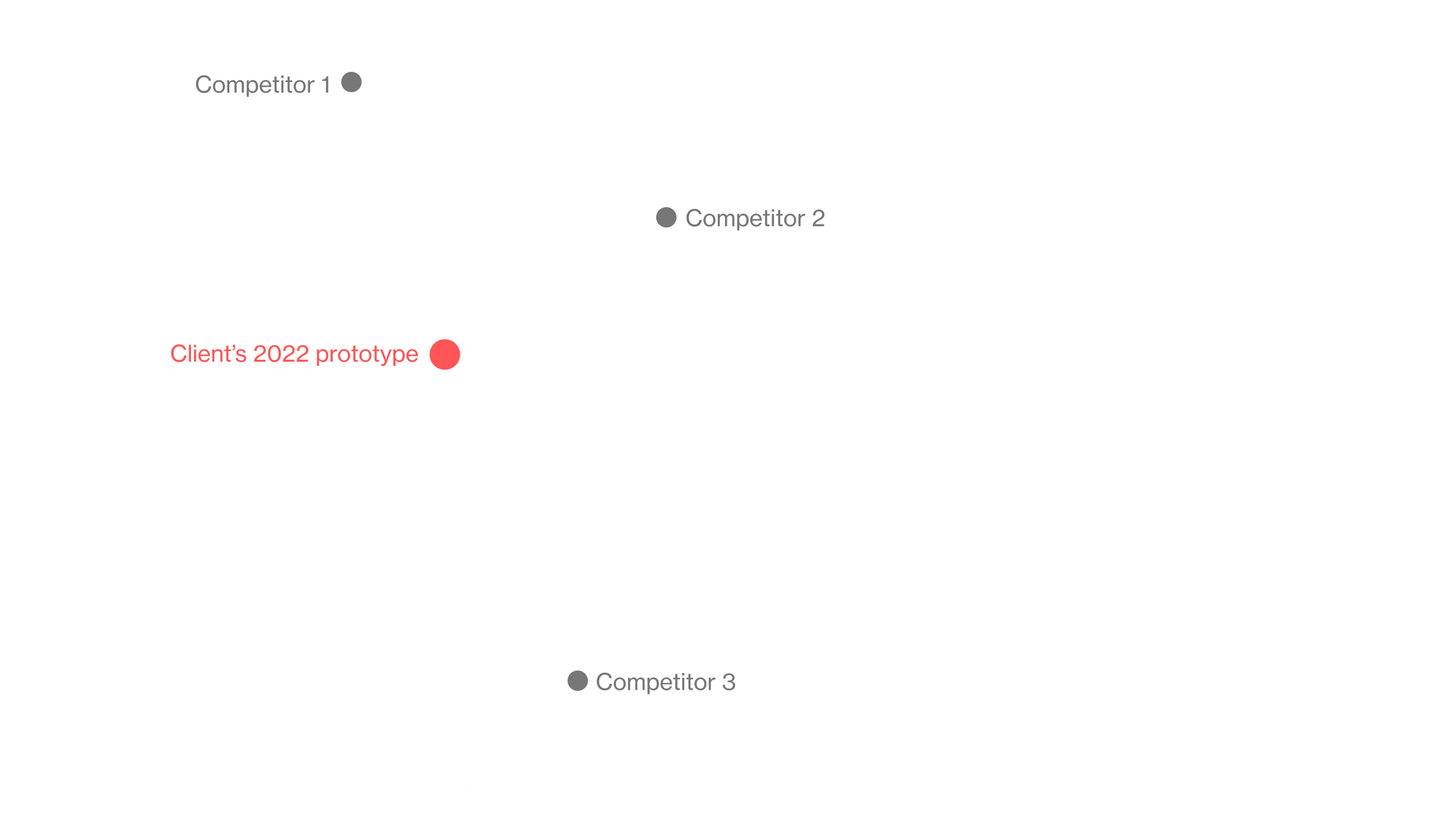
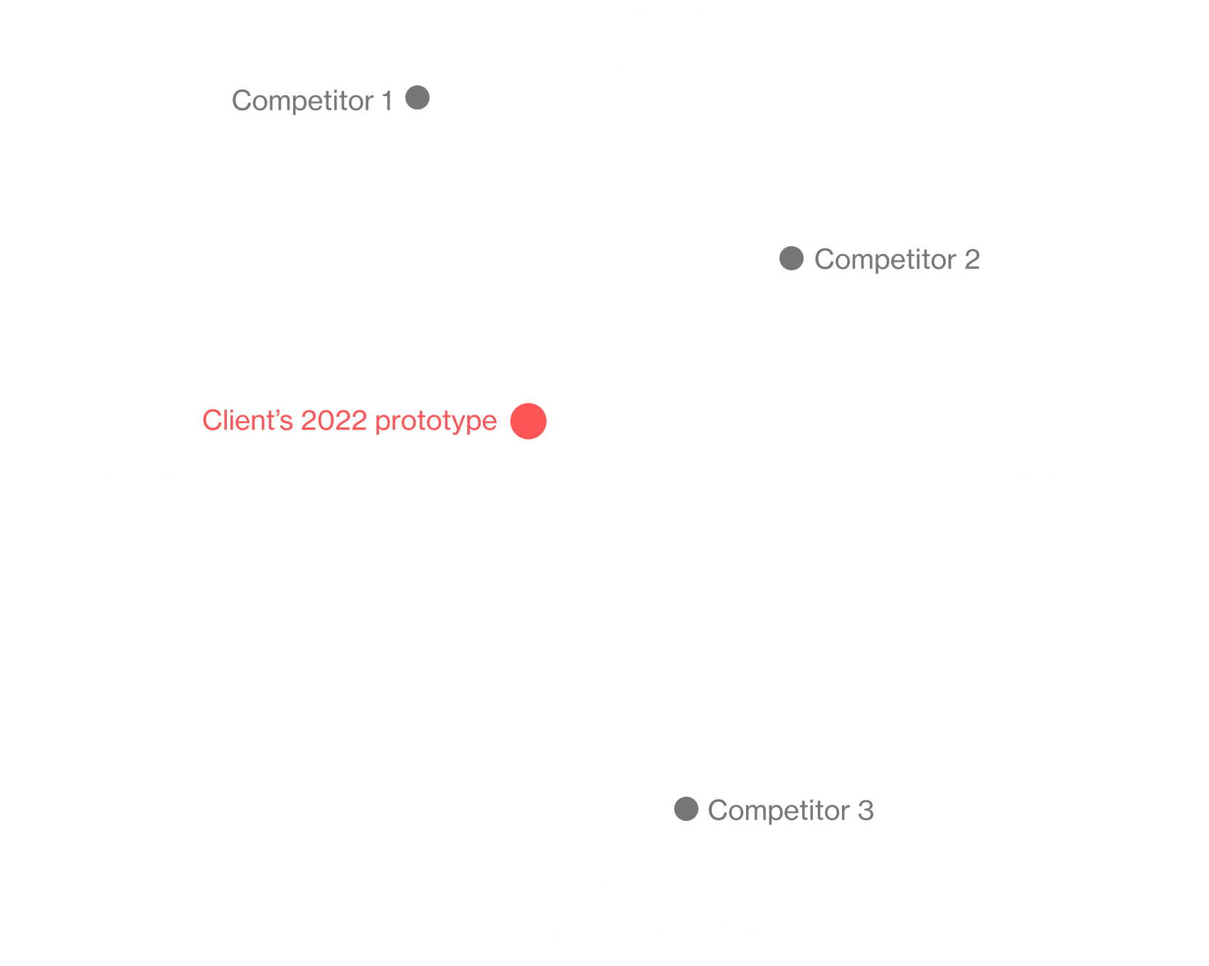
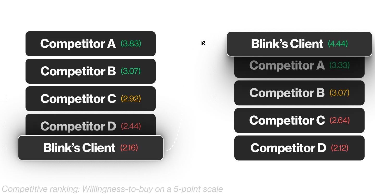
Participants ranked our client’s refrigerator low against competitors. In fact, no one chose our client’s product when asked which refrigerator they would buy out of the options in our study. Participants noted two critical reasons for the low ranking: the ice maker size was a deal-breaker, and the drawer and door bin quality seemed low-end.
Wanting to improve their standing against the competition, the client took these critical findings and built a new prototype to put to the test — one that was both practical and luxurious.
“
The data is here, it is clear...I wasn’t expecting to get as much as we did in this study, and I’m really happy to have this to push for change for the product.
Product manager, Client
Phase 3 | Competitive research
Goal: Refine and retest
For the second round of competitive research, we added couples to our participant mix. Each couple evaluated the new refrigerator prototype against competitors and made their purchasing decisions together.
When we asked participants their perception of the quality, they often pointed to the solid drawers, beautiful lighting, and the use of stainless steel throughout, which gave the refrigerator an industrial, sleek, long-lasting look and feel.
Evidence-driven success
The result
Rising in the ranks
Following multiple rounds of competitive research, our client delivered a product to match their customers’ unique design aesthetic and culinary lifestyle.
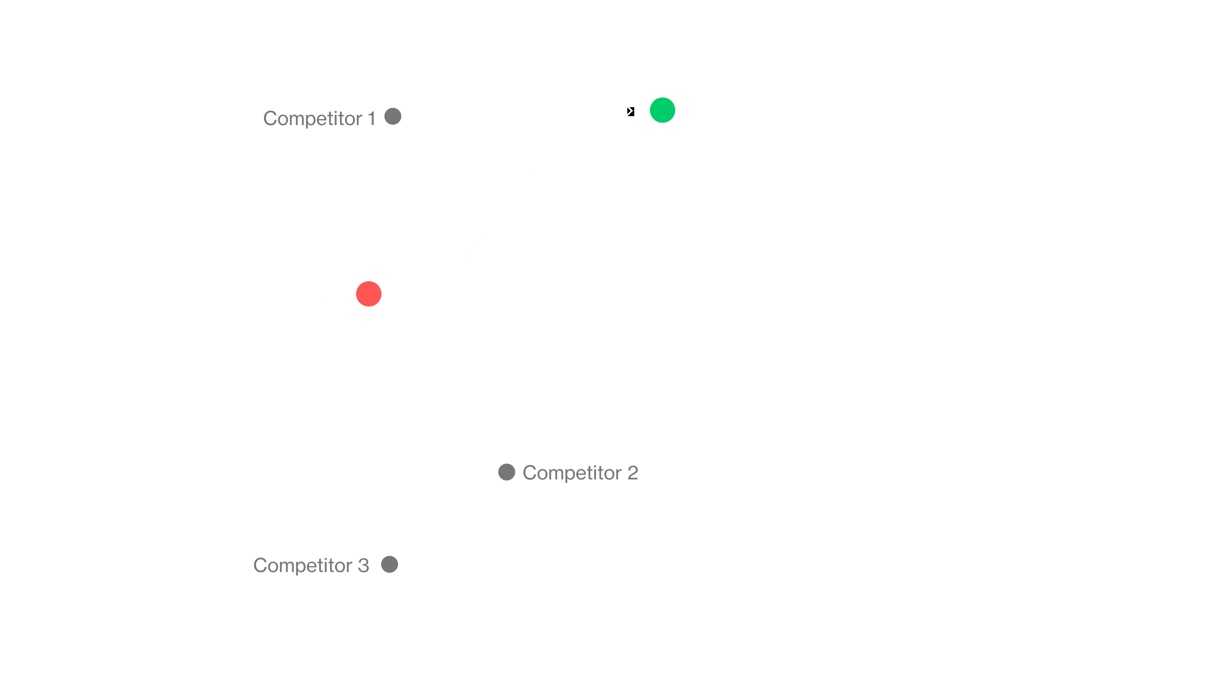
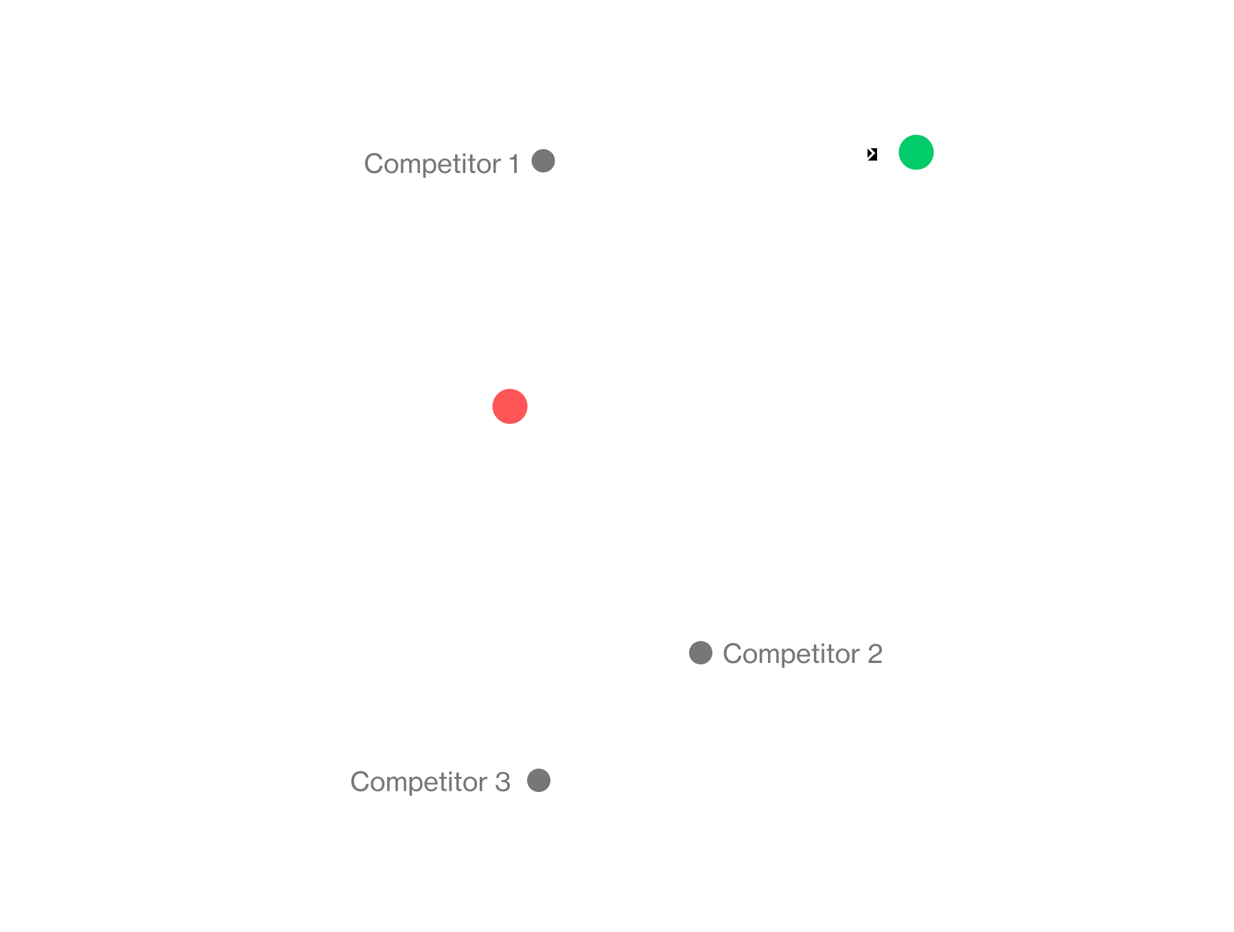
In our first competitive study, the refrigerator ranked lowest against competitors in “willingness-to-buy.” After redesigning and retesting the prototype, our client’s ranking skyrocketed from last to first, with almost all participants choosing our client as their top choice.

Ultimately, our client went beyond the minor improvements they had aimed for. The brand didn't just enhance its product; it gained a deeper understanding of what mattered most to customers when choosing a kitchen appliance. These insights inspired a fresh product strategy that aligned with customer needs and gave our client more confidence as they released their new design to the market.
Ready to design evidence-driven products people love? Let's talk!


