To Go Boldly Where No Stream Has Gone Before
NASA partners with Blink to design a new streaming service that makes space and science accessible to everyone.
About the client
Inform and inspire through video
For most of the planet, space is the subject of science fiction, an environment known only through visual effects and imagination. For NASA, by contrast, space is where they work and what they aspire to explore and know.
After decades of probing what lies beyond the bounds of Earth, NASA has amassed an incredible and vast archive of videos showing the realities of training, space exploration, mission breakdowns, and behind-the-scenes work. If seeing is believing, this is video footage that turns science fiction into science fact and will inform and inspire the next generation of scientists and explorers.

The challenge
Legacy systems and complex processes
The challenge — and the opportunity — was for NASA to find a way to share the footage they have and the video content they continue to produce with the public in an easy, intuitive, and engaging way. In a world where streaming platforms deliver mountains of entertainment, NASA needed a streaming service that delivered a universe of wonders. For that, they turned to Blink.
“
We choose to go to the moon in this decade and do the other things, not because they are easy, but because they are hard.

John F. Kennedy, former U.S. President
Like many large organizations, NASA dealt with legacy systems, duplicate content, and complicated processes that made publishing, managing, and reaching its audience more challenging.
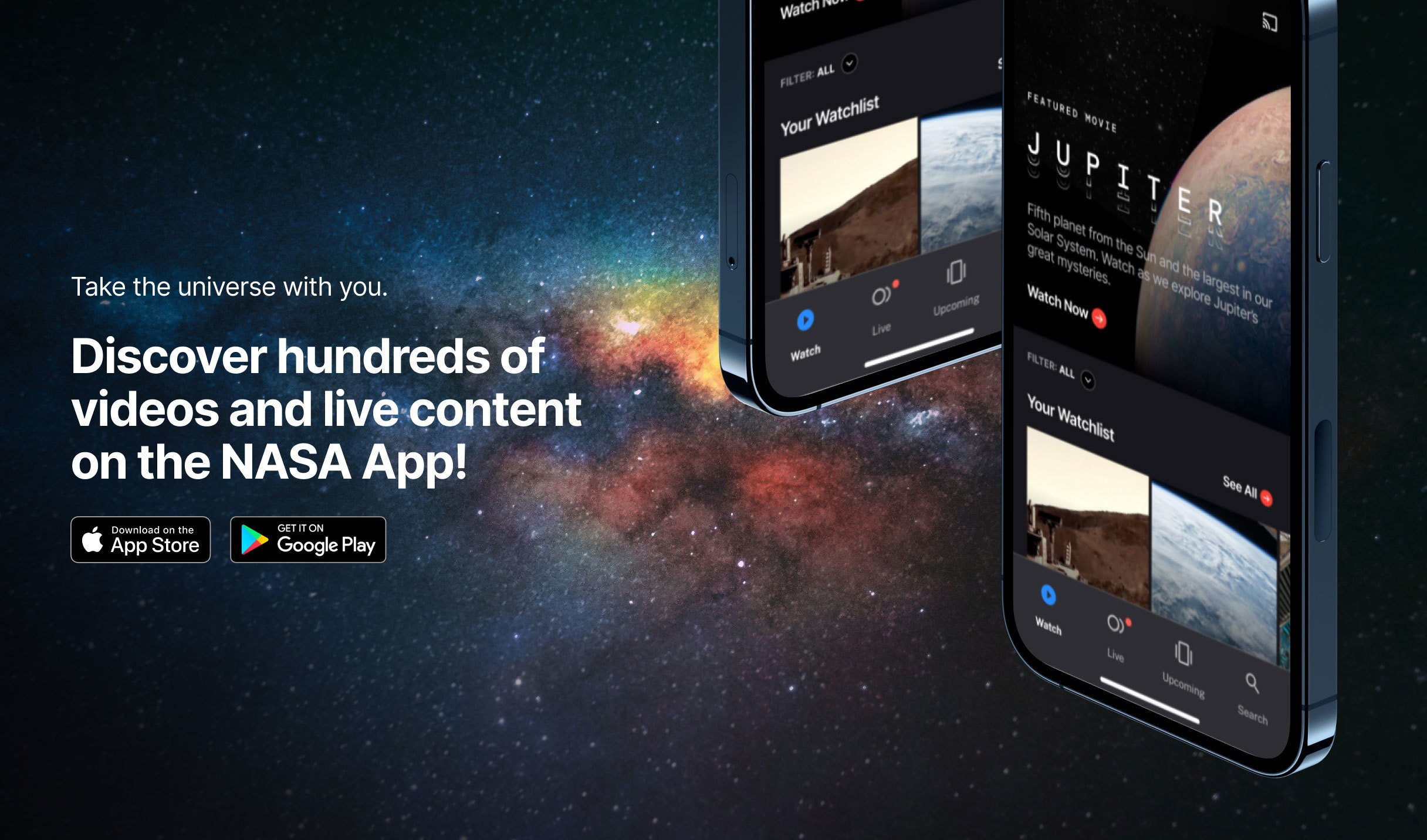
They were splitting content between a public channel that covered missions and events, a media channel that included news coverage, and third-party platforms like YouTube, where they hosted additional videos. As a result, they needed an approach that modernized, simplified, and empowered creators to produce and share content that would educate, engage, and inspire their audience.
Our process
Uncovering audience insights
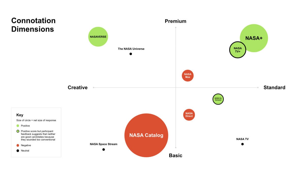
We began by deepening our understanding of that audience, conducting interviews with educators and members of the general public to understand what they would find engaging and what they would look for in a streaming service from NASA. We learned they wanted an inclusive and big-picture name to showcase NASA’s profound impact. After weeks of research, NASA+ emerged as the clear winner.
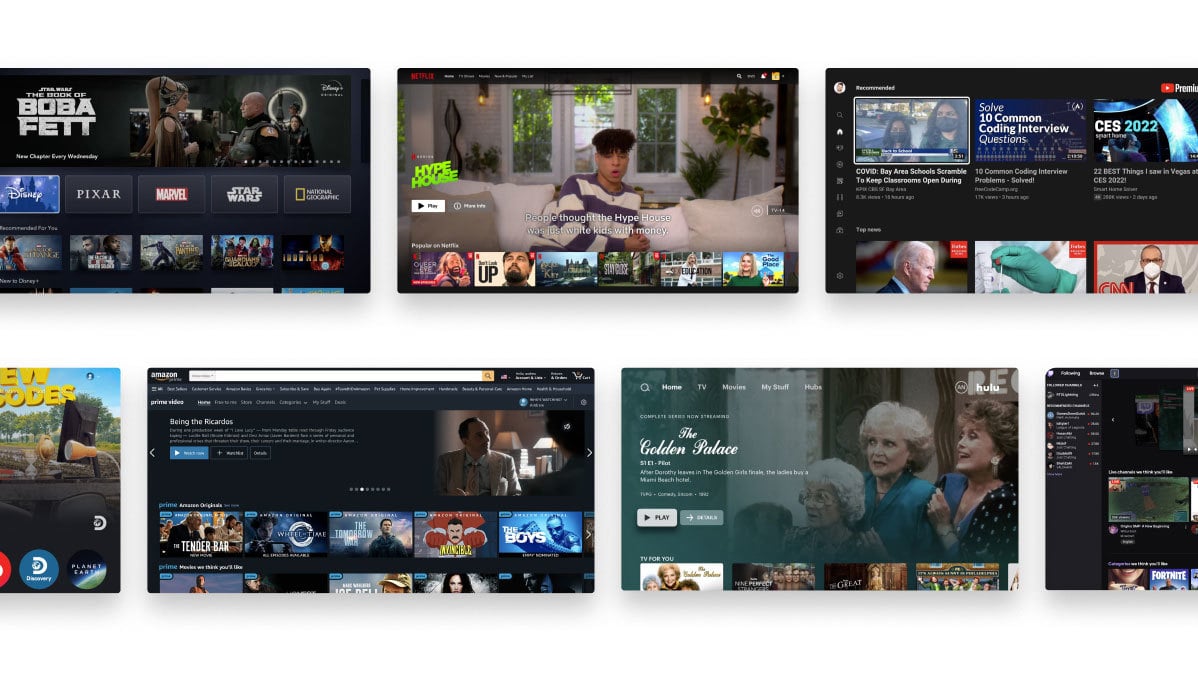
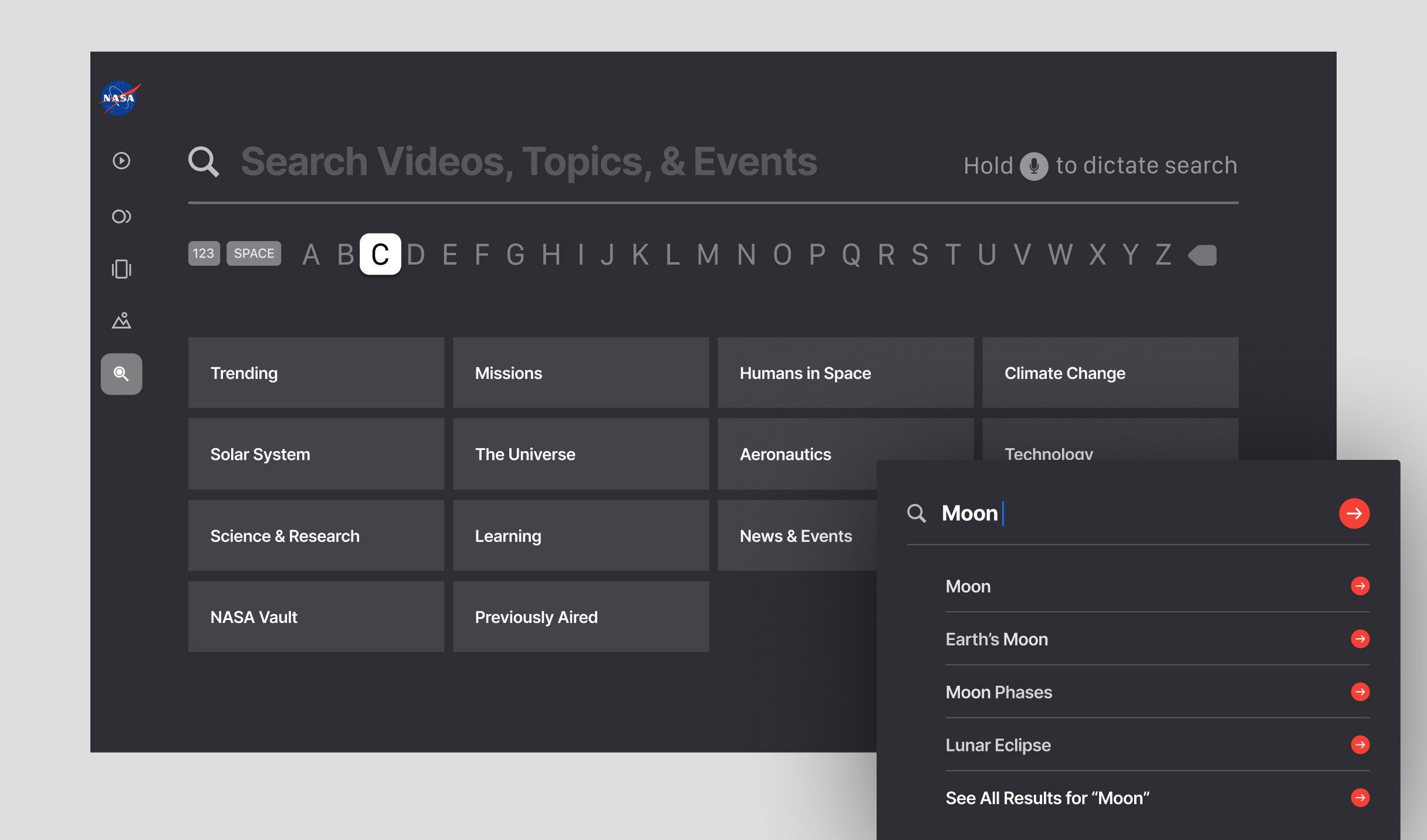
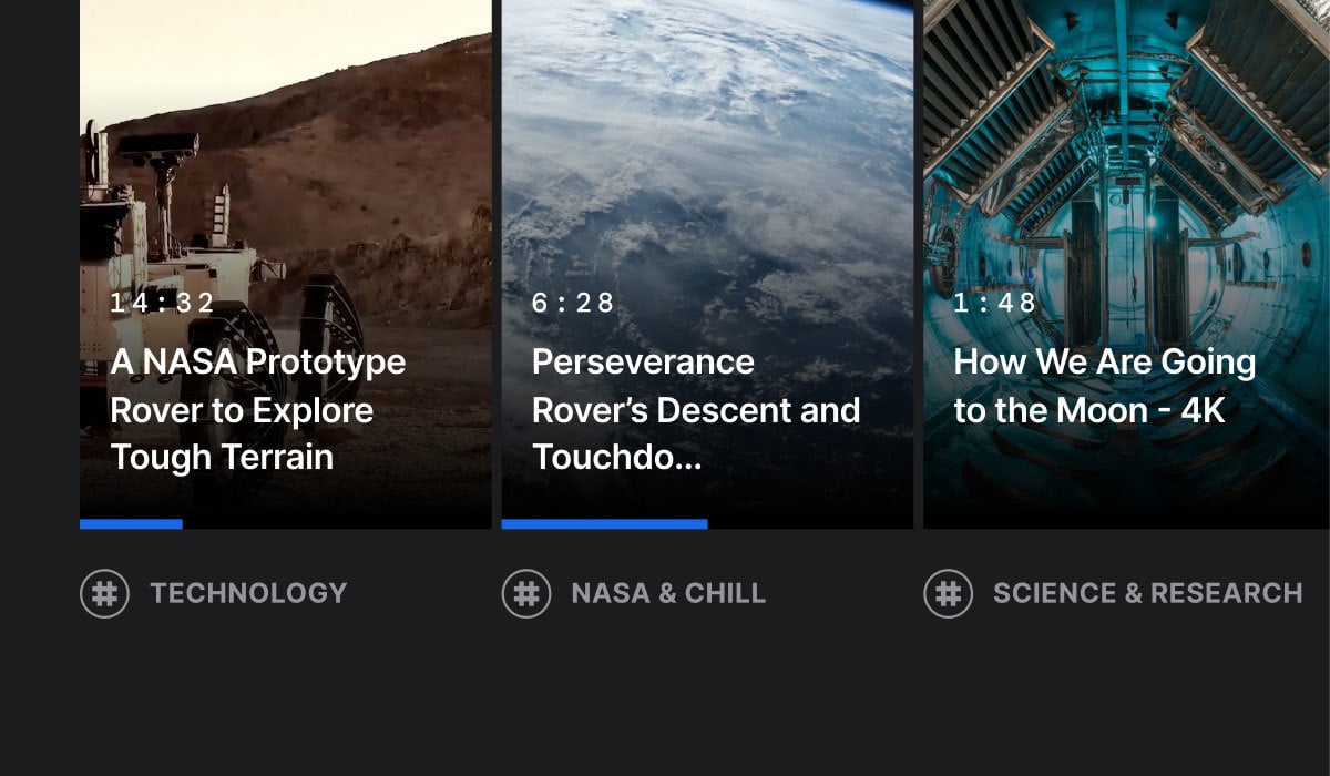
After that initial research, we dove into a comparative audit of streaming services like Netflix and Hulu and adjacent services like YouTube and Twitch to identify which features make for great consumer-grade experiences. These features included well-curated thumbnails, search functions, intelligent recommendations for related content, the ability to download and watch offline later, and the production of original content. Overall, we curated a list of over 25 feature recommendations and worked with NASA to prioritize the features that would matter most for their content and audience.
“
We are a way for the universe to know itself.

Carl Sagan, American Astronomer
The result
A new way to view and publish scientific content
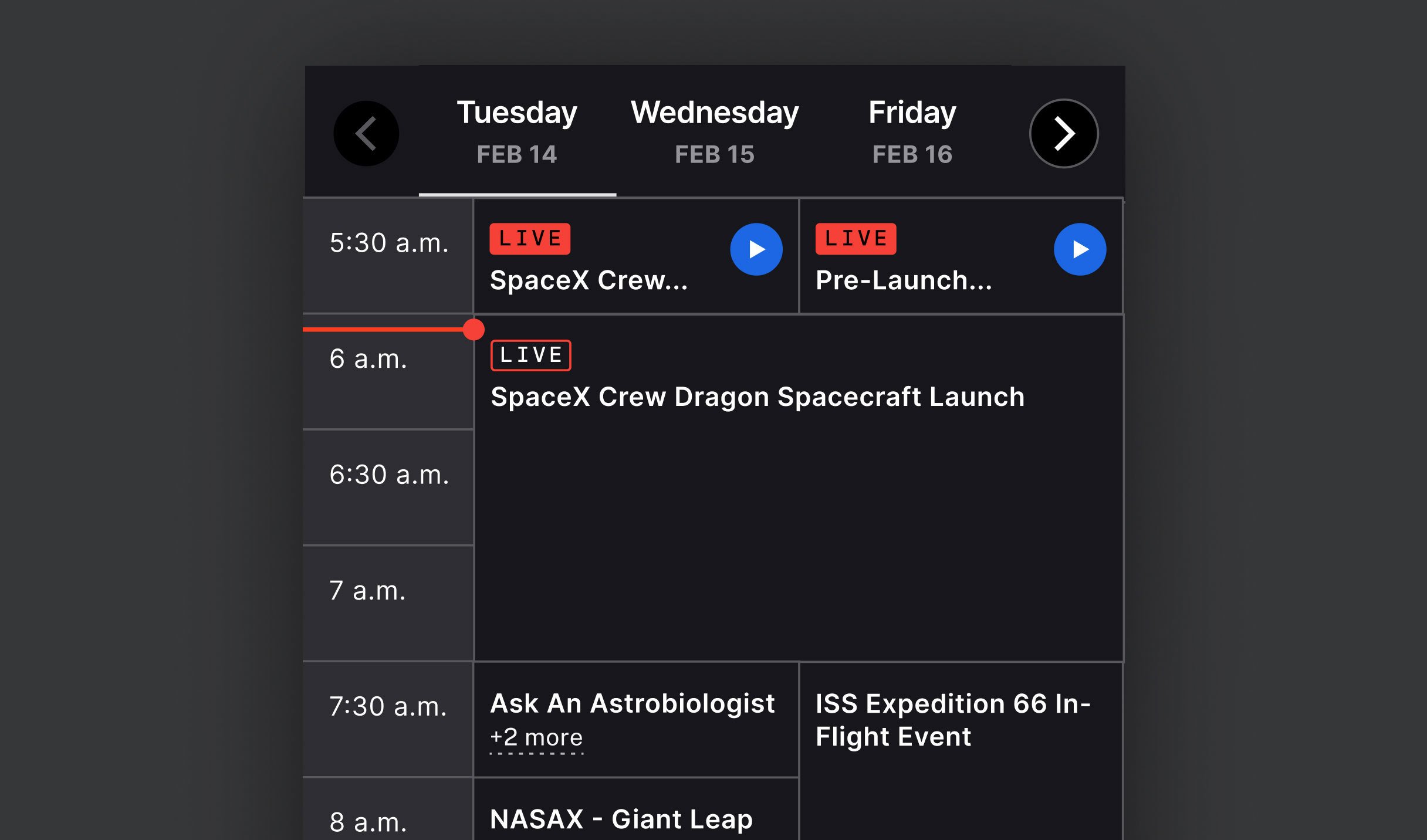
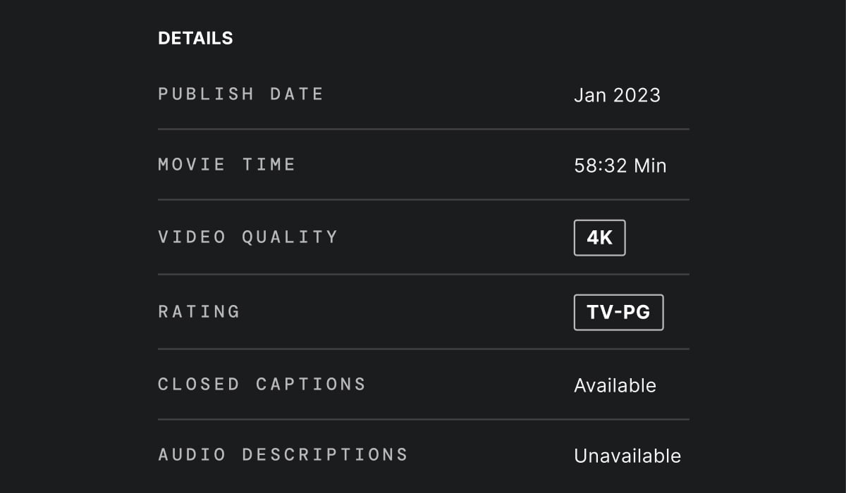
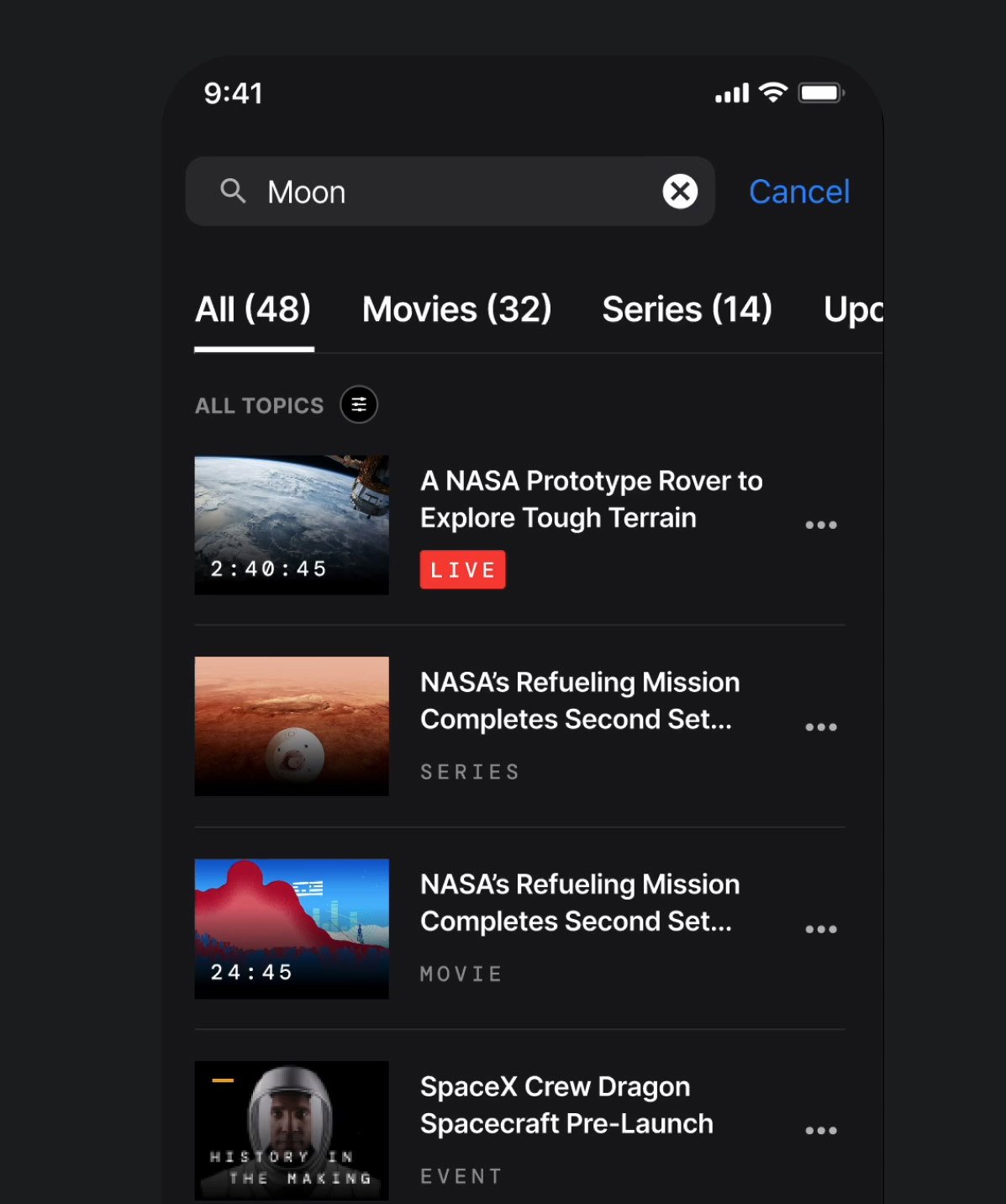
The result is NASA+, a new streaming platform developed from the ground up to provide a consistently engaging experience wherever and whenever its audience wants it. It begins with a captivating design inspired by the Horizon Design System, emphasizing majestic photography, hints of technical design components, and interactivity. We scaled that design and the media it delivers across all responsive touchpoints to ensure the same experience across devices and formats.
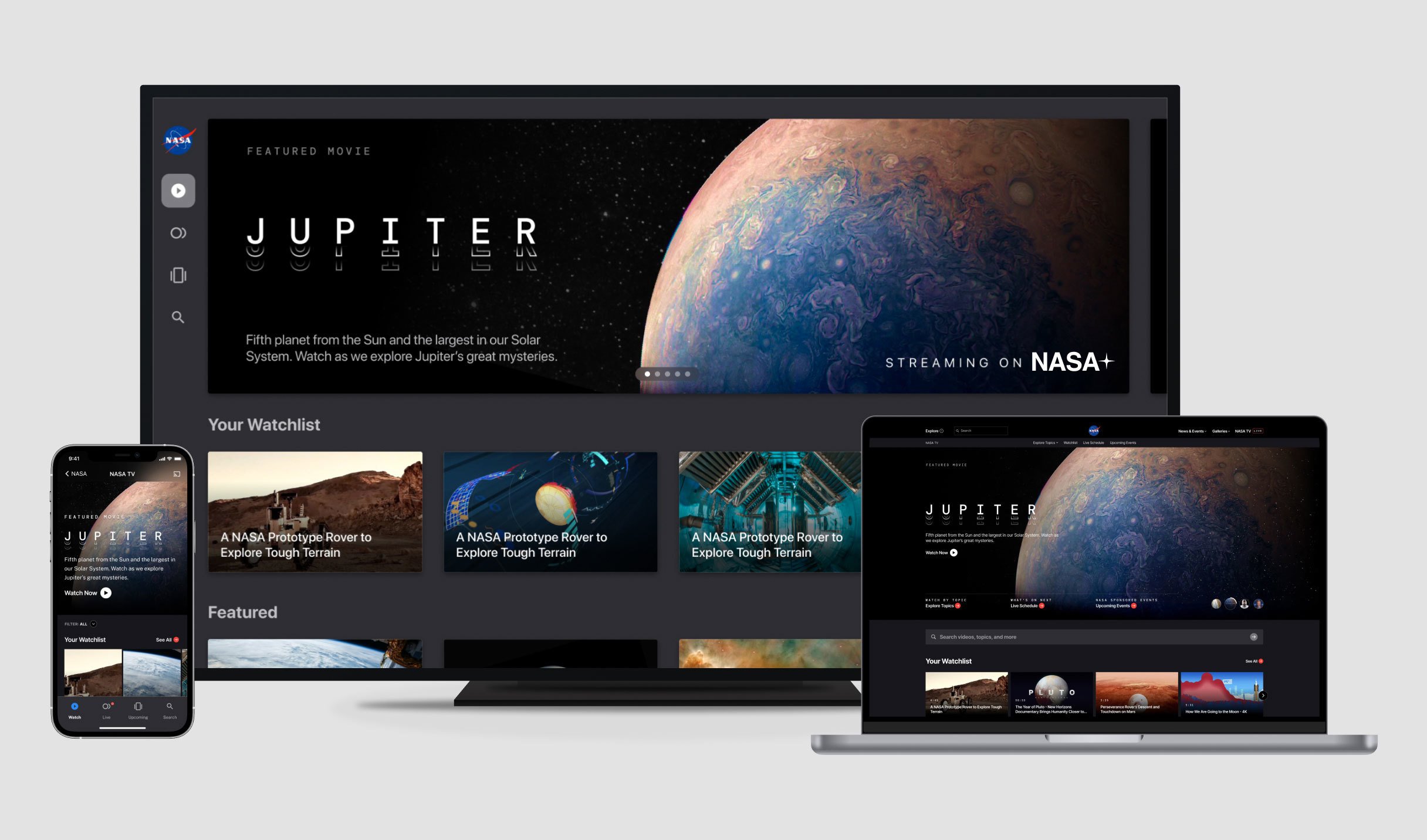
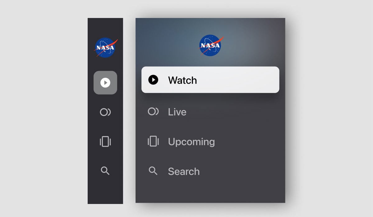
We worked to ensure that navigation was streamlined and consistent. One of our design pillars throughout the experience was to promote exploration. That’s why we recommended the platform engage viewers by suggesting related content, whether video, a website, or an article.
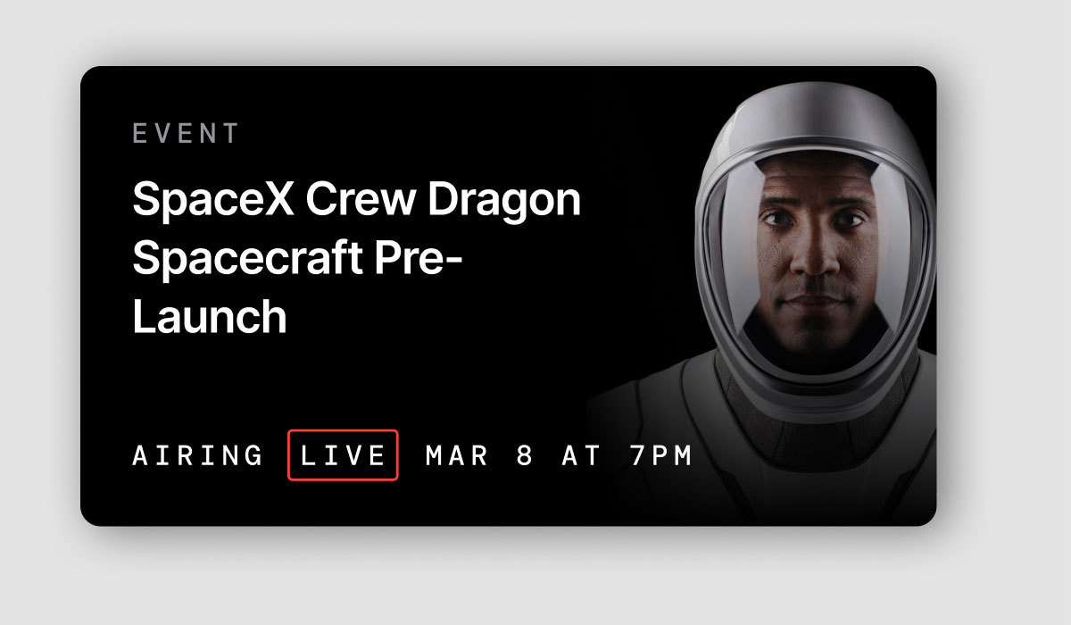
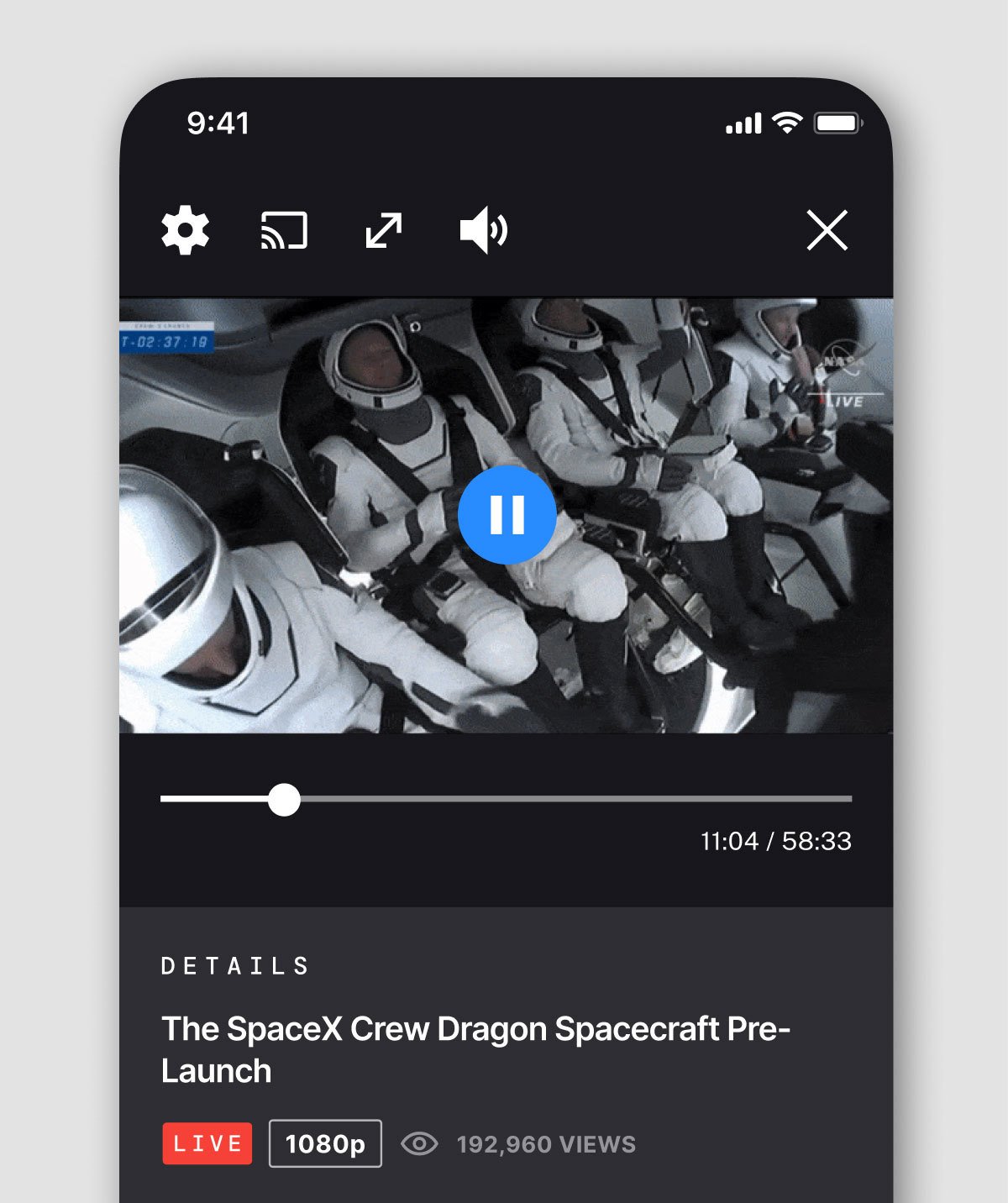
Building a better streaming experience is only half the mission, though. With cost and curation efforts being a concern, we provided an experience that considered reducing time to production. We provided content creators with recommendations for displaying content on the platform in an efficient and effective way.
“
Space is for everybody.

Christa McAuliffe, Educator and Astronaut
The impact
Bringing space to you
NASA+ represents the continued evolution of NASA’s mission to explore the unknown in air and space, innovate for humanity's benefit, and inspire the world through discovery. NASA's partnership with Blink has enabled a no-cost, ad-free experience that brings science and technology into living rooms and the palms of our hands.
NASA+ is education and inspiration as it should be, delivered with consumer-grade experience and enterprise-grade platform capabilities. With streamlined navigation and captivating designs, the next generation of scientists and explorers may discover new content on the platform that just might push them in new directions and inspire them to make discoveries that will one day inspire others.
Space might well be humanity’s final frontier. With NASA+, Blink and NASA have allowed us to explore it together
Want to create better experiences for your users? Let's talk!


