

By
Lilly Murphy
Visual design is powerful. When done right, it can convey an entire message without a single word.
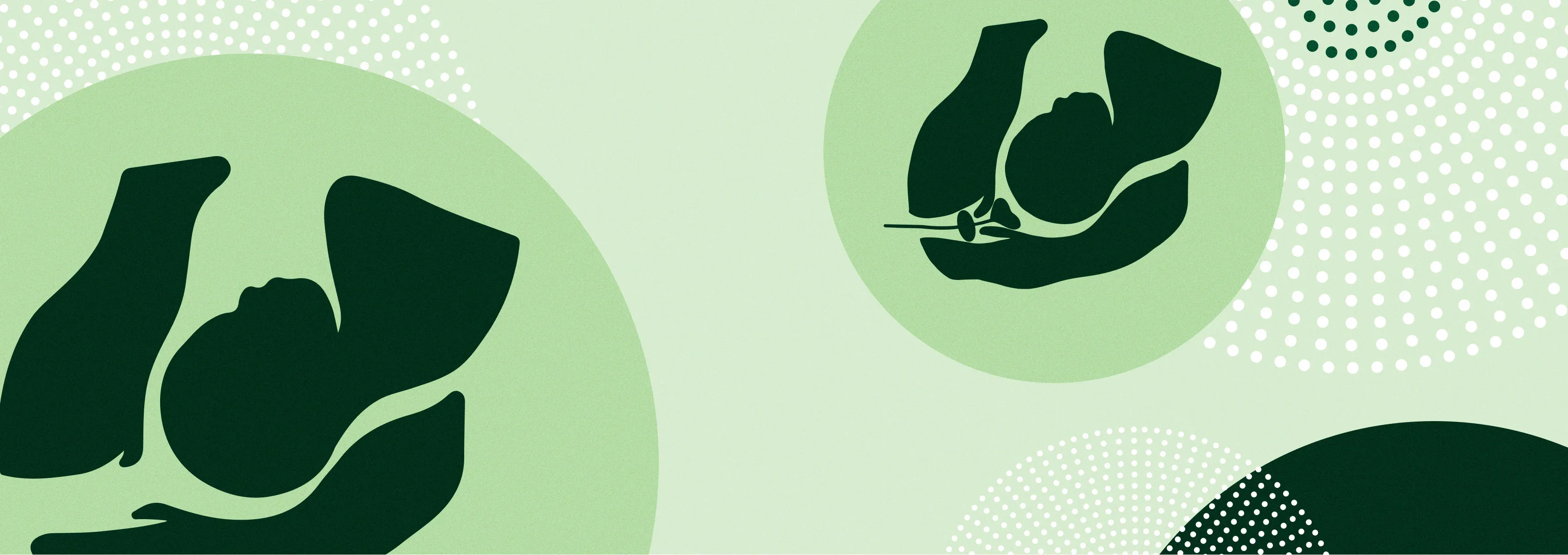
When we redesigned Partner to Decide’s digital decision aid for labor induction, we wanted to create simple, inclusive illustrations that make it easy for pregnant people to understand labor induction methods regardless of their language proficiency, educational background, or literacy level.
While intricate diagrams undeniably have their place in healthcare, we recognized that for Partner to Decide’s resources, a more straightforward approach would best serve their users.
We saw an opportunity to leverage visual design to simplify complex procedures, clarify induction processes, and embrace inclusivity. Here’s why conventional induction diagrams weren’t working, our fresh take on induction illustrations, and a peek at our process for getting there.
Typical induction diagrams: the challenges
Partner to Decide’s mission is to provide user-friendly tools and resources that make it easy for people of all backgrounds to make informed decisions about their labor. These resources often include graphics of induction methods; however, traditional diagrams (like those used in their original tool) posed several challenges.

Traditional illustrations are often:
Intricate and hard to understand
Labor induction can feel daunting, especially when the only resources available are complex, detailed diagrams filled with medical jargon.
Non-inclusive
These diagrams frequently lack representation of diverse ethnicities and languages and fail to resonate with a broader audience.
Not scalable
While effective on larger displays, intricate illustrations lose clarity and impact when scaled down for smaller formats like pamphlets and mobile screens.
The new P2D illustrations: A fresh take on visuals for labor induction
"There is nothing like this out there. Visual aids that effectively communicate labor induction methods are extremely rare. A simple and accessible library of illustrations like this is a game-changer when educating pregnant people about their options."
— Ann Peralta, Founder of Partner to Decide
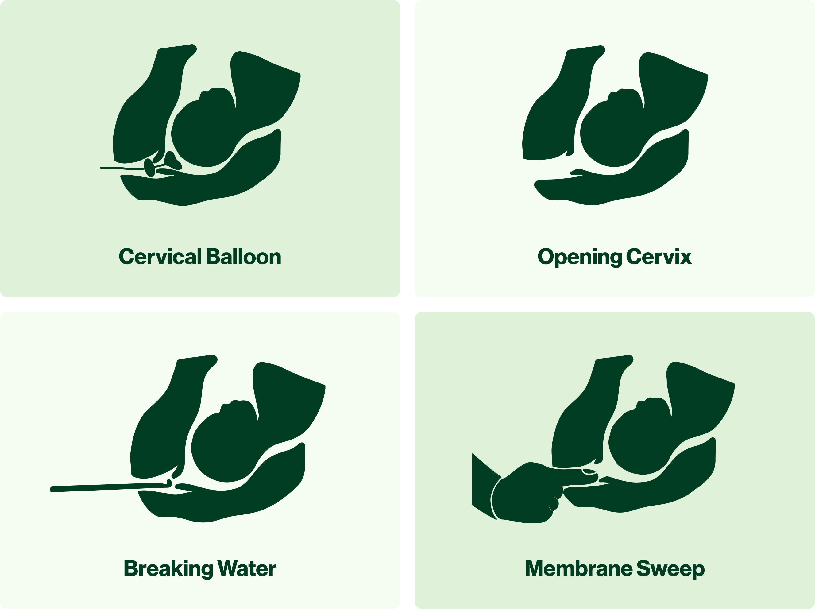
At first glance, these illustrations may seem basic. They’re accurate, but they also intentionally omit many details. This is to help users focus solely on the most essential, meaningful information about each procedure. Once the user has a high-level understanding of an induction method and forms an initial reaction, they're set up to have a more in-depth conversation with their provider.
What we love about the new illustrations:
They’re simple
By adopting a silhouette style, we show enough detail for someone to understand the general concept without getting overwhelmed by unnecessary content.
They’re scalable and clear
Designed to be comprehensible at any size, our illustrations ensure clarity whether viewed on a phone screen, desktop monitor, or large poster — no small labels or intricate graphics to fuss over!
They’re inclusive
Embracing a non-gender-conforming representation of the body in a green silhouette, our illustrations transcend cultural and linguistic boundaries.
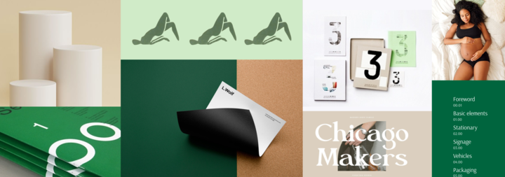
Simple, user-friendly illustrations: How we got there
Our approach to these illustrations was guided by a strategic workshop, an inspiring mood board, and precise keywords to ensure our visuals were patient-centered and on-brand.
The workshop
In the workshop, we laid the groundwork with our client to align on a shared vision for the project’s visual requirements. We knew we wanted the look and feel of our work to be rooted in clarity, empathy, and inclusivity.

The mood board
Our “Folate” mood board guided the design with its organic imagery and soft color palette.
The keywords
Using carefully curated keywords as anchors, we made sure our visuals evoked the desired emotions and aligned with Partner to Decide’s ethos.
Always consider your audience
While our illustrations serve as a starting point for more inclusive medical visuals, it’s crucial to consider the audience and context. While simplified illustrations may be ideal for some scenarios, others may warrant more intricate designs. Ultimately, it’s about gaining a deep understanding of your users and tailoring the solution to best serve them, as we did for Partner to Decide.