By Blink Staff
At their core, wireframes are an efficient, iterative communication tool. As designers, we use wireframes to work through problems and ultimately, communicate our solutions to project stakeholders and engineering teams. We want to create wireframes at the lowest level of fidelity that successfully communicate our ideas quickly, and without adding additional layers of complexity.
Wireframes can vary greatly in fidelity, from very low-fidelity paper sketches, to extremely detailed black-and-white comps and clickable prototypes. Wireframes do not have to stand on their own—they can be augmented by other types of deliverables, including mood boards, videos, visual design comps, comics, storyboards, flow diagrams, and written scenarios.
Keep in mind three key things when determining the level of fidelity of wireframes for any project:
- Intended audience
- Purpose of deliverable
- Complexity of the product
Intended audience
At Blink UX, our audience for deliverables usually includes executives, developers, usability testing participants, and our team members. Each of these groups has different needs.
- Executives need to be able to see the high-level vision and flow of the product. Prototypes (both at wireframe level and with visual design) work well for this purpose.
- Developers need to look deeply at each element and understand all the interactions and scenarios included in the design. For simple applications a prototype might be enough. For complex applications, or when the development team is remote, detailed wireframes with annotations can make it easier for developers to find the information they need. The best way to know for sure is to talk to the development team at the beginning of the project.
- Usability testing participants need to be able to see and understand the product and the vision enough to give us feedback on the design. Prototypes (both paper and digital) are good tools for this, and testing them can help discover issues with the usability and information architecture. For sites that include a lot of imagery it can also be beneficial to test with visual design.
- Team members need to be able to understand what we’re trying to convey to help us improve it – whiteboard sketches with a verbal description are usually the way to go.
Purpose of deliverable
Remember what we’re trying to communicate through the deliverable and what feedback we are looking for: If it’s early in the process and we’re looking for quick feedback on functionality, information architecture, or page flows, low-fidelity wireframes or sketches are an easy way to iterate quickly through ideas and start collaborating. Low fidelity communicates that we are still in the ideation phase and are looking for feedback that challenges our concepts. More detailed wireframes can help us get more detailed feedback on content, and exact layouts and hierarchies, as well as making sure that the content fits in place.
Complexity of the product
Depending on the complexity of the product, we need varying degrees of fidelity and different supporting deliverables.
- For marketing sites designers could begin with a sketch or medium-fidelity wireframe and augment it with a mood board. After having a clear idea on the layout and having gathered client feedback, they could move into visual design and prototyping.
- For e-commerce sites, designers can begin by sketching out their ideas, and then develop a wireframe prototype to show interactions and get a feel for the flow.
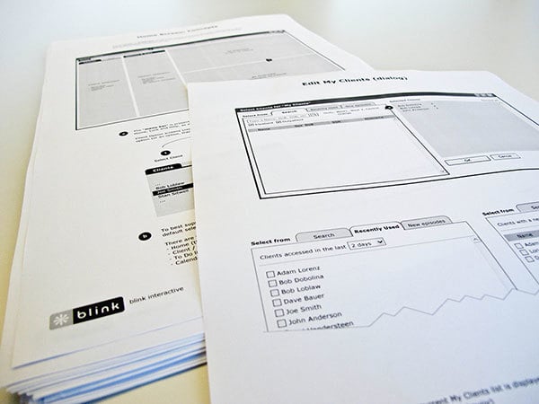
- For deep, complicated applications high-fidelity wireframes with annotations and a screen-flow can help us map not only specific interactions and screens, but also the higher-level framework and information architecture.
A user-centered design process requires a mix of deliverables with different focuses and levels of fidelity. Choosing the right combination truly depends on the audience, the message we’re trying to communicate, and the product we are working on.


