
Empowering patient-centered care amid a maternal health crisis
Designing a digital tool that helps pregnant people make informed decisions around labor induction.
Pregnancy can be a whirlwind of complex language, overwhelming decisions, and confusing provider interactions. For some, these challenges are even greater. Research shows that pregnant people who identify as Black and/or Latinx, are publicly insured, or have low literacy levels are the least likely to receive patient-centered care.
Seeing the lack of accessible resources throughout her own pregnancy, Ann Peralta founded Partner to Decide to make perinatal care an empowering experience for all. Today, the nonprofit creates equity-based resources that help pregnant people and their perinatal care providers make shared decisions on labor induction.
The new decision aid has gained notable support. Partner to Decide received funding related to the implementation of the White House Blueprint to Address the Maternal Health Crisis, and several institutions, including Boston Medical Center, Minnesota Community Care, and the University of California San Diego medical system, are set to implement the tool in 2024.
Interaction Design
User Research
UX Design
Visual Design


“
The Blink team worked closely with me to balance the needs of my various audiences. They were eager to learn, experiment with different design directions, and provide thoughtful pushback when needed. I appreciate how quickly they got on board with my vision. I couldn't be happier with how everything turned out.

Ann Peralta, Founder of Partner to Decide
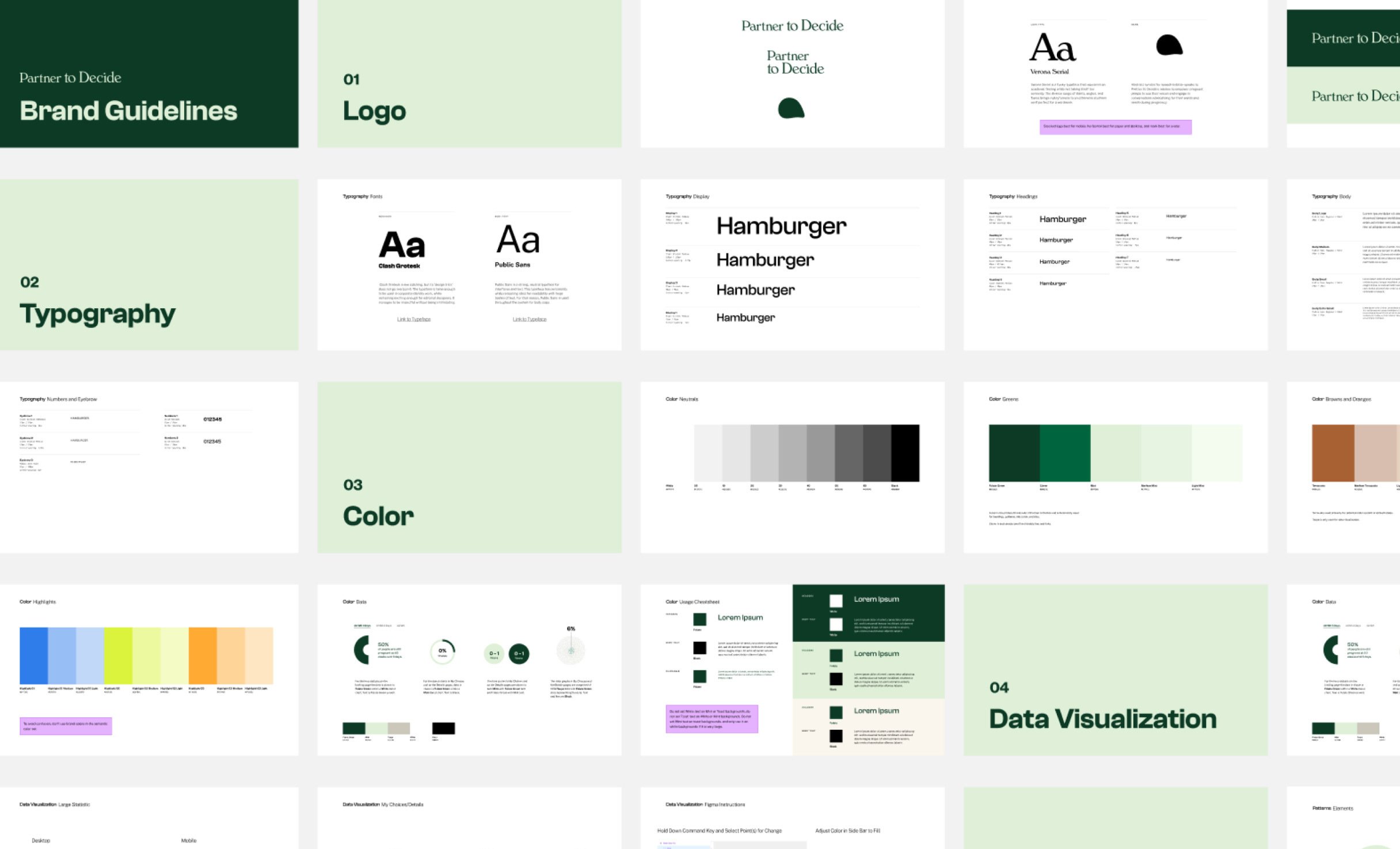
In 2022, Partner to Decide teamed up with Blink to transform its existing paper-based decision support tool into an easily accessible, digital decision aid backed by a new brand that conveys warmth and reliability.
The challenge
An unbiased place to get information
We kicked off the project by aligning on three primary goals for the new digital tool:
- Communicate unbiased information in a simple and digestible way.
- Showcase a brand that is clinical enough to be used and trusted by both patients and providers.
- Present data in a way that transforms how people traditionally explore their options for labor.
The process
Research rooted in equity
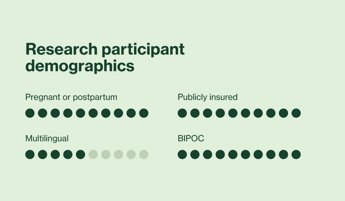
We took a human-centered approach and conducted foundational research to tap into the needs, perspectives, and challenges of pregnant people and perinatal providers. It was essential that our research participants accurately represented who we were designing for — specifically those who identify as Black, Indigenous, and people of color (BIPOC) and whose first language is not English.

“
The ten-week design sprint was incredible. It felt like a true partnership. Blink quickly created a diverse national sample, leading to incredible insights.
Ann Peralta, Founder of Partner to Decide
Signature Product Experiences
Expert Instructors
Gain valuable insights with comprehensive, modularized content created by industry experts.
What we uncovered: User insights to guide the design
Insight #1 Thorough and unbiased
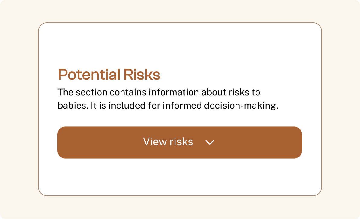
The new tools should provide in-depth information, and all options for labor should be presented equally.
What we uncovered: User insights to guide the design
Insight #2 Varied yet convenient
Information should be communicated in various formats yet be straightforward and easily digestible so users can explore content in whichever way they prefer.
What we uncovered: User insights to guide the design
Insight #3 Empowering and personalized
Pregnancy is an incredibly personal experience, so the user’s agency should be emphasized.
What we uncovered: User insights to guide the design
Insight #4 Neutral yet relatable
Relatable personal experiences are valuable, but neutral over reassuring language is preferred.
The outcome
An equitable solution that scales
The new decision aid:
- Simplifies medical information.
- Displays comparable options for labor.
- Provides a space where users can self-reflect as they prepare for provider check-ins.
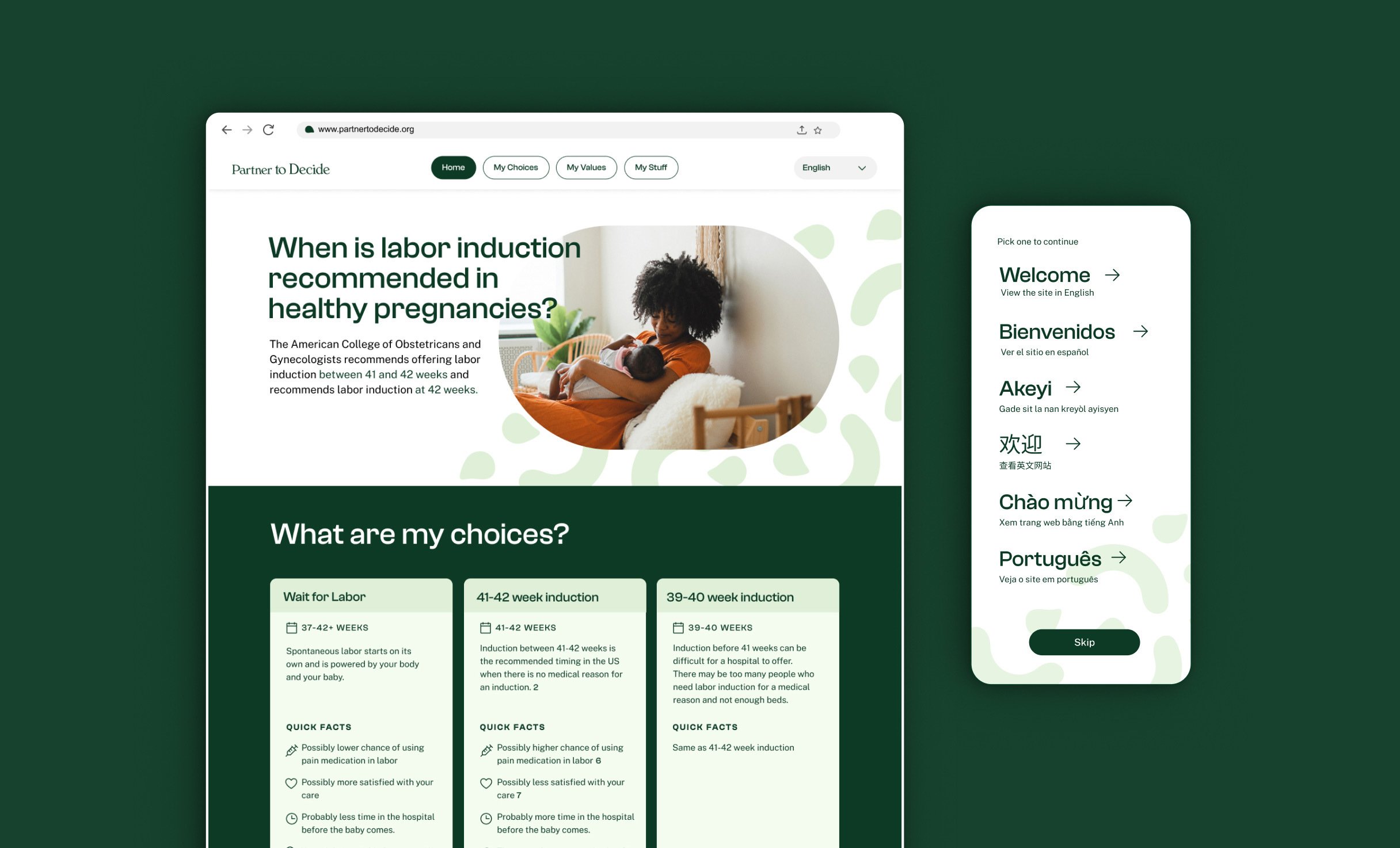
- Is available in six languages: English, Spanish, Haitian Creole, Portuguese, Simplified Chinese, and Vietnamese, with more to come.
New research-backed brand guidelines — characterized by relaxing colors, inclusive illustrations, and warm photography of real people — give Partner to Decide a visual identity that helps users feel more connected to the experience.
The tool is designed to be flexible and offers users the option to view data at a high level or to dive deeper with additional information. This way, everyone — pregnant people, doctors, midwives, doulas, friends, and family — can benefit.
Signature experiences
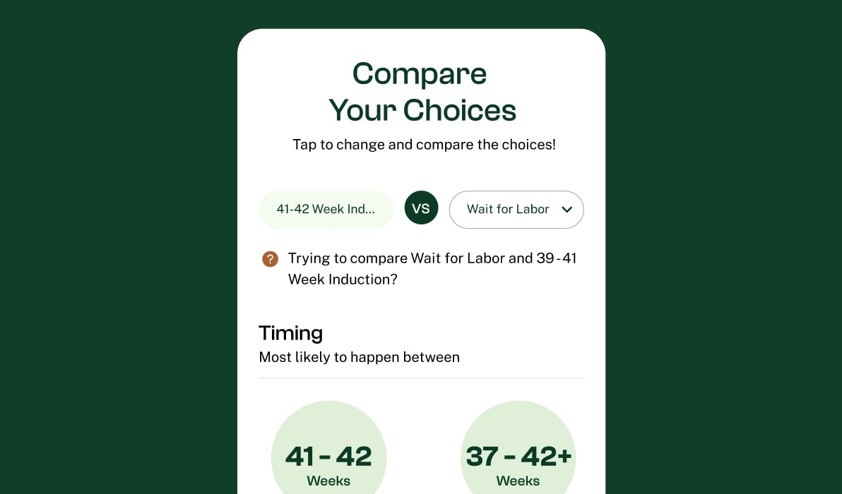
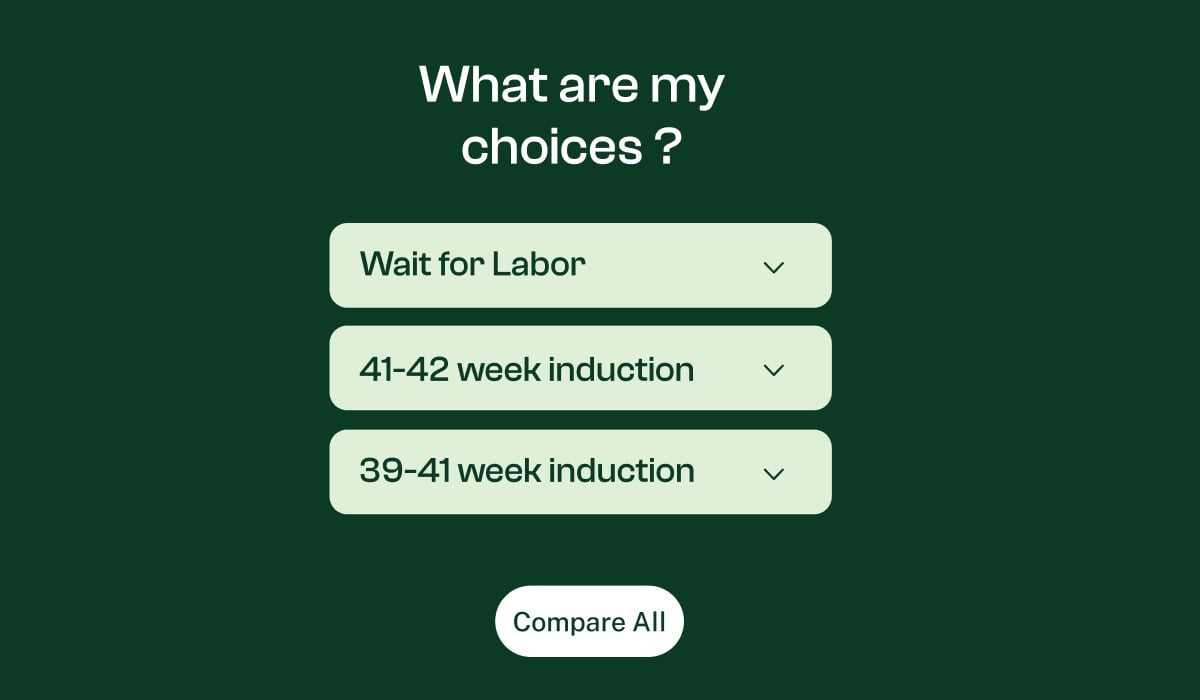
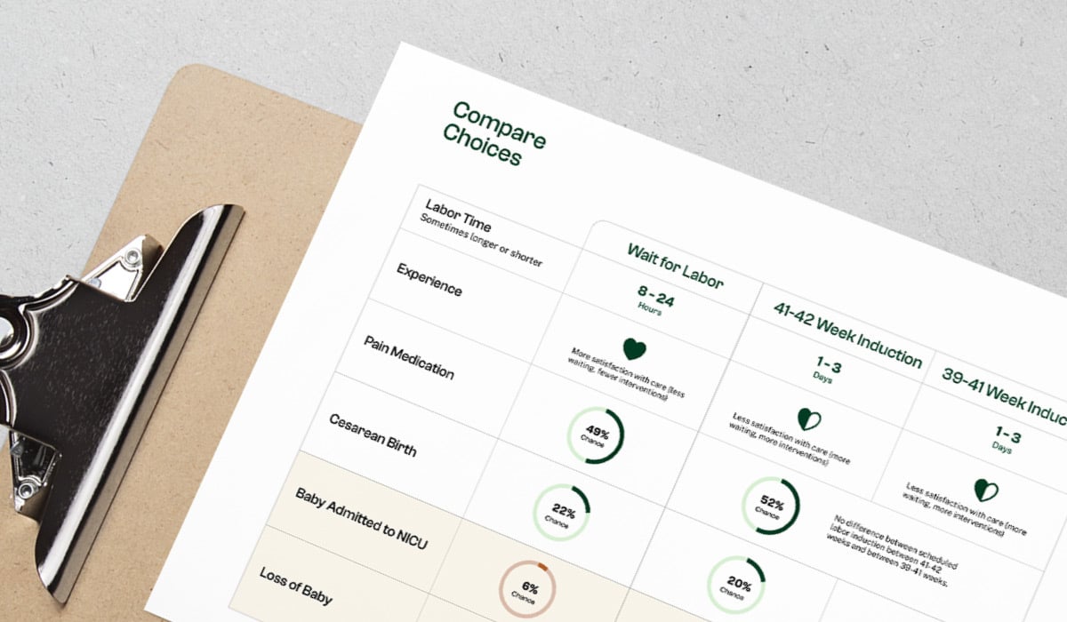
My Choices
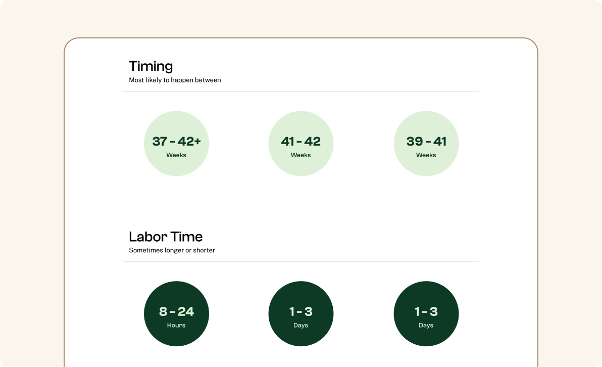
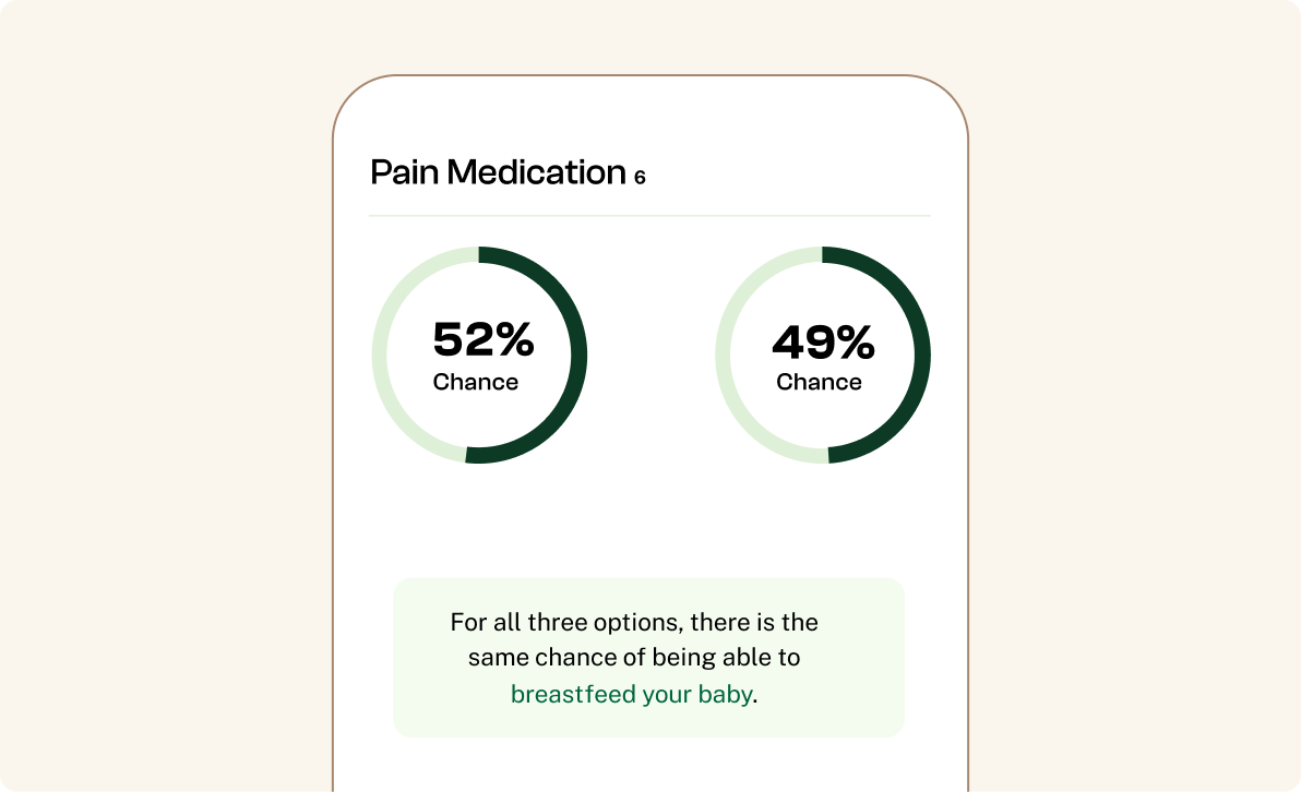
The “My Choices” feature allows patients to compare their labor options in a visual, side-by-side format that’s easy to understand with accessible reading levels. We used large visual data to highlight the differences and similarities of each option so users can consume content at a glance.
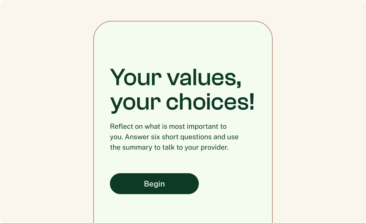
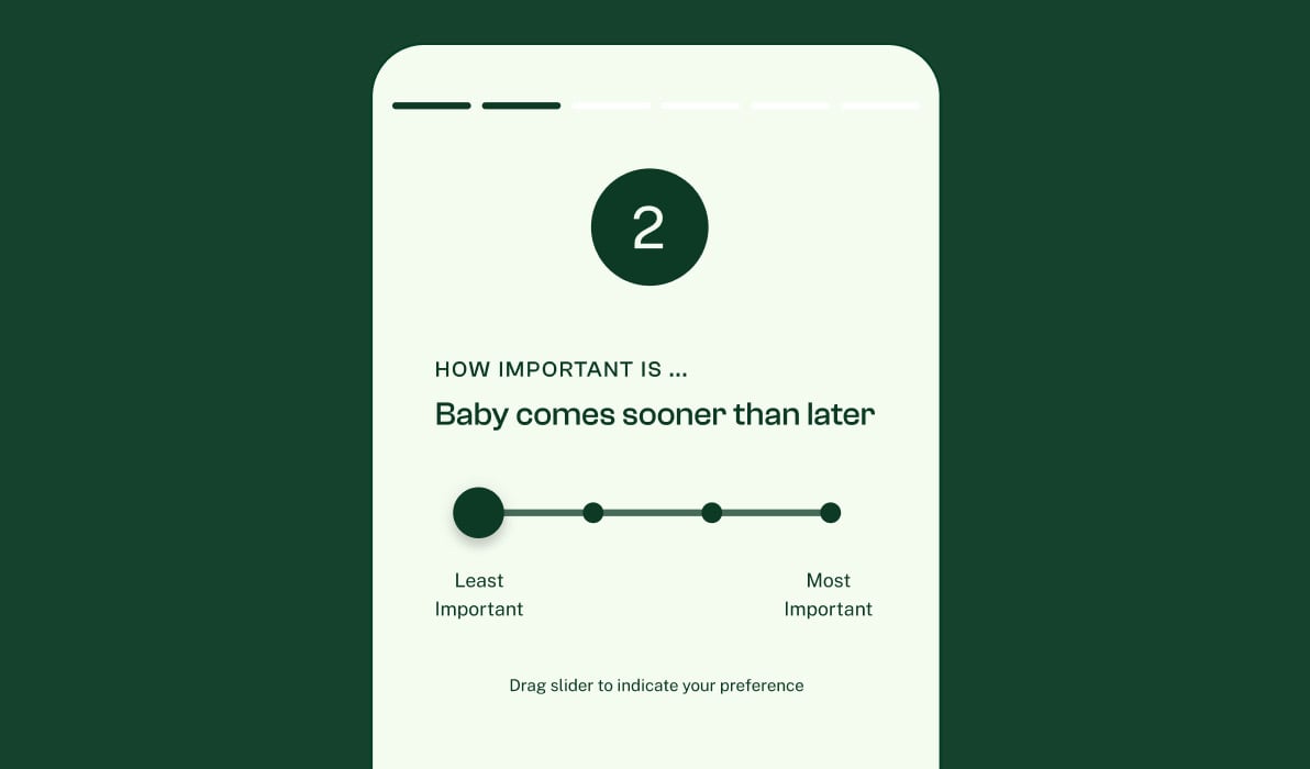
My Values
The “My Values” activity allows users to better understand what matters most to them when it comes to labor. Guiding users through a values-based survey helps them organize their thoughts and determine which labor options resonate most based on their personal preferences.
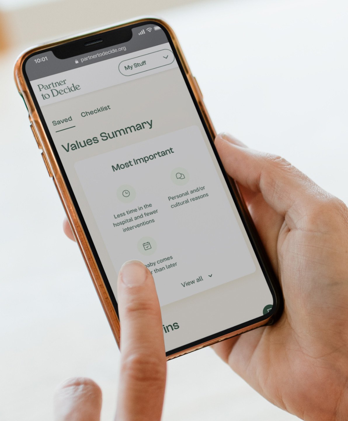
My Stuff
The “My Stuff” feature is a one-stop hub for user notes, personalized checklists, and survey results. It’s easily accessible for quick reference whenever the user needs it most, whether at an appointment or sharing with friends and family.

“
It's like the creators of the tool are more sympathetic to my feelings about the risks.

Blink research participant


The impact
Connecting with patients and providers nationwide
Backed by a design-led approach, Partner to Decide secured funding related to implementing the White House Maternal Health Blueprint and launched its digital decision aid in December 2023.
The tool quickly gained attention from providers across the country, setting a new standard for patient-centered perinatal care. Among its early adopters, Minnesota Community Care integrated the digital aid into its services with the Boston Medical Center and the University of California San Diego’s medical system close behind.
Now pregnant people can confidently navigate their journey and make informed decisions aligned with what they value most.
“
I hope this project raises the standard for patient resources. People deserve better tools. They can be beautiful and interesting while also being informative and evidence-based.
Ann Peralta, Founder of Partner to Decide
Have a big idea in mind? Let’s discuss how we can work together.

Blink Teams
- Design
- Ben Shown
- Megan Greco
- Jill Hannay
- Sunny Cheng
- Lilly Murphy
- Leadership
- Ben Shown
- PM
- Kate Pollash
- Research
- Katie Xu
- Sylvain Durst