Evolving the Experience of Digital Healthcare
Blink partners with a leading managed care provider to reimagine the digital healthcare experience in a way that empowers and retains members.
Envisioning
Digital Transformation
Product Design
Rapid Prototyping
User Research
UX Strategy
Web Design
Wellness
Insurance

The challenge
Optimizing member touchpoints
Our healthcare client came to us with high ratings for healthcare quality but low ratings for digital experience. Recognizing the need for improvement, they initiated their digital transformation with a clear goal in mind: create an entirely new digital healthcare experience that puts the patient in charge and helps retain and attract new members.
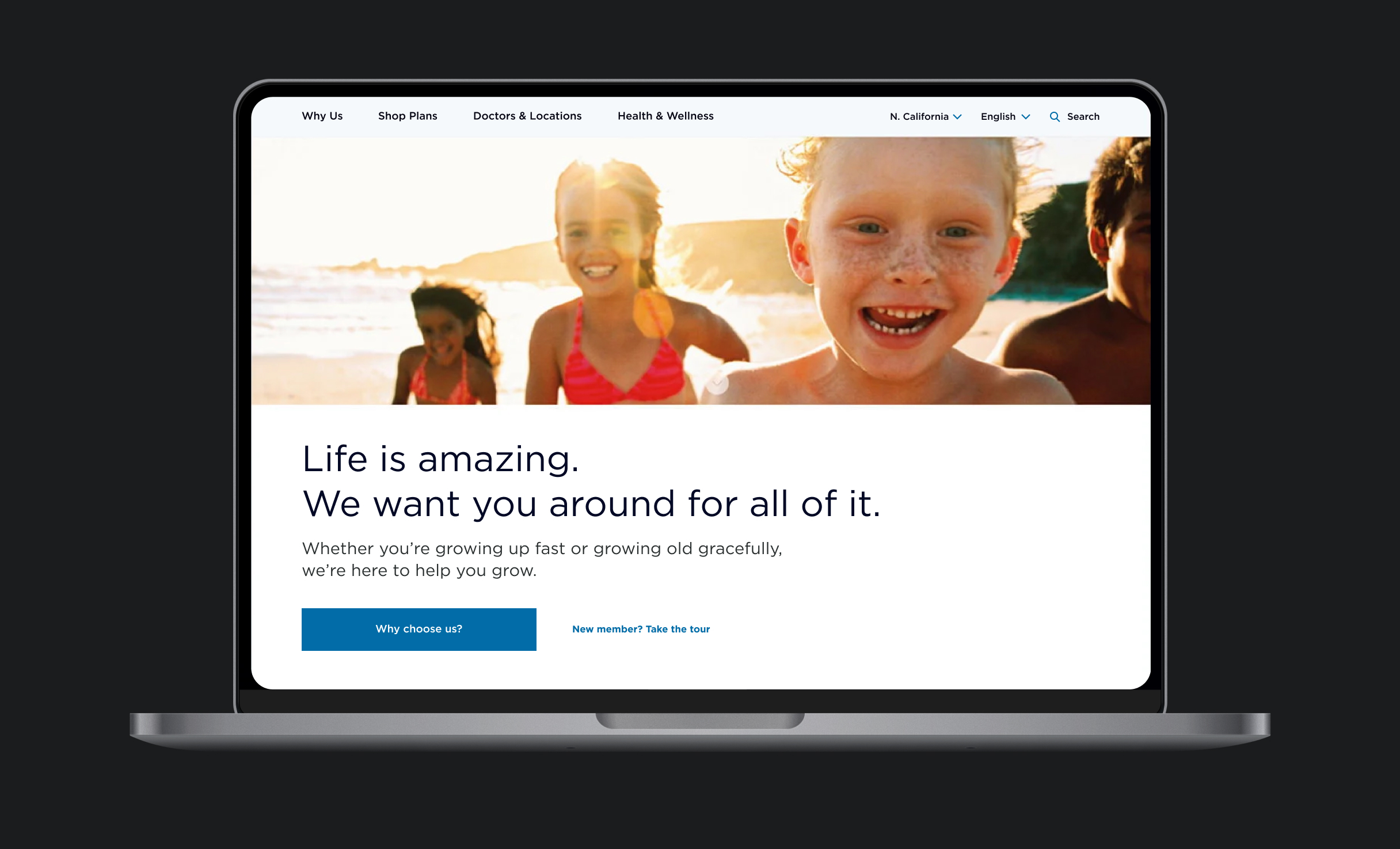
They asked us to rethink their members’ digital touchpoints, from the way members find and enroll in plans to the way they communicate with their doctors and manage their health and wellness.
About the client
hospitals
employees
members
“
It was such an honor to work with a progressive healthcare organization dedicated to helping patients take control of their health, from the basics of finding a doctor to managing prescriptions, whether at home, in the exam room, or anywhere between.

Scott Lambridis, VP of Design at Blink UX
Our process
Researching member needs
Blink researchers talked to hundreds of members to understand what they want in a digital care platform. We found that people are looking for a personalized, simple, and user-friendly experience with tools that empower them to independently manage their care.
Recognizing the diverse needs of older adults, young individuals, healthy and sick people, and families, we knew a one-size-fits-all solution wouldn’t meet the unique needs of every member. That’s why we created a flexible, inclusive experience that works for all patient types.
The solution
A personalized experience
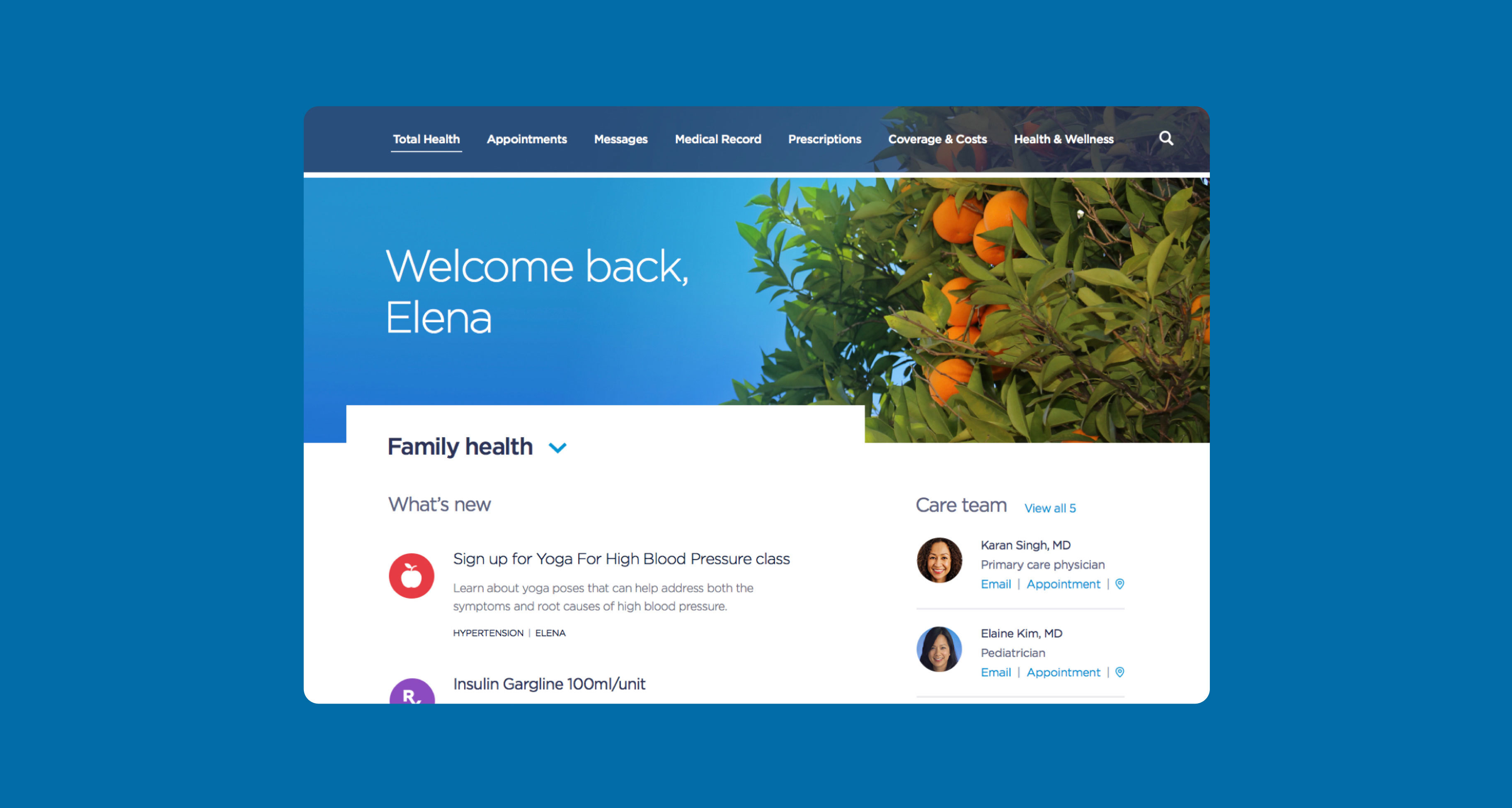
The new design introduces The Health Feed, a personalized feature on the platform's homepage. It compiles vital information like prescription refills, doctor messages, and lab results to offer a tailored solution for all.
Simple interactions
Members craved simplicity when it came to healthcare. We spent time thinking about how to write a clearer medical bill. We used simple language and complemented the text with infographics, making it easier for members to understand what they were paying for.
Tools that empower
Empowering members means giving them essential information and practical tools to make informed decisions. The new Action Areas tool elevates key patient actions — like prescription refills and doctor communication — to the top of the patient’s homepage.
The exam room of the future
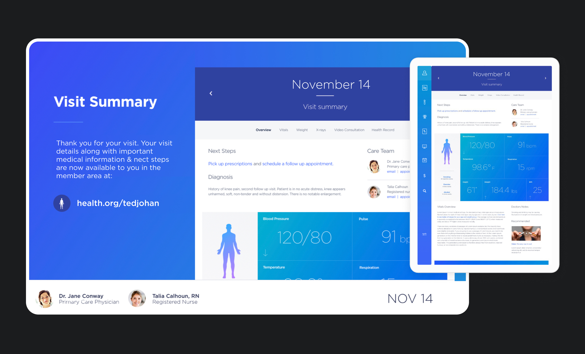
Much of our work focused on solving today’s problems, but we also got to plan for the exam room of the future. We developed interfaces that work with tablet applications and big screens to help doctors better communicate with patients.
For example, as your doctor takes your vitals, they would be able to share that info with you in real time on a big screen and explain what it means. It’s another great example of putting the patient in charge.

The impact
Healthcare at your fingertips
This new digital healthcare experience is patient-driven and mobile-first, so members feel empowered throughout their healthcare journey and have access to their healthcare anytime, anywhere.
Create valuable experiences for your users. Contact us!
Your personal client relations team


