


UX motion is now a core product competency
As someone who talks about UX motion design a lot, I’ve noticed that my audience usually falls into three camps:
- The hype squad: This group lights up at every swoosh, slide, and micro‑moment because they know motion brings products to life
- The overwhelmed skeptics: The people who tense up thinking about how to build, scale, and maintain motion across an entire product
- The parsley brigade: The folks who treat UX motion like decorative garnish, an option to sprinkle on at the end
The last group, the “motion as garnish” crowd, is the majority by far. But motion design is not optional. It's a crucial UX layer that product makers often overlook at their peril.
Your product already contains motion
Let’s retire the “motion is optional” myth. Every product has motion. If you do not design it, the defaults will.
Leave it to chance and you inherit mismatched durations, abrupt transitions, and timing improvised by whoever shipped first. Those one‑off choices accumulate. You end up with a “motion system” with no system and frictions users cannot name but definitely feel
If you design motion with intention, however, it pulls real weight. It guides attention, preserves context, supports orientation, and reinforces the brand experience. Users notice the difference. Accidental motion is noise. Intentional motion is clarity and character.
Motion also strengthens accessibility. Used thoughtfully, it reinforces spatial cues, supports comprehension, and reduces cognitive load. When less movement is needed, well‑built systems honor user preferences with predictable choreography and full support for reduced‑motion settings. Good motion is expressive, but it’s also inclusive.
Sophisticated motion design is now a pillar of modern UX
We experience the power of great UX motion every day, even if we don’t consciously register it. It’s the way Apple’s Dynamic Island expands like a living thing, how Airbnb glides you from search to stay, or how Duolingo’s cheeky animations give tiny dopamine boosts. Even your operating system is quietly animating dozens of micro‑moments every minute.
This is the standard now. UX motion is simply part of sophisticated UX. It’s what we hear from product teams that come to us for help with shaping motion systems. Category leaders like The New York Times, Amazon Books, Dell, and NASA understand that UX motion design isn’t polish or decoration: It’s a working layer of UX that's crucial to their products.
The six core responsibilities of UX motion

How we use the UX Motion Pyramid to steer our design choices
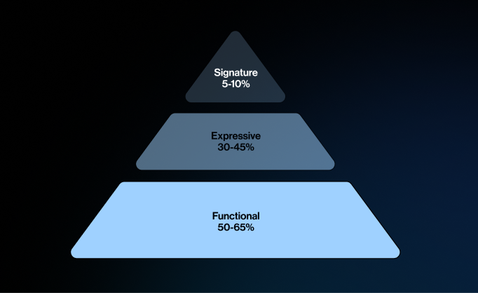
The UX Motion Pyramid has three tiers: Functional, Expressive, and Signature.
We treat the tiers like a recipe. You want plenty of Functional, a satisfying amount of Expressive, and a small but intentional hit of Signature. Overdo any layer and things fall apart. Go too far in either direction and you could end up with pure function that has zero soul, or endless flourish that’s delightful at first and exhausting long-term. The UX Motion Pyramid keeps the mix right‑sized.
Understanding UX motion begins with recognizing the jobs it does within UX beyond aesthetics. It’s not decoration; it’s structure. Here are the six core responsibilities motion plays in every product
- Utility: Confirms actions and system changes
- Attention: Directs focus to what matters
- Wayfinding: Maintains orientation between states
- Spatiality: Shows depth and reinforces spatial awareness
- Flow: Smooths transitions into a seamless journey
- Emotion: Adds personality and brand feel
Understanding UX motion’s responsibilities is a solid starting point, but how should we prioritize them? Without a framework, it’s easy to over-emphasize one role and neglect others—which is why we use a mental model called the UX Motion Pyramid.
Tier 1: Functional UX Motion
Purpose: The backbone of a smooth experience.
What it does: Stays quick and minimal to keep users oriented as they move through tasks—confirming actions, preserving context, and maintaining a responsive feel.

Why it matters: Without strong functional motion, everyday interactions feel sluggish or chaotic when repeated dozens of times a day.
Best for: Utility and attention, where clarity, confidence, and speed are the goal.

Tier 2: Expressive UX Motion
Purpose: The layer that adds warmth and refinement.
What it does: Uses nuanced easing, choreography, and transitions to make interactions feel intentional and human—without slowing anything down.

Why it matters: Remove expressive motion and a product feels sterile; add it thoughtfully and routine interactions gain subtle polish that users feel.
Best for: Wayfinding, spatiality, attention, and flow—moments where motion guides, clarifies, and adds character.
Tier 3: Signature UX Motion
Purpose: The high‑impact brand layer.
What it does: Creates bold, memorable moments—onboarding, celebrations, branded transitions—that articulate what makes the product one-of-a-kind.

Why it matters: Signature motion is what sticks. Used sparingly and with purpose, it’s the difference between functional and unforgettable.
Best for: Emotion first, with supporting roles for thoughtfully crafted moments of flow.
The formula of the UX Motion Pyramid is like a recipe worth perfecting. Functional motion is the foundation: fast, reliable, repeatable. Expressive motion adds flavor and warmth. Signature motion is the finishing note you remember. When these ingredients are measured and mixed with intent, they transform everyday interactions into experiences people love and remember.
Our job is to turn this formula into a system that can actually scale, with principles that guide, tokens that travel, choreography that respects accessibility, and delivery that lands cleanly in code. The result is clarity, confidence, and impact, from better completion rates and stronger loyalty to a brand that feels alive in every touchpoint.
The Functional–Expressive–Signature pyramid enables us to place motion at the right altitude so everyday moments stay smooth, the right places feel alive, and the rare highs become unforgettable.
Motion that looks good is easy. Motion that looks good, magnifies impact, and delivers breakthrough experiences is the bar you need to shoot for.
Christian Stewart is a Principal Designer in Blink’s Seattle studio. He's our resident motion instigator who transforms static ideas into crisp prototypes and purposeful motion that unlock design breakthroughs. He has brought his expertise to The New York Times, Amazon Books, Google Shopping, Qualcomm, Microsoft, and more. He is a vocal Rive evangelist promoting smarter, scalable motion across UX. You can find him on LinkedIn sharing the latest in motion craft and modern design.