


By
Tristan Plank
Onboarding is a human resources term that we in the UX field have borrowed as a label for the process of getting someone “up and running” with your site, app, or service. The onboarding process is a critical step in setting your users up for success with your product, but there are a number of considerations and hard decisions to be made when you are designing your onboarding to define how best to get your users familiar with your product and its value. What follows are a few general tips we have found to be key for setting your onboarding up for success.
1. Avoid long up-front tutorials and screen-by-screen walkthroughs
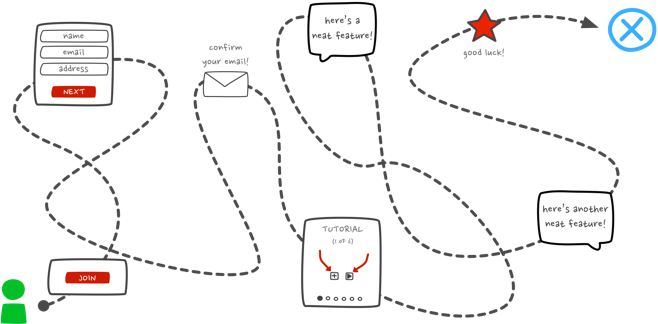
We all know that feeling: You just started with a new service or app and you want to start exploring. You want to use it! So you get ready to check it out and… ah. A swipe-through tutorial. Is this what you really want to be doing – swiping or clicking through seven or eight screens, reading what you can do, how to do it, and memorizing every action, button, and icon? Does this effectively demonstrate the value of the product?
I would bet that when presented with a series of screens that must be swiped through before actually using an app or web service, most of us barely pay attention or simply ignore the content (we have actually seen users do exactly this in various usability studies here at Blink). Swipe, swipe, swipe, swipe, swipe. Ah finally, here is the app I downloaded.
A number of problems exist with these long swipe-through tutorial / value proposition tours that we see in many apps. The first problem, which I have already hinted at, is the way in which these swipe-through screens immediately inject a barrier between new users and your site or app. Want to start using this? Nope, here are some screens you need to look at first. What a momentum killer!
Another, more usability-focused problem I see with these up-front tutorials is that they present screen shots from various parts of the site or app with coach marks and instruction overlays, expecting users to remember every available function before they have even seen the app or site. This is asking a lot, and it shows a pretty serious lack of empathy for our users.
One additional issue with front-loaded screen-by-screen walkthroughs and tutorials is they make the mistake of explaining the value of the product rather than demonstrating the value. Users want to know that what you are offering is worth their time, and wasting precious seconds forcing them to swipe or click-through screens is not going to give the best impression of the value you are offering.
2. Make onboarding contextual and progressive
A contextual, just-in-time onboarding approach is a good way to avoid those pesky information-loaded screen-by-screen tutorials. Rather than asking your users to remember everything up-front, why not provide guidance as they go? Surfacing helpful information at the point of action is always going to be more effective than a firehose-worth of instructions and explanations at the beginning. By implementing a more contextual approach to onboarding, you reduce the friction on a user’s journey through your site or app, and you ask for less up-front commitment (reduced friction + less up-front commitment = onboarding bonus points!).
Contextual onboarding also gives you the freedom to make the onboarding process more interactive because the guidance you offer is specific to the user’s current point in the journey using your product. For instance, project and task management app Trello starts you out with a “Welcome Board” that includes pre-populated to-do list items, with each item explaining a different interaction or feature within the app. In a nutshell, Trello uses the interface to teach you and encourages you to explore and try out these interactions in the context of where you will use them in the future. This approach allows users to learn features much more effectively than a static screen with a bunch of instructions that users must memorize for later.
Another benefit of contextual assistance is that it allows for a more progressive approach to guiding users as they branch out and learn to use more features or functions. Useful information about more advanced or deeper features can be presented as users encounter them, whether it’s the first day of use or three weeks later. If you had presented the same information in a screen-by-screen tutorial up front, how many users are likely to remember it weeks later when they finally are ready to use the feature you were referencing?
A contextual onboarding strategy also gives you the benefit of scalability. As you mature your site or app and add or update features, you can present changes and feature updates contextually the next time a user encounters that feature or function, rather than forcing your users through yet another set of explanation screens when each new feature is added or every time a substantial design update is released.
3. Maximize empty states
Content is what provides value for most apps and websites. Whether it’s a social feed, news updates, a to-do list, or something more technical like a dashboard of assets, it’s why people are there — for the content! This is why it’s critical to consider how we treat empty states, those scary places in the experience where a user might not have content yet.
Maybe a user hasn’t added friends or followed anyone yet, or maybe it’s a system that requires some user input data for content generation. These “blank slate” experiences are a key point in a user’s journey through your site or app and are a great onboarding opportunity to start demonstrating the value of your product. Empty states are also a very natural point to inject some onboarding to continue guiding users along. Have an empty dashboard because there isn’t any data to present? Demonstrate the potential value by giving users an idea of what they will get once they get started, and provide an obvious way to move forward to that next step!
The absolute worst thing you can do with an empty state is to drop your users into a dead-end. Consider the difference between the following two examples from MailChimp’s dashboard. The first image is MailChimp’s current dashboard when you first sign up, a useful and smartly crafted empty state that reduces friction by guiding users along to actions that will get them started. The second image presents a “hacked” version of the same dashboard that I created to demonstrate an ineffective empty state that provides no guidance, no examples – just a plain ol’ dead end. Which would you find more helpful and engaging?
Dig in deeper
One of my favorite resources for exploring existing onboarding experiences and reading detailed breakdowns is https://www.useronboard.com/, created by UX designer Samuel Hick. Hick has also authored a handy e-book titled The Elements of User Onboarding, which we at Blink have found valuable for communicating the value of a well-designed onboarding process to our clients. You can also see breakdowns of the onboarding in many popular apps at https://uxarchive.com/appFlowName/Onboarding/1.
Crafting a focused, fluid, and successful onboarding process takes a lot of work and strategic thinking about your users and how you believe to best set them up for success using your product. While these tips are a good start, they are really only the tip of the iceberg, and I encourage you to dig deeper into the world of onboarding and explore the wide variety of resources and examples out there.
Tristan is a proud member of the interaction design crew at Blink. In his off time he can be found sipping a cortado at Caffé Fiore in Queen Anne or taste-testing local IPAs in Fremont & Ballard.