By
McKayl Barrows
Every day, we face thousands of decisions, and as many as 220 of those are on food alone, says one study from Cornell University. From what we wear to what we eat, three things impact our decisions: our environment, how we feel, and how the choice is presented.
This idea that our surroundings influence our decisions is the foundation of behavioral science and the nudge theory. In their 2008 book Nudge: Improving Decisions About Health, Wealth, and Happiness, behavioral economist Richard Thaler and legal scholar Cass Sunstein coined the term “nudge” as a minor design feature that influences our decision-making process in predictable ways.
Think back to the last time you visited a coffee shop, for example. When paying for your drink, you might have noticed a default tip option prompting you to add $1, $2, or $5 to your order. These predetermined tip options are one example of a nudge. The default selections nudge you to give the employee a few extra dollars, and often, it works.
To classify as a nudge, the design feature must be subtle, low-cost, and easy for a person to decline. So, for example, instead of using mandates or restricting a person’s freedom of choice to influence decisions, we can use nudges to gently point a user in the right direction.
As UX strategists, we use nudges in our designs every day to help people make better decisions quickly and seamlessly — typically without their noticing.
Nudges are all around us
In a 2018 episode of Charles Schwab’s Choiceology podcast, behavioral design expert Sille Krukow points to US road design as a popular example of nudging. If the US road system is the choice architecture, the civil engineer is the choice architect, and the features of our road system — such as the road lines, stoplights, and speed limit signs — are the nudges.
The white lines on the road nudge us to stay in one lane, and traffic lights encourage us to stop for oncoming traffic. But, of course, as is the case with any nudge, we aren’t bound to these influential features and can choose to ignore them.
Nudges can be digital, too
Nudging is a part of every user interface and digital design — not just physical environments.
Authors Christoph Schneider, Markus Weinmann, and Jan vom Brocke define a digital nudge “as the use of user-interface design elements to guide people’s behavior in digital choice environments.”
Let’s take a look at a few examples:
1. Default messages of encouragement

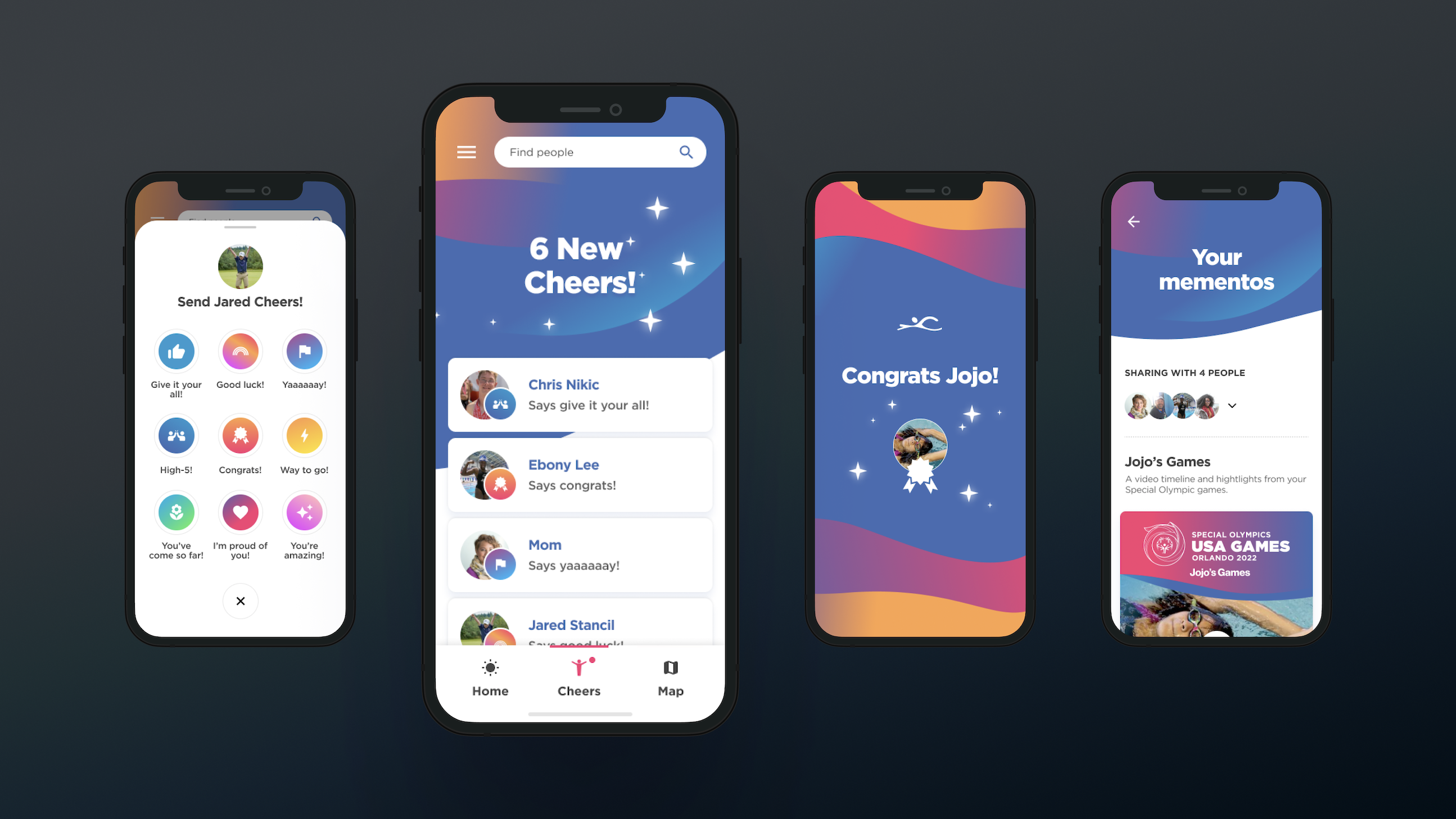
Athletes can easily send messages to their friends with Blink’s new design for the Special Olympics USA Games 2022 mobile app.
In our recent work for the Special Olympics USA Games 2022 mobile app, we used nudges to encourage athletes and family members to send motivating messages to each other throughout the Games. Prewritten, default messages such as “Give it your all,” “Good luck,” and “High-5” provide an easy way for users to send a message without a second thought.
Without these default messages, the athletes may be less likely to send messages to their friends and fellow athletes. Like the coffee shop tipping example above, using default options is a low-cost, non-invasive way to influence human behavior.
Another well-known example of a default nudge is the opt-in versus opt-out organ donation system. One study found that countries with an opt-out system — in which people are automatically enrolled in organ donation and must actively opt out if they choose — have more organ transplants per country. By making organ donation the default choice, more people remain a part of the program.
2. Reminders to exercise

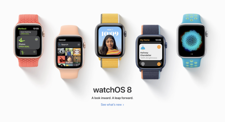
If you’ve ever worn a smartwatch, you’ve likely experienced a nudge. Smartwatches nudge people to move by deploying notifications when a person has been inactive for a set amount of time. Oven timers, stoplights, and the gas light on your car are all examples of nudges that remind you to take action in your best interest.
3. Automated passwords for better protection

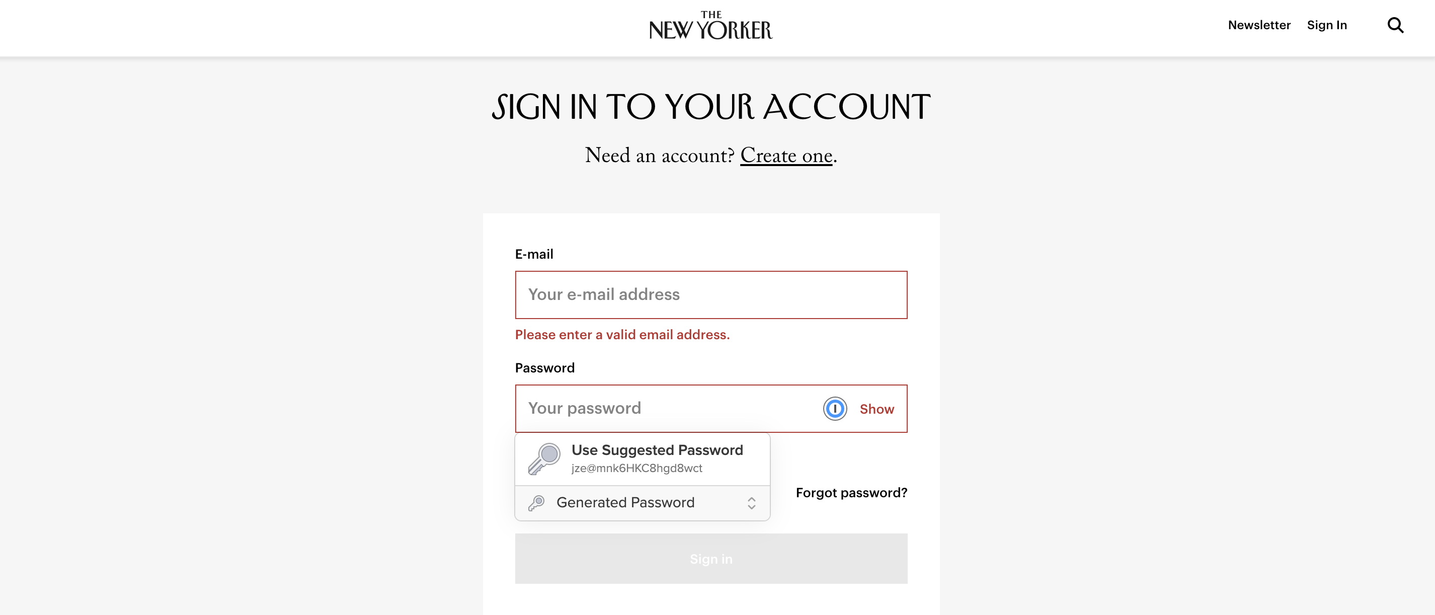
When users create a new password for an account, platforms such as 1Password, LastPass, and even Google suggest a strong password. This suggestion prompts people to use strong passwords that ultimately make their login credentials more secure.
Why are nudges so effective?
We can understand why nudges are effective by looking at the human brain. As people, we have two modes of thinking: System 1 and System 2. When we make quick, automatic decisions with minimal effort, such as kicking a soccer ball, we use System 1 thinking. This type of thinking typically uses heuristics, biases, and intuition to inform a decision. Alternatively, we use System 2 thinking when making slow, methodical decisions based on logic, such as applying for a job.
Nudges work because they appeal to the automatic, subconscious System 1 thinking. According to Krukow, “nudges make the right choice the easy one.”
Is it ethical to nudge customers?
When used appropriately, nudges help people. Nudging customers in design can be excellent for lightening the cognitive load and guiding people to make choices in their best interest. Helpful nudges remind us about upcoming meetings, encourage us to exercise, and support our communities and health care system by making organ donation a default option. Unfortunately, people can misuse these same tactics to influence people to make harmful decisions that benefit only the provider. Thaler and Sunstein call this misuse a “sludge.”
Therefore, designers can help people by creating designs with intention and presenting choices to promote positive change.
Using design for good
When we create designs that prioritize people and their well-being, we can create long-term positive behavior change. Nudging is just one small way designers can influence human behavior to produce a positive, beneficial outcome.


