By
Roxane Neal
Simple user-centered design (UCD) Methods for internal IT teams
Enterprise companies continue to face employee expectations to conduct work from mobile devices — personal and company-issued. Many enterprise applications have mobile apps to support their needs: Salesforce, Dynamics, Concur, K2, and Workday have examples. However, what if you’re a company’s internal technology team and have created custom line-of-business (LOB) applications for your employees? You may have developed internal apps in the past but now need to extend that functionality to mobile devices.
If you—a business analyst, solutions architect, IT project manager—have limited UX resources or experience but need to design a mobile experience for your internal applications, we’re here to help with nine handy tips.
1. Clarify the problem to be solved, don’t just create a mobile version
Adopt the mindset as you embark on this project that you are building an app to solve a problem, not just to build a mobile version of the app. Ultimately you are defining when, why, and how a mobile app will benefit the user. User research on user goals, pains, and shifting contexts clarifies the specific problems the mobile app can or should solve.
2. Play to your strength: Easy access to your customers
Internal technology groups have some of the easiest access to their users: you simply need to ask your fellow employees for their time. Use this availability to get user input at multiple stages of design and development. Iterative or sprint-based UX methods are particularly well-suited to internal application development.
3. Identify performance measures the tie back to business goals
User research can help you identify whether business goals are being met. When objectives are defined for the mobile app, plan ways to measure how well the app is meeting those objectives. For example, is the goal to reduce the users’ time on certain tasks? Or to help employees to complete an end-to-end business workflow within a certain time frame? Consider measuring the time required in the desktop app (assuming it is preforming well) and using that as a baseline for the mobile app.
4. Remote user research is better than no user research
If you aren’t able to observe users directly, conduct remote interviews via web conference to understand users’ key tasks and mobile usage scenarios.
For example:
- In what tasks do they switch contexts over the course of their day, such as when they are away from their desk, traveling, or at home?
- What difficulties have they experienced by not having access to the desktop app from their phone or tablet?
- What tasks did they want to perform?
- Why was it burdensome to use a laptop or desktop in this scenario?
5. Try a simplified “diary study” for mobile context
Because it might be hard for users to remember all the difficulties they experienced during an interview, consider a lightweight diary study that might better capture their needs in mobile settings.
In a diary study, users keep a record of product- or topic-related activities over a specific time frame. This method requires more engagement from users than an interview, but it can be better at capturing real-life scenarios. In formal diary studies, entries may include text descriptions, photos, screenshots, audio, and/or video.
To suit the limited resources of an internal tech team, a diary study can be executed fairly simply. For example, if you can get users to participate for three to five days, you could email them once or twice per day with some short questions (three max). Don’t go overboard: you don’t want to ask any more questions than you’ll want to analyze.
Example questions:
- In the past six hours, what tasks in [the desktop app] did you need to do when you were away from your computer?
- Where were you?
- On a 7-point scale, with 7 being extremely problematic, rate how problematic the lack of mobile access was.
Follow up the diary study with interviews to understand more about participants’ needs.
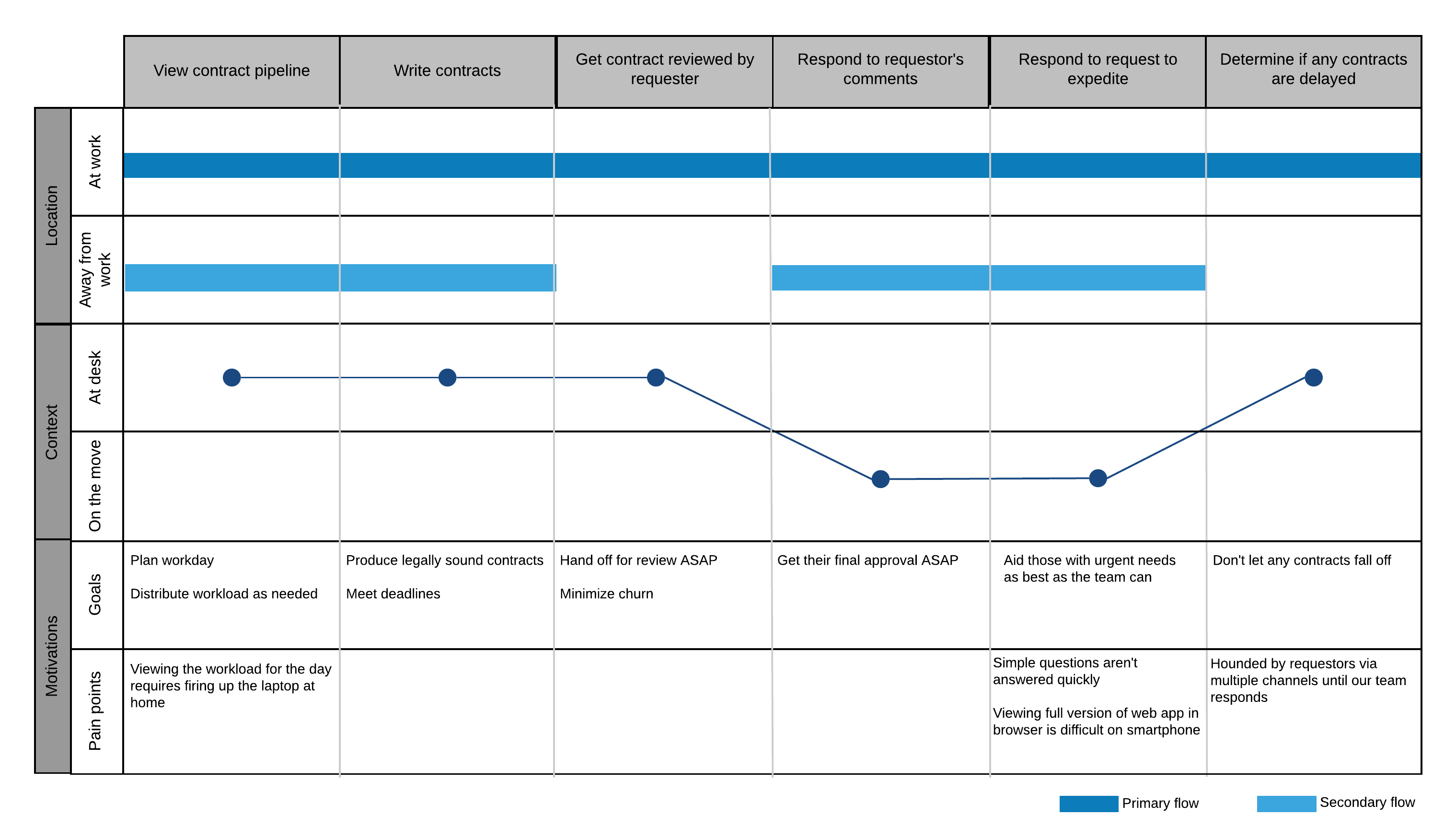
6. Quick swim lane diagrams work in lieu of rich but time-consuming UX journey maps
In our user research, our designers often make beautiful journey maps, also known as experience maps, to model task flows, changing contexts, pain points, and opportunities. However, if you don’t have the time or design skills, a swim lane diagram—a business analyst’s classic method—is also helpful in conveying the tasks, needs, and varying contexts. Viewing the mobile needs in a lane of its own could communicate the subset of tasks to prioritize for mobile capabilities. Swim lane diagrams could easily be annotated to describe constraints (e.g., other data systems the workflow requires, involvement of other user profiles) or opportunities (how a mobile version will benefit the employee or the company).

7. Get feedback early and often, even with low fidelity sketches of concepts
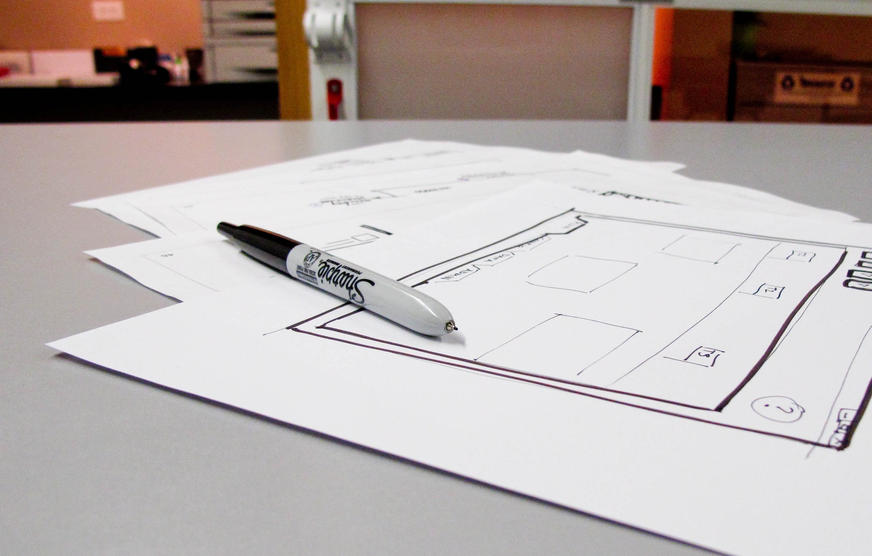
In our process we design iteratively, starting with low fidelity and progressing to high fidelity, getting user feedback along the way. It’s OK to put rough sketches in front of end users, even for an app in the professional context. Go one step further and create sketches together—the app users are the experts in their processes. The point is to get feedback quickly on the concept and to test your assumptions, not the visual design, which will come later.

8. Test mobile apps, even remotely, without a huge investment in equipment
Once you have a prototype or working code of your mobile app, observe your users interacting with it. If you are in the same location as your study participants, you have a few options for capturing observations: aim a web camera at the participants’ phone to record the session or simply watch over their shoulder. (Here are some tips for in-lab mobile UX testing.)
If you want to observe remote employees use the mobile app, read this primer on remote mobile usability testing options. The least complicated testing method is to ask your remote participant to run a web conference from her laptop and ask her to point the laptop’s web camera over the phone, the old “laptop hugging” method.
9. Test in the wild
Ideally you want to observe people use the mobile app in the environment, time frame, and on the devices that they’ll use once the app is released. If you’re building a scheduling app that will be used at home, observe participants while they are at home. If your app would be used in a manufacturing environment, walk with your users as they try to use it.
Roxane has spent most of the past 12+ years conducting user research for enterprise applications, including within an internal LOB technology team. Heidi Adkisson and Byron Baker also contributed to this blog post.


