Much can be gained from having participants create visual representations in a research session. Usability studies are great for identifying issues that prevent users from getting things done, however our goals for user research often encompass trying to gain insight into what users understand about the overall structure and layout of a system. Recently I used mind mapping in a body of work around mobile navigation and found it was an effective and helpful research tool.
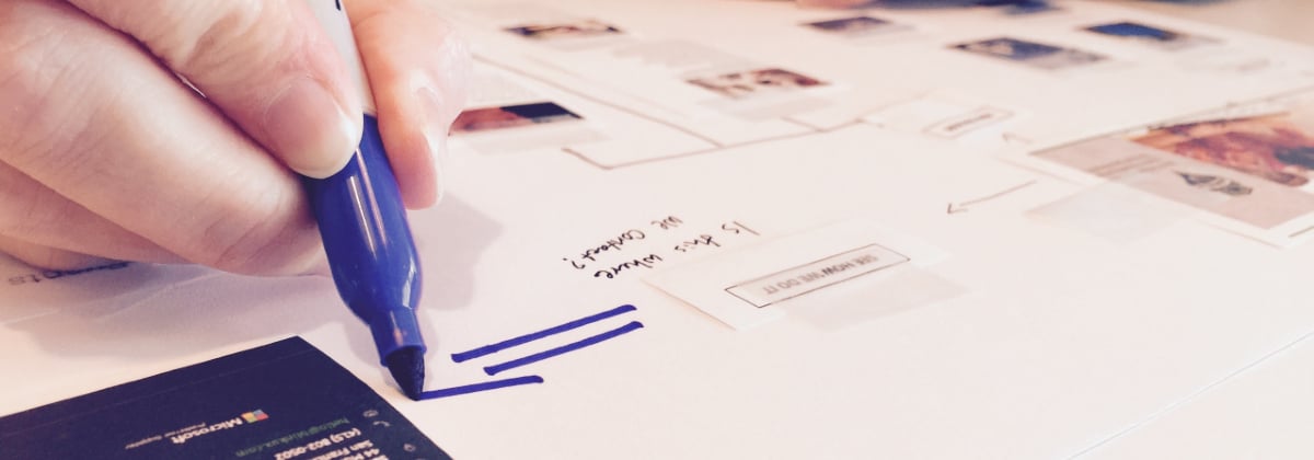
The mind mapping exercise I used is a version of a technique where I ask participants to visually represent their ideas as part of an interview session. In this instance, I asked participants to recreate, from a high-level, the site they used throughout a usability session. To do this participants used small cutouts of different elements of the site. We were testing prototypes for a responsive design on a mobile site, so each of the elements was one screen’s worth of content. I also gave the participants an 11×17 sheet of paper, some clear tape, and a marker. I asked them to think of the paper as a canvas and to represent the site from their perspective.
Participants then placed the cutouts on the paper; they were also free to draw connections or label things as they saw fit. This technique was useful in combination with observed behaviors in that it provided insight into where a user’s understanding of how the site worked may be breaking down or did not align with the designers’ intent.
The exercise also served as a prompt to help participants talk about what they experienced in the session. People will often remember certain aspects of a design that did not make sense to them or ones that were particularly helpful.
Participants also provided direct feedback on how the site (or app/operating system) was laid out. For this session, some participants reordered content in a way that made sense to them. This was really helpful for the client in identifying which areas of the site they might move from the first to second level navigation.
What mind mapping uncovers
Participants’ behaviors in the sessions were reflected in the maps they created. Early on in the testing, we saw participants who had struggled to complete study tasks, later produced maps that were not reflective of the overall site structure. These participants also struggled in the session to discover some key interactive content. The combination of the maps and our observations drove some immediate changes to the prototype (we were doing RITE testing so there were a couple of days for the designers to respond). The later sessions were more successful (in terms of task completion/errors) and the maps reflected a stronger understanding of the site.
Interestingly, I’ve found while using this technique in the past that participants can end up forming two different types of maps: process and conceptual. In a process map, participants end up only being able to focus on a single task and represent the product they used as a series of linear steps. In a conceptual map, participants will layout the entire structure of the site (e.g., like a tree diagram) and use that to talk about how to accomplish many different tasks. My experience is that participants who draw up a process map have difficulty when they end up in unexpected situations while navigating. They will often not have a firm grasp on how to get back to where they were or where else they might find what they are looking for.
Why mind-mapping is helpful in usability studies
A mind mapping strategy is helpful for any navigation study in which people are interacting with a working product or prototype. It provides an additional lens to make sense of the observational data we gather at the same time. It helps us understand what users have uncovered about the overall structure of the system while using it. If there are major gaps or misunderstandings, we have some idea of where to start designing solutions.
We employ a variety of lenses and techniques to understand how people interact with our designs. Most often we use a think-aloud protocol while participants complete a specified number of tasks using the product to identify specific usability issues. We also engage in observational fieldwork to better understand the context in which someone may use a particular technology. All of these methods rely on verbal descriptions or observed behavior. However, relying solely on these standard methods limits our ability to explore participants’ emergent thinking and their understanding of how a system is organized. The act of creating visual representation opens us up to what participants know and understand about the system as a whole.
If you’ve successfully used mind mapping in your own work, we’d love to hear about it.
Tom is a member of the research team at Blink UX. On his days off he loves to reminisce about his days as a bus driver at the University of Michigan and figure out ways to make eating healthy easy.


