By
Jake Fleisher
Designing system responses and feedback for these devices require different considerations than “traditional” user interface systems. As these project types proliferate, we’re establishing a growing library of best practices, tips, and tricks. Here are five things we think about when working in the domain of hardware and NUI.
Wait, what is a natural user interface?
A natural user interface (NUI) is a highly intuitive method of human-device interaction that enables users to operate devices using natural gestures and behaviors.
Take touch screens, for example. On your typical computer, you'd need to move your cursor across the screen and double-click on the app you want to open, which is hardly an intuitive action. On a computer equipped with a touch screen, though, all you need to do is tap the app icon. Touch screens, therefore, are NUIs, while cursor-based interfaces are not.
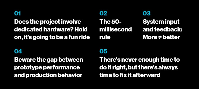
1. Does the project involve dedicated hardware? Hold on; it's going to be a fun ride
When a client wants to develop a project with “dedicated hardware,” we get excited. Some devices, like cell phones and laptops, are great as one-size-fits-all products. Other devices are hyper-focused by design, such as stud finders and circuit testers, stovetop espresso makers, and kitchen knives.
Working on use- or scenario-specific devices like the above allows research and design teams to focus on creating a great experience without constantly switching between multiple “hats.”
Walking the path of dedicated hardware and NUI is more difficult, with more variables, more unknowns, a longer timeline, and stronger chances for stumbles and mid-course “adjustments.”
That said, the difficulty makes it interesting. Each mechanical and physical design comes with its own unique problems and challenges. Make sure you have access to people such as designers, researchers, and engineers, who have experience with physical human factors, also known as ergonomics and cognitive human factors. These experts will help you slay the dragon of hardware challenges with alacrity and skill.
2. The 50-millisecond rule
Speaking of physical and cognitive human factors, our research has found that, generally, humans perceive latencies below 50 milliseconds — five-hundredths of a second — as instantaneous.
It turns out that this perception is pretty important, especially when considering elements that heavily influence user experience, such as:
- Input modality
- System response time and type
- Battery life requirements
- Thermal management
In our work, we get the chance to apply first-hand knowledge about latency in specifying hardware performance, which has a direct corollary to user experience. Some types of experiences require maximizing latency while simultaneously preventing users from detecting that latency. Conversely, minimizing latency negatively impacts key performance factors such as:
- Chip speed requirement
- Power consumption
- Heat generation
- Battery life
Extensive usability testing helps us make specific, quantitative performance recommendations that allow our clients to optimize the hardware user interface and user experience.
3. System input and feedback: more doesn't always equal better
The desire to add more stuff to a product remains strong for many, even when good reason and evidence say otherwise. When adding more stuff extends to slapping on additional system feedback or behavior, the user experience becomes really inelegant really fast. Think about it — does that microwave really need to beep for each keypad press when the display indicates the system is receiving your input?
We sometimes encounter engineering teams who want to add an indicator to show that the system registers user input and responds appropriately. This addition is well-intentioned, of course, but it can be superfluous at best and highly annoying at worst, like adding an unnecessary indicator light to a lamp to “show” you that it's working. Just because you can doesn't mean you should.
4. Beware the gap between prototype performance and production behavior
Getting valid feedback data from users can be difficult or downright impossible if your prototype doesn't accurately reflect production behavior. This is true for all types of products, from digital to physical and everything in between. The more physical a product is, the more important it is to be aware of any differences between your prototype and your final product.
It all boils down to balancing the speed of prototype creation and revision against performance accuracy. Your project team must have solid experience in materials and manufacturing processes. Having developers to guide digital product implementation is equally crucial.
Prototypes sometimes perform better than the production versions — in these cases, nasty surprises arise when the real product starts coming off the line. That's why designing your prototype to accurately reflect the manufactured product's limitations and compromises is so critical for generating sound feedback and valid data.
We once gathered feedback for a client whose prototype involved a spring-loaded button users had to hold down during use. Using several versions of the prototype, we established the users' acceptable range of motion and input effort for the button. These specifications turned out to be unsupportable using our client's desired materials and processes, so our client made some important changes — including the difficult decision to flex on some of the UX specs we developed. Their decision, informed by their expertise and our research, prevented surprises from popping up in the final product.
5. There's never enough time to do it right, but there's always time to fix it afterward
It's a well-worn design and engineering aphorism, but it never goes out of date.
Essentially, it means that insisting on an unreasonable development schedule — because, you know, it has to be done now — won't save you any time because you'll have to make up for your haste after the product gets panned. Just think of all the “what were they thinking?” experiences you’ve had with products, services, or messages out there. We guarantee that this saying applies to all of them, at least to some extent.
It’s one thing to go live with a digital design that you can fix later, such as the location, size, or color of a call-to-action button on a website. That’s okay, and it’s a great way to do the best testing possible — with real users in real scenarios. It’s much more difficult to adjust hardware components after the production process has started. The desire to stick to a schedule can overshadow sound decision-making and bite you later on.
The best time to address this issue is at the very beginning of a project. Make sure you have enough time to codify user needs and expectations and define minimum user experience performance requirements. Remember that if you're working on a brand-new product and mechanism, it's going to take longer than you think or want it to.

Designing new hardware? We're here to help
Developing dedicated hardware is a challenge, but that's what makes it so much fun. When you bring your project to Blink, our experienced team will help you avoid critical development pitfalls and create a realistic program schedule to ensure your end result is useable, useful, and desirable. The result? You'll save time, money, and heartache in the long run.
Ready to get started on your next project? Contact us for more information about our UX and design services today.


