Little Lotus
Developing a smart baby warmer for the US market


Bringing life-saving scientific research to diverse audiences
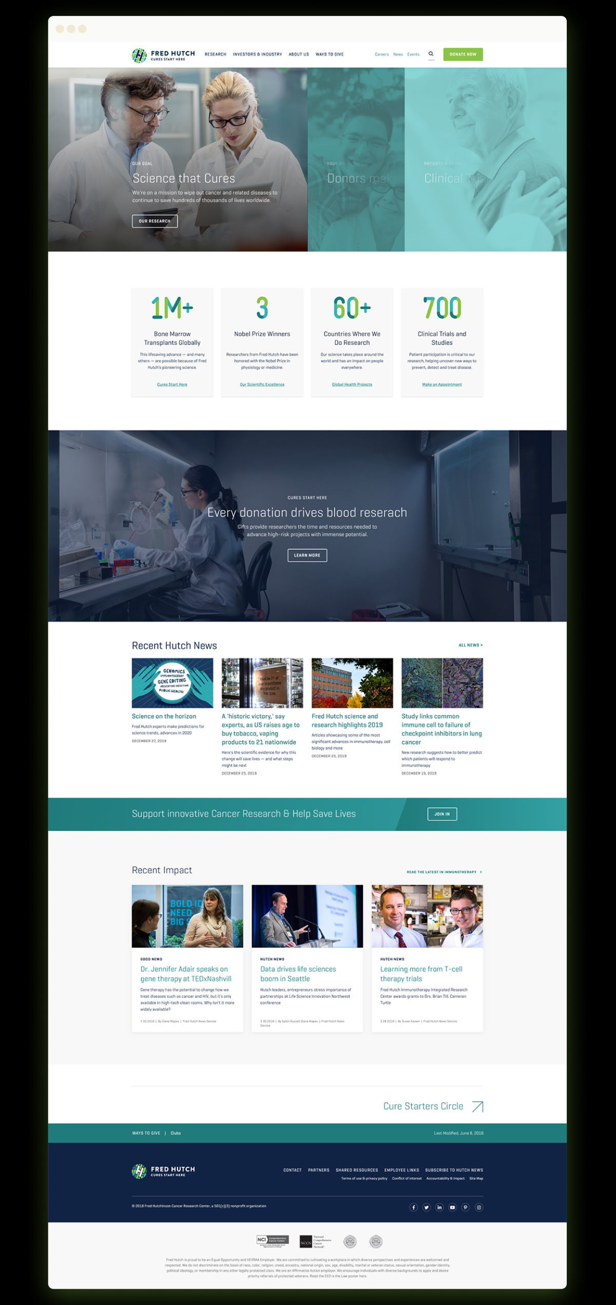
Since its founding in 1972, Fred Hutchinson Cancer Research Center has impacted hundreds of thousands of lives through its pioneering research. It has become an important hub for clinicians, scientists, patients, and research partners from around the globe to collaborate on prevention and treatment for cancer, Coronavirus, HIV, and other diseases.
Although Fred Hutch doesn’t treat patients, the research conducted by its labs and scientists are at the core of today’s cutting edge treatments, and its website has become an important resource for medical professionals and the public. Doctors, scientists, patients, families, tech investors, job seekers, and donors all look to the site for the latest in-depth information. The website offers more than just data—it offers hope to the many people impacted by ruthless diseases.

The Hutch wanted its website to be a resource for a range of different constituents, but it had been constructed largely with scientists and internal audiences in mind. The content was written and structured at an expert level. Over the years, it had also grown in size and complexity, resulting in a convoluted information architecture.
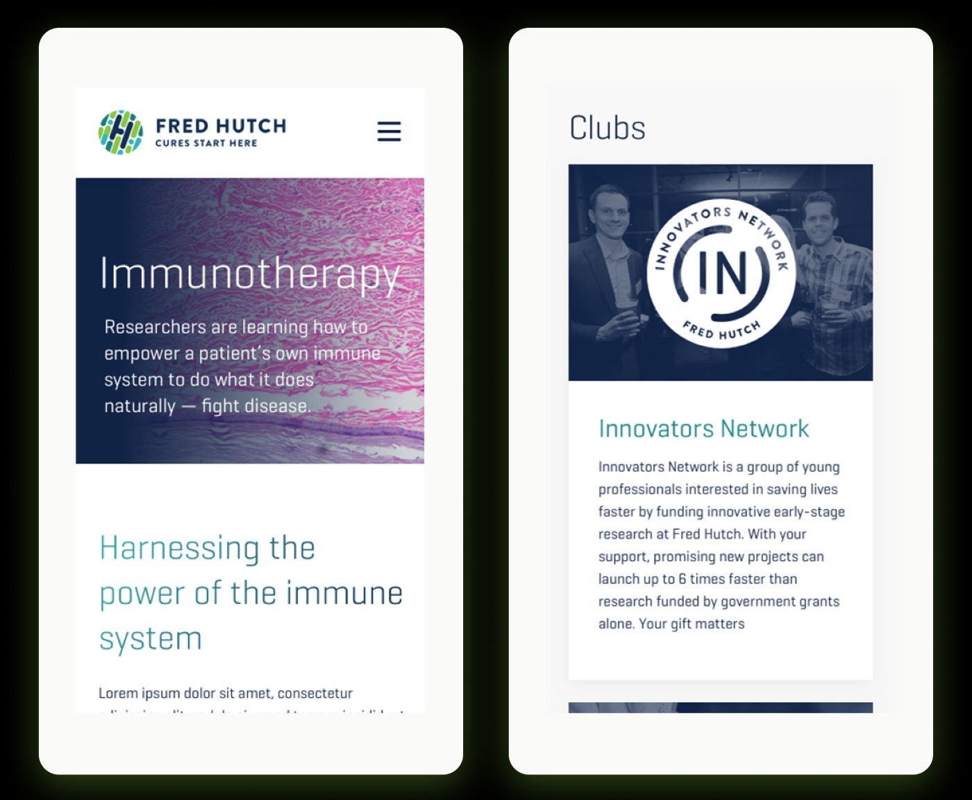
Blink was asked to help envision a site that would make its research and publications available to the scientific community while also welcoming patients, business groups, philanthropists, and others. They wanted the new site to be user-friendly and accessible—which meant, among other things, that it needed to be optimized for mobile devices.

As a starting point, Blink began its work with Fred Hutch by engaging in extensive research and discovery. With so many different types of users on the site, it was important to understand each of their unique needs, their user journey, pain points, and how best to address them. The team reviewed a wealth of data collection in Google Analytics to see the most common navigation paths and the winding routes visitors to the website had to take to get to specific content. Then the strategy team turned to the content itself, analysing it to determine the reading level and scoring the emotional drive of the headlines.
This initial discovery work provided the foundation for a full-day workshop with the Fred Hutch team, including designers, web producers, scientific writers, and a photographer/multimedia producer. In the workshop, they created proto-personas and user journey maps. The Hutch and Blink teams collaborated to evaluate the current site and envisioned a future state that would shift it to a more user-centric approach.
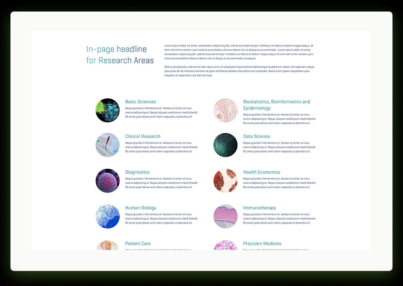
This collaborative workshop provided the fodder for Blink to begin design exploration. The Fred Hutch website is home to an immense amount of material, and the team was careful to develop a scalable information architecture that supported the findability of each kind of content. Blink prototyped many iterations of the navigation and key pages, negotiating the different needs of different audience segments.
Working with input from stakeholders across multiple teams, Blink arrived at four website prototypes with two general design directions. They then conducted evaluative testing on the prototypes with different groups representing audience segments, validating the voice, tone, and word choice to ensure the site achieved the right balance of hopeful and scientific.

Blink’s research methodology, user research strategy, and design approach provided the foundation for Fred Hutch’s new website, which was recently launched in the summer of 2019 and is seeing outstanding results (data from 6 months post launch):
In addition to the site itself, Blink’s evidence-driven design process also fostered organizational alignment for Fred Hutch, opening up dialogue between teams, aligning leadership, and cultivating a culture of user-centered design.

Developing a smart baby warmer for the US market

Envisioning a powerful new web platform to help kids heal from trauma