
By
Damon van Vessem
6 tips for better website accessibility
The benefits of the web are not evenly distributed. It promises easy access to content and tools for everyone, but frequently fails to include the needs of people with impairments, whether permanent (over 57 million people in the US alone) or temporary (all of us at one point or another).
More often than not, sites are simply not designed and built to be inclusive. Our own site was no exception, so we embarked on a journey to uncover and remove its accessibility barriers.
Here are the key takeaways.
1. Start with solid UX and coding practices
Let’s start with some good news: a site that’s built on standards-compliant code and designed for optimal ease-of-use will already meet many accessibility guidelines. These include descriptive links, error prevention, alternate wayfinding mechanisms, content that’s well-structured with clear headings, support for keyboard navigation, review-before-commit, and sufficient contrast.
In other words: many things that benefit disabled users benefit everyone (which is also one of the principles of inclusive design).
2. Retrofitting is a pain
Unfortunately, like most sites out there today, our site hadn’t been created with accessibility in mind, so we were faced with the somewhat daunting task of fixing problems across a couple hundred pages (many of them blog posts).
We prioritized our efforts to maximize our impact:
- Ensure accessibility of new content by educating and collaborating with content producers and gatekeepers.
- Fix shared components (i.e. anything with an impact across many pages) including css, templates, global navigation, and footers.
- Fix individual pages, prioritized by number of visits.
We’ve made great progress so far, but the work is ongoing.
3. Guidelines can be unwieldy
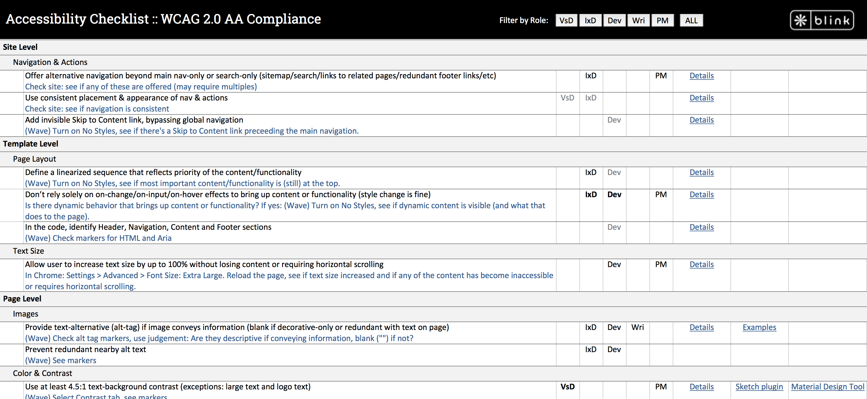
Published guidelines, especially the official W3C WCAG guidelines, can feel abstract and overwhelming, and many sites that host them add to the misconception that accessible sites can’t be modern or appealing. Fortunately, there are some good resources out there that make is easier to digest (Wuhcag) and more practical (WebAIM).
A number of standards also required more digging to fully understand them. Even something as well-known as providing image alt texts is not as straightforward as it first appears (context is everything).
- We set out to create a simpler and more practical tool, shown below. We knew that we wanted to aim for WCAG 2.0 AA compliance, so first, we simplified by consolidating some of the overlaps between levels A and AA.
- We further simplified by recognizing that each role (developer, designer, etc.) only needs a subset of these guidelines, so we enabled filtering by role.
- We also took a more user-centered approach to group the guidelines, making it easier to find (or to ignore if irrelevant) all the guidelines associated with common features (e.g. audio & video, forms, navigation, etc.).
- Finally, we made it more practical by adding tips on how to validate each guideline and links to sample solutions where available.
We also prioritized improvements to our general design and development practices by understanding where those were falling short and emphasizing the associated guidelines:
- Color contrast for visual design.
- Dynamic behaviors for interaction design and development.
- Resizing text without breaking the page or losing text for development.
- Image alt text for bloggers.
4. Automated inspection tools can only do so much
Accessibility inspection tools are helpful but far from enough to get the full picture. They can accurately identify certain types of issues, but they miss others and often only point to a potential issue.
For example, they may show which images have no alt tags (always bad), but not if the images that do have alt tags have the right tags (either descriptive or blank) – for that, each image still needs to be manually assessed in the context of its page.
In the right hands, automated tools can augment but not replace manual inspection.
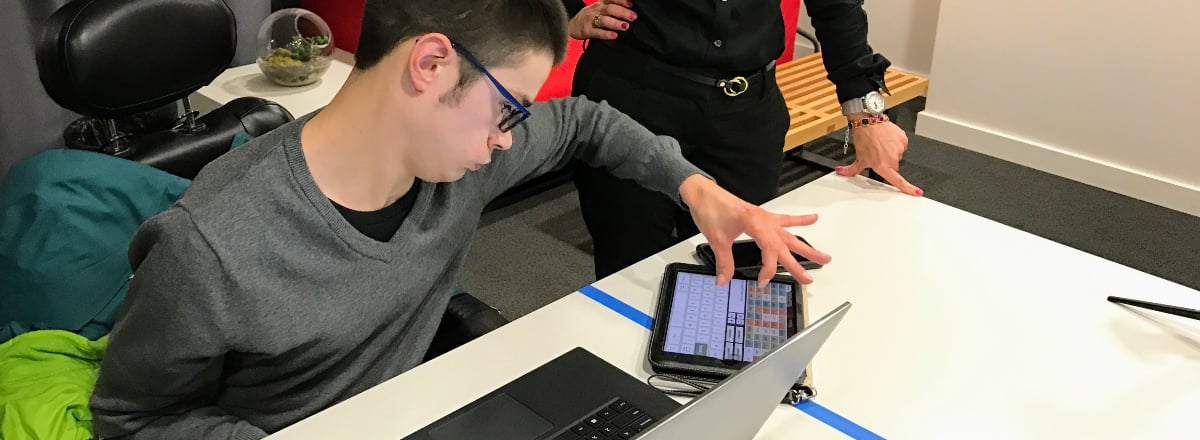
5. Exposure to people with disabilities is invaluable
We wanted to get a deeper understanding of the unique ways that many people use the web and build empathy for their struggles, so we invited people with different disabilities to our labs, where they used our site with their own assistive technology.
Nothing beats seeing and hearing firsthand how someone with a disability uses your website. It also allowed us to uncover some issues we hadn’t yet found through the guidelines-based review.
6. Get ready to investigate, collaborate, and iterate
Accessibility impacts development, design, content, and product. We collaborated and iterated on solutions that were feasible, desirable, and on-brand. (The impact on the brand, especially, can be contentious. When we changed the color of our hyperlinks from our “brand green” to a darker green for contrast, it almost felt like we’d gone from a design company to an outdoor company. Nevertheless, we persisted.)
Here are two examples of the solutions we created in design and code:
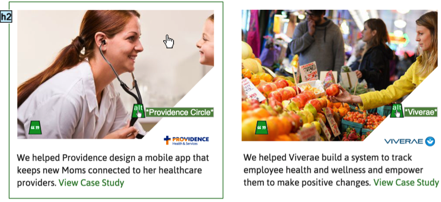
Tiles/Cards
We use interactive tiles in many places across the site, but each caused a host of accessibility issues.
Before:
- The imagery consisted of a main image plus a small logo image; each had an alt text that was neither descriptive nor blank.
- Link duplication between clickable image and “View Case Study” was confusing in screen reader software.
- The clickable image had no visible focus when navigated to by keyboard.
- The “View Case Study” hyperlinks were not distinct and descriptive.
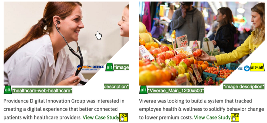
After:
Aside from the focus style, this solution required mostly a restructuring of the code.
- Coded as a single unit with a single hyperlink.
- Clear visual focus when tabbed to or hovered over.
- Can be accessed when navigating by headers (<h3>).
- Logo alt tag conveys its meaning for screen readers (“Clipper Vacations”).
- Main image alt tag hides it from screen readers (“”).
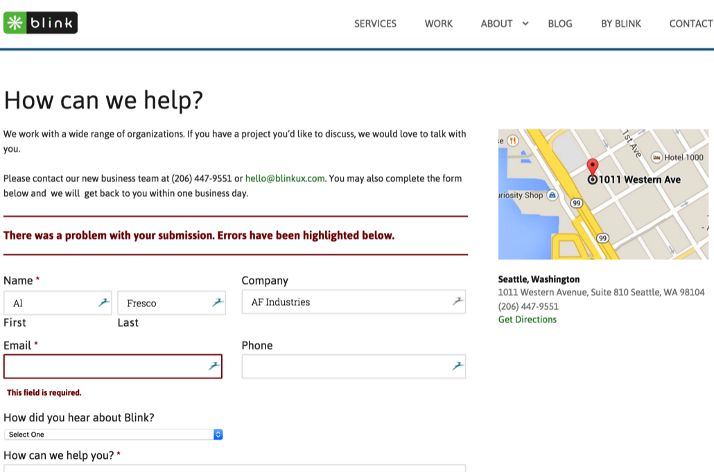
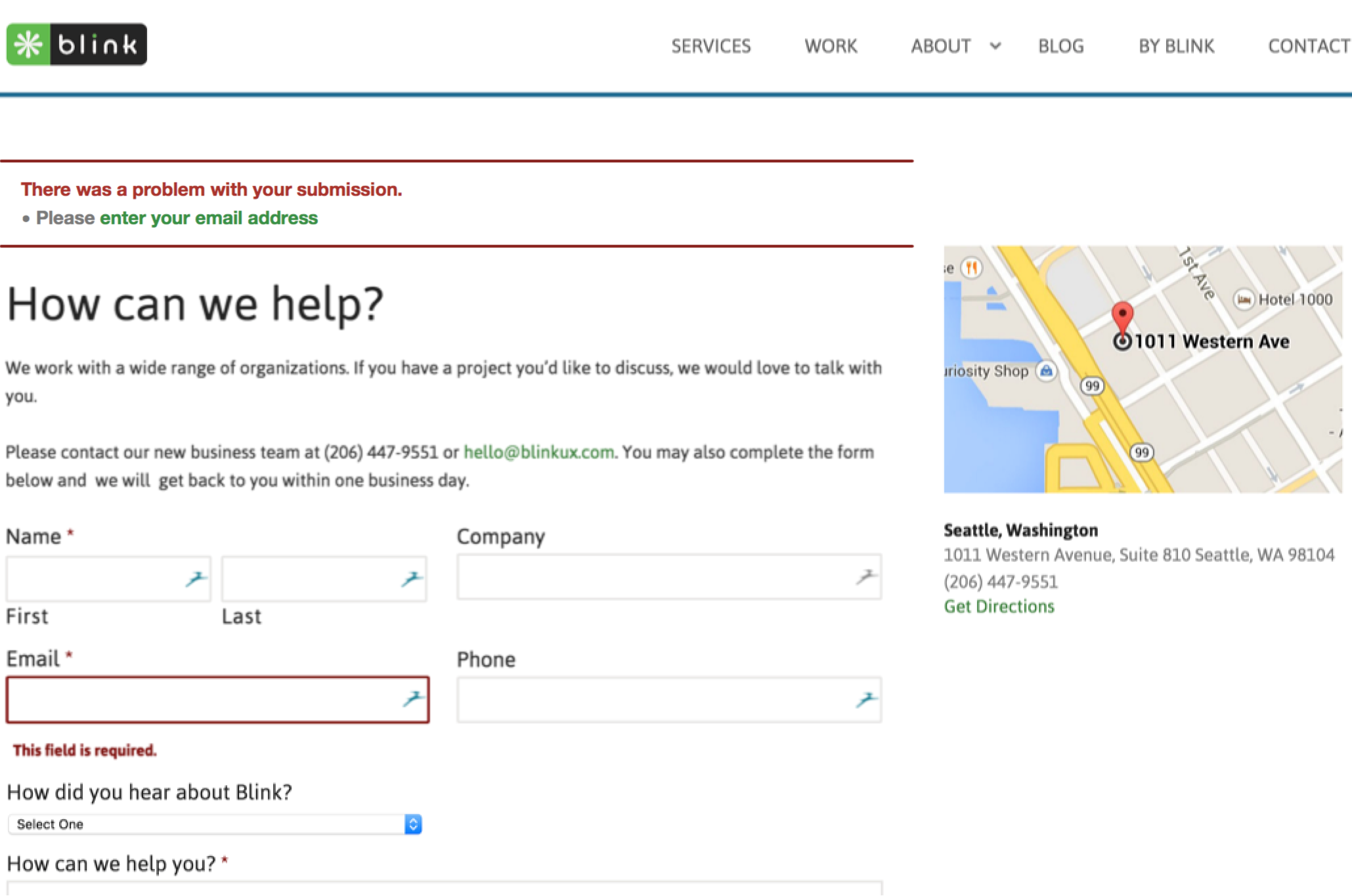
Error recovery
When a form comes back with an error, most of us can easily tell what happened and what to do from the visual highlighting of message and field, but blind people don’t have that luxury.
Before:
- Blind users using a screen reader couldn’t easily tell why the page reloaded.
- They had to read the content again until they eventually came across the error message.
- They still wouldn’t know which field to edit, and had to go through each field again to find it.
After:
- Error message moved to the top, to be first piece of content the screen reader sees.
- The error message is explicit and hyperlinked, taking the user straight to the field with invalid input.
- The field is marked “area-invalid” in the code, so screen readers can pick up on its status.
Onward!
Accessibility is much harder if we let it become an afterthought. Retrofitting is time-consuming and costly. The solution is to think of accessibility needs as no different than, say, mobile needs, and proactively design & develop for them. The principles, guidelines and solutions are already out there.
UX was founded on our ability to look beyond our own needs and preferences. Let’s continue and extend that tradition and create products that are truly inclusive.
Damon is principal designer at Blink UX. When not deconstructing UX wherever he finds it, he enjoys traveling and rock climbing, often at the same time.