
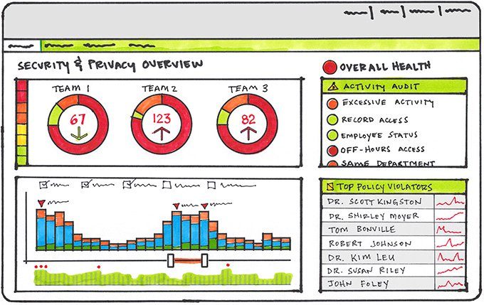
An interface can fail its users in several areas, but the data dashboard seems to carry with it a particular risk. Maybe because it’s easy to produce a page that looks impressive through the use of fancy gauges, graphs, and charts—yet still misses the mark with users. Not that there is anything wrong with making a dashboard visually appealing—it’s a key part of the user experience. But I’d suggest an approach to designing dashboards that begins with the what before getting into the specifics of how to present the display.
What do we mean by a dashboard?
I like Stephen Few’s definition of a dashboard:
“A single-screen display of the most important information needed to do a job, designed for rapid monitoring.”
More specifically, the mission of a dashboard should be to
- Provide an overview of what’s going on
- Highlight what needs attention
- Provide easily discoverable ways to drill down into details as necessary
A dashboard is often designed as the initial view when logging into a system.
Step 1: Determine what information and functionality will be most meaningful
If you are already using a user-centered design process, then you should have a good idea of the system’s purpose and who the system users are. But some specific digging can be warranted when designing a dashboard, particularly when there is a range of user roles using the system (for example, a help desk tech versus an IT executive).
For each user role consider the following:
- How frequently will the dashboard typically be accessed? Is it a persistent display (for example, projected onto a wall or always on a dedicated monitor)? Or is viewed more occasionally (multiple times a day, daily, or less frequently)? What typically triggers or otherwise drives users to view the dashboard?
- Should the scope of the dashboard be broad or narrowed to a specific function or process?
- What time horizons are most relevant? Historical (trends over time), Real-time Status, or Predictive (projected performance).
- How much data exploration should be supported? Is the dashboard communicating a specific point of view or should it encourage customization and exploration?
Deciding what specific metrics appear on a dashboard can snag up the design: there is the risk of too much information, information that is not relevant or actionable, or data that doesn’t change frequently enough (and is better suited to a reporting function).
It can be helpful to think in terms of the questions users need to answer in order to do their jobs. For example:
- For the help desk tech this could include, “What tickets are assigned to me and what are their current status states?”
- For the IT executive this could be, “Is our current staffing level keeping up with the volume of issues?”
It may be that a dashboard could focus on a particular business theme such as “Providing a high level of service while controlling costs.”
Step 2: Draw attention to information requiring action
The principles of good page layout certainly apply to dashboards. You want a strong visual hierarchy (the most important information should have the most visual weight). You want to group related information together, thinking particularly about how the data on the dashboard can tell a story or speak to the theme.
Overall the design should draw the user’s attention to information that may require their action (for example help tickets that have been open for more than a certain number of days; call backlogs that exceed a target value). However, in highlighting exceptional information, avoid relying exclusively on color as an indicator, as this is decidedly unhelpful for colorblind individuals. Alternatively you could use color intensity (rather than hue) to indicate data in a normal, warning, or alert status. Other options include object size (small, medium, large) or marks (an open bullet for warnings, a filled bullet for alerts).
Step 3: Carefully consider pies and gauges
If you search the Internet for examples of dashboards you will no doubt encounter all manner of gauges and pie charts. These can be appropriate, but consider that gauges can be replaced with a bullet graph that communicates just as clearly in much less space; data shown in pie charts are often better communicated using a bar chart.
Learning more
The foundation underpinning dashboard design, touched on only briefly here, is understanding the available data, the story they can tell, and what visualizations are best suited to tell the story. To dig deeper into this and dashboard design in general I can recommend Stephen Few’s Information Dashboard Design: Displaying Data for At-a-Glance Monitoring.
Heidi works in Interaction Design and is a Partner at Blink. She divides her leisure time between classical music, cooking, and the Seattle Mariners.