By Nika Smith
When Blink conducts usability evaluations, we seek to do more than simply identify the pain points of a web site or application. Our goal is to uncover users’ honest impressions and the impact of these impressions on the overall user experience.
Recently I have tested several web sites that were functionally usable (often with a 0% task failure rate), but my clients wanted to know more. Were participants excited about using the site? Were they interested enough to possibly revisit the site on their own? Did they feel an emotional connection to the site that enforced the brand or that would compel them to choose this site over a competitor?
These types of research questions are often challenging for participants to honestly answer in a verbal interview setting. Participants may find it difficult to pinpoint exactly how a site makes them feel or may lack the words that adequately convey their reactions. They may give you the answers they think you want to hear, or they may focus too narrowly on specific elements and experiences they encountered during the session. In other words, they may not be able to see the big picture clearly enough to describe it in their own words.
Further, participants often may not know how likely they are to revisit a site. Although participants may say they will use the site again when they have a need for it, this does not tell us that they would actually want to use this site if they had an alternative. How do we measure this?
It is common to use the Net Promoter metric (“How likely are you to recommend this site to a friend or colleague?”) to understand how well a web site “wows” users. The assumption here is that users only recommend web sites to friends and colleagues when they provide an exceptional user experience; thus, a high Net Promoter score indicates a high level of the “wow” factor that brings users (and their friends and colleagues) back for more, while a low Net Promoter score indicates a lackluster user experience that doesn’t encourage users to recommend the site to colleagues (let alone use it again themselves!).
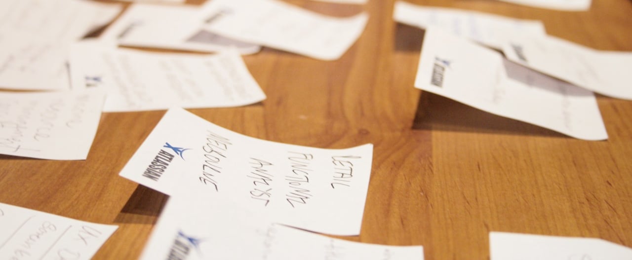
A complementary method I like to use in understanding participants’ reactions and measure the presence of this “wow” factor is a reaction card sort. In this activity, which is based on the Desirability Toolkit developed by usability researchers at Microsoft, I give participants a stack of 60 or so cards containing a wide range of individual positive or negative adjectives (such as “beautiful” or “boring” or “novel”). The instructions are simple:
- Quickly go through the stack of reaction cards and create a pile of all of the cards that match your impression of the site.
- Create a small pile of these cards that most strongly convey your impressions of the site, and tell me a little about why you chose each card.
- (Optional) Create a pile of “anti-reaction” cards that represent the complete opposite of your impressions of the site, and tell me a little about why you chose each card.
This method is highly flexible and adaptive to each project and client with whom we work. Although we start with a base set of cards that serve the needs of most situations, we can add or subtract cards to further reflect the project’s research questions, the product’s goals, or the brand image or mission of the client.
The data collected from reaction card sorting is rich and fascinating. The words that participants choose (or don’t choose!) provide an uncensored peek into how participants feel about the site being tested, and speak to whether the site delivers a wowing experience that is likely to encourage loyalty and repeat visits. We pair this activity with more traditional approaches such as task completion, Net Promoter scoring and open-ended interviewing for several reasons:
- It helps explain the “why” behind responses to interview questions and the Net Promoter score. For example, a participant’s choice of reaction cards may shed light on why he or she expressed a lack of interest in visiting an easy-to-use site in the future (“it was boring, uncomfortable, and plain.”).
- The variety of adjectives given to participants allows them to express themselves fluidly without the cognitive burden that often comes with responding verbally to interview questions. Specifically, the cards remove the need for participants to come up with the right words to describe how they feel. Working through the stack of cards often results in several “Aha! That’s the word I was trying to think of earlier” moments.
- It gets participants talking about the complex range of emotions they may feel about a web site without worrying that they are contradicting themselves or providing inconsistent feedback. For example, participants are able to use the cards to describe the content of a web site as “relevant,” “comprehensive,” and “convenient” while also describing the overall design as “busy,” “distracting,” and “ordinary.”
- Because participants can quickly work through a deck of cards and choose as many cards as they would like, they seem less likely to censor themselves or only discuss their strongest opinions. Consequently, we are able to gather a comprehensive set of positive and negative impressions in much less time than may take with open-ended interviewing.
- This activity allows clients to subtly test out the efficacy of their branding or their product goals. For example, if the developers of a health information website seek to provide a fun and engaging learning environment for health information-seekers, we can include the words “fun,” “engaging,” and “educational” in the stack of cards. If participants choose these cards during the reaction card sort, we can infer that the client’s current efforts are on the right track to meet their goals.
When presenting findings, we find that word clouds do a great job of emphasizing the various dimensions of the user experience we observed in a study. The words that are chosen most frequently appear in the largest font size and typically represent the strongest opinions that participants expressed during the study. Starting here, we can share with the client their site’s biggest strengths and opportunities for improvement. The smaller words represent those that were chosen less frequently but still play an important role in describing how participants perceived the site. Often, the smaller words represent individual impressions (such as “unattractive,” “disorganized,” “annoying” in the example shown below) that explain or support the larger, more frequently-cited impressions (“busy,” “distracting”). Brought together, these sets of words provide a visualization of participants’ core feelings about the site in a way that clients can digest and respond to immediately.
References:
Measuring Desirability: New methods for evaluating desirability in a usability lab setting, Benedek, Joey and Trish Miner. Usability Professionals’ Association Conference Proceedings (2002).
