
Designers know that using contrast is an effective way to direct attention to a specific design element. But what makes it so effective?
Recently at Blink in one of our weekly knowledge shares I shared some research from neuroscience and cognitive psychology that helps answer this question.
Certain dimensions of contrast are particularly effective at directing attention because our brains are wired to quickly differentiate elements that differ along these dimensions.
There are four fundamental dimensions of contrast that our brains quickly differentiate:
- Color
- Orientation
- Size
- Motion
Our brains contain neurons, or brain cells, in the visual cortex that are tuned to one or more of these fundamental elements of contrast.1, 2
For example, research has shown there are neurons in the cat’s visual cortex that preferentially respond to lines of specific orientations. One neuron in the visual cortex may respond when an animal looks at vertical lines, while another might respond best when an animal looks at horizontal lines.1
Just as some neurons in the primary visual cortex are preferentially responsive to specific object orientations, others are responsive to specific object color, size, or direction of motion.
Objects that sufficiently differ along at least one fundamental element of contrast from their surrounding objects can be quickly perceived. They appear to pop-out from the objects surrounding them.3
To achieve this attentional pop-out effect, an object needs to differ by a significant amount from the objects surrounding it.
How much is enough? It depends on the dimension of contrast. For example, along the dimension of orientation, a good rule of thumb is for objects to differ by at least 30 degrees from their surroundings to pop-out3.
Designers can leverage these fundamental dimensions of contrast to draw attention to specific elements of their designs.
To make an object easy to see, differentiate it from other objects along one or more of the fundamental contrast dimensions.
Let’s imagine you’d like to draw attention to three different elements on a home page. One way to do this effectively would be to make each element differ from the background along a different dimension of contrast. For example, one item might be a different color from its surroundings, while another might be larger than the other items on the page, and the third might be the only moving element on the page or might move in the opposite direction of other moving elements.
But contrast isn’t just important for websites.
Effective contrast is particularly important in any situation where a user must locate something quickly. It’s important when searching a map for the fastest route between points or when noticing an alert sign on the road when driving a car.
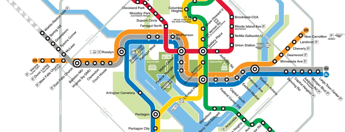
A great example of a map that effectively leverages the fundamental dimensions of contrast to direct attention is the Washington DC subway map.
Color contrast. In the map, different bright colors are used for different lines, making it easy to locate the subway line you are searching for.
Orientation contrast. The circular stops on the map are easily distinguishable from the subway lines due to contrast in orientation.
Size contrast. The transfer points are easily distinguishable from the other stops through the use of size; they are larger than the other circles on the map.
If you’d like to learn more about the human visual system and how it relates to design, I strongly recommend the excellent book “Visual Thinking for Design” by Colin Ware. It was a big influence on my thinking that contributed to this blog post.
Brian Essex works in user research at Blink UX, joining the team after attaining a Ph.D. in Cognition and Cognitive Neuroscience from Vanderbilt University.
References
- Hubel DH, Wiesel TN (October 1959).“Receptive fields of single neurons in the cat’s striate cortex”. The Journal of Physiology 148 (3): 574–91.
- Schluppeck D, Engel SA (2002). “Color opponent neurons in V1: a review and model reconciling results from imaging and single-unit recording”.
- Journal of Vision 2 (6): 480-92.Ware C (2008). Visual Thinking for Design. Amsterdam: Elsevier.