

Have you ever agreed to something online without fully understanding all the ramifications of what you agreed to?
Recently at Blink we made an online purchase without understanding all of the terms and conditions. We bought 200 attractive, customized mugs for our office, however, there was one unrecognized flaw: After putting them in the dishwasher, some of the imprinted ink came off.
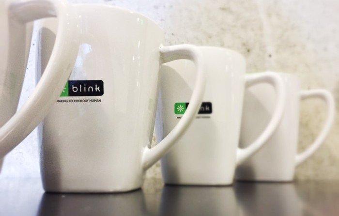
Understandably, we tried to return the mugs. This, however, wasn’t possible. The online retailer told us that it had been listed on the checkout form that the mugs were not dishwasher safe.
Really? We hadn’t noticed this when we checked out.
We looked at the form again and noticed that the information about the mugs not being dishwasher safe was there, but it was in fine print deep on the page on a separate tab, far from where we were looking when we made the purchase.
I think many web designers de-emphasize or hide important information that can detract from a conversion. By making the essential actions in a checkout form or sign-up form highly prominent, and de-emphasizing other elements, completing the form may become easier. There are costs, however, to making this design choice.
Example 1: Check boxes to indicate agreement to all terms and conditions
Rather than forcing users to consume large amounts of information, users can often click a box indicating that they agree to all the information written in an agreement. Undoubtedly, this makes it faster for users to complete a task, but it comes at a cost: Users don’t have to actually read the terms and agreements, and I doubt many of them do.
The checkbox to indicate agreement to all terms and conditions protects a company legally, but it does not protect a company’s reputation. Users may come to dislike or distrust the company if they find out that they unknowingly agreed to some undesirable terms.
A huge opportunity exists for many companies to replace (or supplement) dense terms and conditions with a concise digestible list of essential points placed in a prominent position that users are likely to notice.
Example 2: Opt-in as default
As articulated by Thaler and Sunstein in their excellent book Nudge, one powerful way to drive behavior is to set defaults to the behavior you would like to see. Web designers often employ this tactic by making the user take an action to opt-out of something. A common example is adding users to a mailing list when signing up for something unless they take the time to uncheck a box to receive correspondence.
Making users opt out of agreements is an effective way to nudge behavior, but there are potential costs to using this approach. Users may not notice or understand which option is selected when they complete a form, particularly if the information is not prominent or explained clearly. Or they may understand what is selected but feel that the company is trying to trick them into something they don’t want. Consequently they may lose trust in the company.
Before using this powerful nudge ask whether most users would be satisfied with opting in. Only use this technique if the answer is yes. When it comes to mailing lists I’ve repeatedly heard from users that they are not happy with a default that opts them in to receiving email.
Building a long term relationship with your customers
Simplicity is very important in web forms. As I’ve written earlier, it’s important for actions to be easy. If a form is too difficult only highly motivated users will complete it. However, I don’t think the best way to make things easy is to hide important information from users or set defaults to something they may not be happy with.
Limiting the amount of salient information in web forms so that users only notice the essential steps may help conversions in the short term. But in the long term it may hurt your company’s reputation if important items were not noticed. If individuals take action without fully understanding the ramifications of what they’ve agreed to they may later regret what they’ve done.
Helping your users understand what they are agreeing to before completing a form will help build trust in your company. Do you have an example where you agreed to something online without fully understanding the ramifications, and later came to regret it?
Brian Essex works in user research at Blink UX, joining the team after attaining a Ph.D. in Cognition and Cognitive Neuroscience from Vanderbilt University.