

By
Ankitha Bharadwaj
With an increasing number of airlines in the skies users now have more options than ever for how to get from point A to point B. Arguably, the most important interaction for airlines to focus on is the “book a flight” experience.
I decided to look at some of the big names in airlines to better understand how well they support users trying to book a flight through their mobile apps (full disclosure, Blink has done work for both Alaska Airlines and Hawaiian Airlines). In theory, the task seems simple enough: pick your destination, throw in your departure and return dates, pick a flight, fill out passenger information, and pony up the dough. But when working with limited real estate, app developers need to be more mindful of supporting the user’s goal and not overwhelming them with taps upon taps and walls of text.
I’m going to walk you through the stages of booking a flight on an iPhone 6S and point out how the top domestic airline apps size up against each other. Breaking down this process can be lengthy so for this post, we will stop just shy of adding passenger information and transacting. Our journey will take us all the way to selecting the flight.
Apps in our comparison today: Alaska, Delta, American, Southwest, JetBlue, United, and Virgin America.
Let the games begin, and may the odds be ever in your favor.
Launching the app
The launch screen is the first opportunity to wow the user. There are a few ways to get the user excited to use your app: a fanciful splash screen with pleasant delighters, a full-screen immersive image to draw the user in, or cut to the chase and launch into the main menu. Airline apps employ some of these methods to hook potential customers.
JetBlue and United get straight to the point and greet the user with a robust dashboard of options for booking a flight, checking in, and even in-flight entertainment.
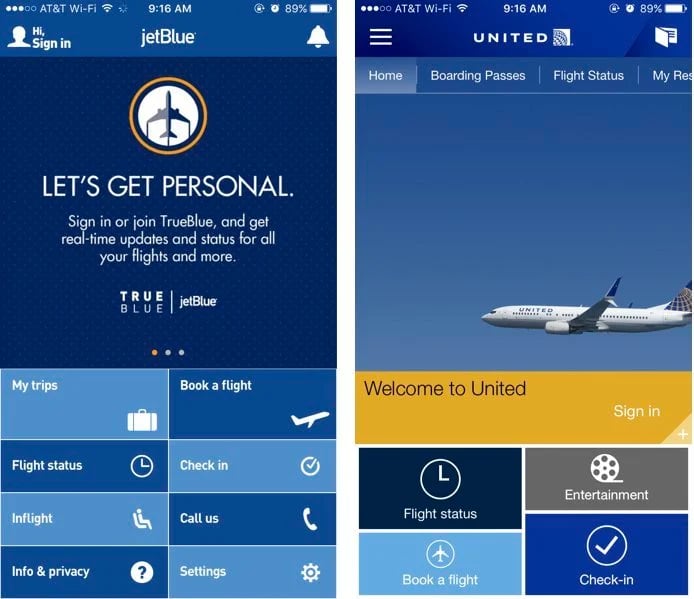
Though this is a fine way to greet the user, there’s a missed opportunity for some delightful design to enchant users. Bridging usability with beautiful design has long been the holy grail of user experience professionals.
Southwest presents the user with a full-screen image with the right amount of dreamy blur. The initial screen prompts the user to select their entry path – login, create an account, or continue as a guest.
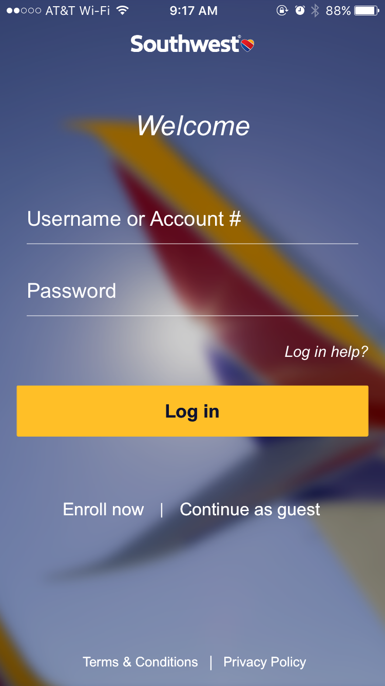
Though this adds an additional tap to the user’s goal of “booking a trip,” it’s a nice greeting to the app. The user feels welcomed and excited to get started.
American Airlines combines the immersive image experience and the cut-straight-to-the-main-menu method. However, the execution feels sloppy. Note how the menu starts awkwardly in the middle of the screen, with nothing above it for counterbalance. And don’t get me started on how text-heavy it is. Users don’t want to be greeted by a page of text. Keep things visual.
Winner: Southwest
Takeaway: When opening this app, provide a clear and simple path without too much information. Keep things visually engaging to encourage the user to continue their journey.
Getting into the app
Booking a flight shouldn’t require a high level of investment to the airline. Much like booking a rental car through Enterprise or even booking a room at your local Marriott, the user shouldn’t have to login or create an account to complete a transaction.
Unfortunately, Virgin America requires the user to create an account prior to using any app features. This makes Virgin America a non-starter for this Blinker.
So, here’s where we will bid adieu to our evaluation of Virgin America. But before we move on, it’s worth noting that Alaska Airlines recently purchased Virgin America, so it’ll be interesting to see if or how the app will evolve in the future.
Fortunately, all the other apps have a friendly “continue as guest” call to action or directly take the user into the app, keeping the user moving forward, even without an account.
This option is valuable because it allows people to transact easily without feeling like they’re getting married to any app. In a world where people are squeamish about privacy, it’s hugely beneficial to support the user’s goals without mining for personal information. This also helps build faith in the brand because they’re not holding the user’s feet to the fire.
Winner: All except Virgin America
Takeaway: Allow users to transact without a high barrier of entry. Do not require the user to create an account to book a flight.
Homescreen impressions
The homescreen is the heart of any mobile app. Airline apps have an additional responsibility to pack the homescreen with valuable information users will need during their travels. Let’s see how well our apps handle their homescreens and how easily users can begin booking a flight.
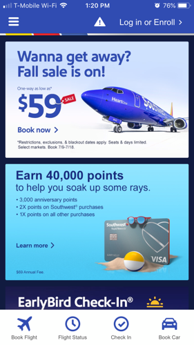
Southwest presents the “Book Flight” option on the bottom navigation, which isn’t immediately apparent because the user is more drawn to the main content on the screen. The emphasis on advertisements and upsells affects how quickly the user can get going with the task at hand.
The Delta app immediately takes the user to the “Book a flight” flow, which might be problematic if that isn’t the user’s main objective. Forcing the user down a path they may not be interested in is a sure fire way to confuse and potentially frustrate the user.
United’s app is overly and unnecessarily complicated with multiple navigation systems and confusing icons. If you set aside the confounding “wallet” icon, United does have a well-placed, and noticeable “Book a flight” option smack dab on the homescreen. JetBlue has a similar dashboard UI, with “Book a flight” prominently placed on the screen. No sleuthing required here!
The Alaska app has the most efficient and pleasant homescreen. The user is presented with a clean menu and in the center of the screen are three obvious options. The “book a trip” button is clearly visible and easily accessible – no intrusive advertisements or upsells, no overwhelming suite of dashboard options.
Now on to the American Airlines app for a quick moment. Though there is a clear menu option to book a flight, the app punts the user to the mobile website. This essentially negates the need for the app for this task, so this Blinker is left wondering why. Let’s continue to look at the American Airlines app during the rest of the journey, but the experience will be tinged with a little disappointment.
Winner: Alaska Airlines
Takeaway: Be mindful of user’s goals and keeps everything simple and intuitive. Require few taps to accomplish tasks by presenting users with an immediate set of options to move forward with the app.
Departure and arrival city selection
Once into the “book a flight” flow, the next step is to add some crucial bits of information: where you’re flying from and to.
Let’s start with the good stuff first. All the remaining apps allow users to start typing the city or airport, and the app provides suggestions in a dropdown. This helps users quickly select the airport while avoiding any input errors. This helps users move through the flow more efficiently.
A few apps go a step further and try to leverage the user’s location to auto-populate the nearest airport. However, one of the hurdles is to guide the user to turn on location services in the first place. JetBlue does the best job of providing the user with explicit instructions to turn on location services.
United provides a similar dialog box, but the instructions aren’t clear. The user may have to dig around on their phone settings to figure it out. That being said, United does keep a list of saved cities so the user can quickly input regularly visited airports.
Alaska displays a banner notification at the top with just as little information about location enabling. Another quirk in both the Alaska and United apps is seeing the “current location” detector on both the departure and arrival fields.
Though there is potentially a use case for selecting your current location as the arrival city (some fangled multi-city adventure, perhaps?), it isn’t immediately obvious why this functionality needs to exist on the mobile app. And if you find yourself thinking so hard over a feature, chances are it’s not benefiting the app’s core UX.
Delta and Southwest don’t have a current location detector, but it’s not a deal breaker since users can still type in “sea” and see “SeaTac” auto-populate.
Winner: A tie between United Airlines and JetBlue
Takeaway: Provide users with robust instructions on how to proceed with the task at hand (i.e., clearly spelling out how to turn on location services) and cater to their repeated actions (i.e., searching for the same airport more than once).
Date selection
Once the departure and arrival cities are taken care of, the next step is to input the travel dates. After reviewing these airline apps, the biggest takeaway is this: keep the departure and arrival date picking on the same screen BUT be explicit about which selection is being made. Keeping date selections on the same calendar requires few taps so users don’t quickly forget what dates they were considering.
Alaska, United, and American require a lot of clicks to select the dates. The user must enter and exit several screens to input both departure and return dates. This gives user time to get confused or forget what they had input on a prior screen.
Delta, JetBlue, and Southwest present date selection on the same calendar view, which is good because it requires the fewest clicks. But can the user clearly see which date they are selecting? Well…sort of.
Delta handles date picking very nicely but the notification (that the user is picking departure and return dates) could be elevated to make it easier to discern. JetBlue keeps the selections to one calendar display but doesn’t provide the user with enough of a visual about what date they’re selecting (departure or return).
Southwest handles it well with color coordination – return date is in green and departure is in a dark blue. This makes it very easy to figure out which date the user is selecting. Bonus points go to these apps for visually highlighting the duration of the trip.
Winner: Southwest
Takeaway: Keep calendar actions in the same screen so users don’t have to struggle to keep decisions straight in their heads. Clearly indicate to users what they’re doing and the impact of those actions.
Number of passengers
Next up, selecting the number of passengers. These airline apps handle this in two ways: a dropdown to select a number or an incremental stepper. The latter is the more successful and usable method because it is less jarring visually than pushing aside on-screen content to show a dropdown.
United, American, and JetBlue all employ the dropdown method, which is inconvenient and clunky.
Alaska, Delta, and Southwest allow users to quickly adjust number of passengers using + or – icons. This requires the fewest taps and keeps the user on the booking flow screen without splintering their attention. However, Delta takes the cake for the best implementation of the stepper. The large icons for + and – are easy to spot, look interactive, and are fat-finger friendly. Southwest’s icons are so far off to the right that they seem disconnected from the passenger count.
Winner: Delta
Takeaway: Help users accomplish tasks with as few taps as possible, while maintaining clarity around the actions they’re taking.
Flight selection
Finally, to the main event – picking the right flight.
Alaska doesn’t make it easy to understand what to click on to select a flight. After selecting a departure flight, the return flight selection section opens at the bottom of the screen, making it difficult to discover.
Delta handles flight selections well – keeping the departure flight selection to one screen, then transitioning to another screen for the return flight selection.
Southwest handles it the best by keeping departure selection and return selection separate and color coordinated for easy distinction. The user can immediately see the two dates and understands what each of them mean.
United does the same thing Southwest does (keeping selections distinct) but it goes through too many screens which could lead to user confusion and potential abandonment.
Winner: Southwest
Takeaway: Keep flight selections streamlined so that the user is making decisions about only one flight at a time. Clearly identify which flight (departure or return) the user is taking actions on.
Summary
At the end of the day, no one airline app is the outright winner. Each of the six (almost seven, if we briefly include Virgin America) have stellar components. The insights from this review are intended to shed light on what parts of the different flows shine and what parts could use some help. So, to recap:
- When opening this app, provide a clear and simple path without too much information or text. Focus on pleasant visualizations to encourage the user to continue their journey.
- Allow users to transact without a high barrier of entry. Do not require the user to create an account to book a flight.
- Be mindful of user’s goals and keeps everything simple and intuitive. Require few taps to accomplish tasks by presenting users with an immediate set of options to move forward with the app.
- Provide users with robust instructions on how to proceed with the task at hand (i.e., clearly spelling out how to turn on location services) and cater to their repeated actions (i.e., searching for the same airport more than once).
- Keep calendar actions in the same screen so users don’t have to struggle to keep decisions straight in their heads. Clearly indicate to users what they’re doing and the impact of those actions.
- Keep flight selections streamlined so that the user is making decisions about only one flight at a time. Clearly identify which flight (departure or return) the user is taking actions on.
Ankitha Bharadwaj works in user research at Blink UX. She’s a doer and a trier, and spends her free time thinking about how we know what we know is, in fact, the truth.