
By
Ronald Viernes
Whimsical, clean, fresh, dark, edgy, or all of the above. Not everyone has the same vocabulary when it comes to the look and feel of a product or service. As designers, how do we get people to agree on an aesthetic? One practice we love at Blink is putting together moodboards.
Working as a visual designer over the years, I have learned how to use moodboards to successfully pitch concepts to our internal team and clients. Making a moodboard is more than just selecting images that specify type, color, texture, etc. At a higher level, a moodboard should express specific feelings and attributes. Here are nine tips to teach you how to create a moodboard and how to use them effectively in your next design project.
1. Know why you're using a moodboard
Getting started on a project is always tough. The vast number of possibilities for how a product or service could look and feel can be both intimidating and exciting. How do we make sure we are going down the right path? Moodboards can help you get started with a low barrier to entry.
What a moodboard isn't is a final direction for the look of a project. Moodboards are an early step in the process because they are about communicating a feeling or experience using a combination of images and words.
2. Start with keywords
Many moodboard designers I know dive straight into selecting images. That’s one way to go about it, but at Blink, we think the process works better when we focus on the keywords we are trying to visually represent. That’s not to say you can’t post-rationalize images in the process.
I like to create boards that hit on a common set of words, but I also inject some words that are unique to each board. These differentiators help communicate the nuances between directions and could come from either a brand’s key attributes or a set of values we create with the client.
3. Sell the idea to stakeholders (By making it theirs)
Working with different levels of aesthetic vocabulary, tackling unclear goals, or aligning multiple stakeholders with strong visual POVs (of varying tastes) can make talking about visual look and feel a challenge.
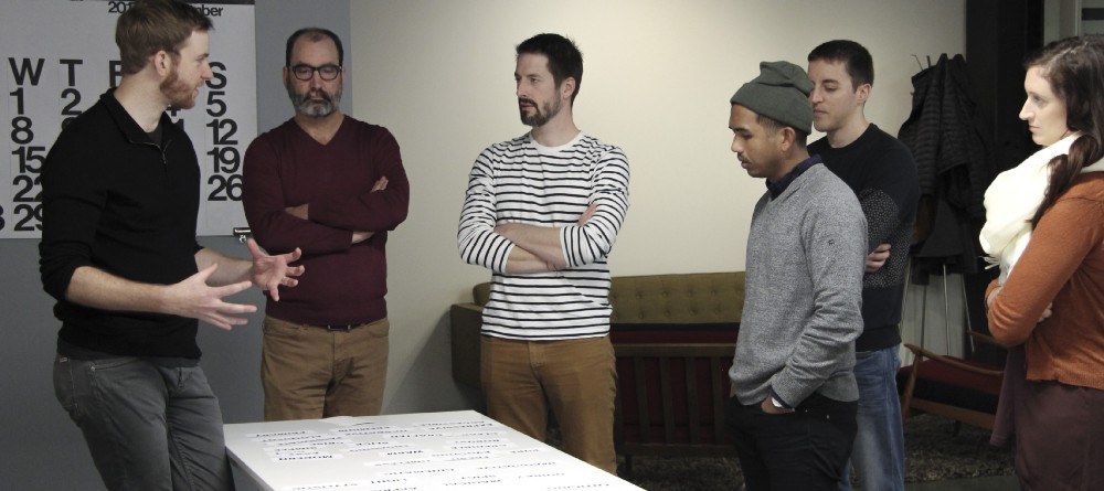
Moodboards are an awesome tool to help sell your concepts, especially when pitching them to high-level execs. A well-planned moodboard workshop gives important stakeholders a chance to personally impact the design direction. This can help you gain momentum during the all-important early stages of a project.
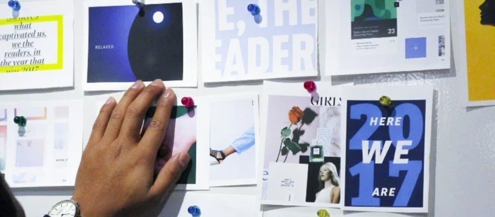
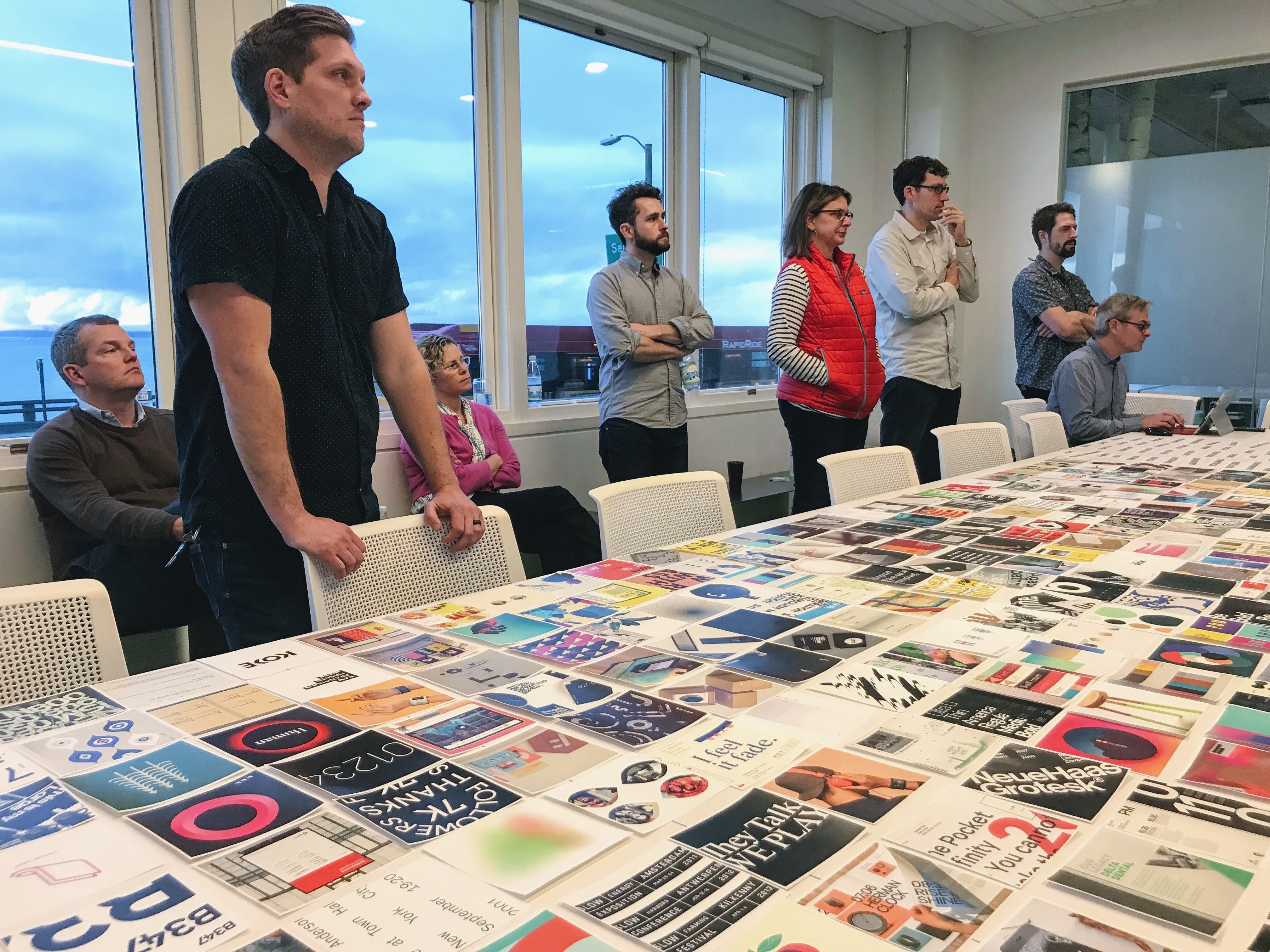
Blink uses a workshop format to collaborate with clients to select images that give us some insight into how they communicate visually and what they like (and don’t like).
4. Try a MacGuffin
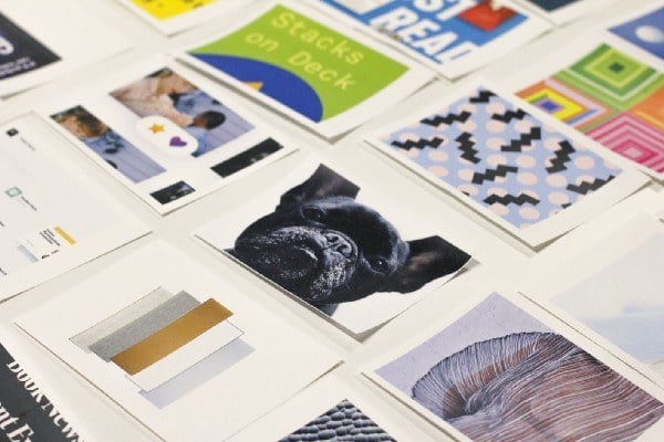
We like to select images with our clients so that they are part of the process. Before we do this exercise, however, we pull dozens (and dozens) of images from a mix of sources. We include stuff we are feeling at the moment, trendy things, cool things, naked people, industry-specific images — you get the idea. We also like to include images we believe are absolutely not the right direction to pursue. This is the MacGuffin — a mole trying to derail the direction of the project.
Pro tip: Be ready to defend why the client should not pick the MacGuffin if it comes up in the discussion.
After selecting keywords and images with a client, the next step is to apply your learnings. The following tips help you create better, more distinct concepts.
5. Get your ideas out. Then, “kill your baby.”
This is actually something I learned from Annabelle Gould, Professor of Design during my undergrad at the University of Washington. I later learned that this quote was an interpretation of “murder your darlings” from The Art of Writing by Sir Arthur Quiller-Couch. In school, we often fell into the trap of working hard on one idea without exploring other worthy directions that could have been better. Professor Gould would tell us to “kill our baby” — those ideas she noticed her students were spending so much time and effort on that simply weren’t working.
This phase of a project is my favorite. I can explore different directions very quickly without holding any one idea too precious. In our process, we can kill bad ideas in the moodboarding phase, which helps us get one step closer to identifying the best direction and creating our designs.
6. Add a little spice
For the best results, look for sources of inspiration beyond digital design. Pull images of editorial and book design, transportation design, exhibit design, and fashion. In my opinion, the most uninspiring experience is looking at a moodboard for an app and seeing only images of other apps . It’s no wonder so many apps look so much alike.
Drawing inspiration from these other sources will help you avoid the pitfall of designing the same card design metaphor over and over again. Try it for yourself.
7. Less is more. Be ruthless with image selection
There is an endless supply of visual inspiration out there, and I am certainly guilty of pulling a ton of content hoping to include all of it. However, if you can be ruthlessly selective, your point of view will be clearer.
One design technique I use to feel more confident in the images I pick is to make sure each image hits on multiple keywords.
8. Crop it like it’s hot
Images can have a completely different feeling or focus depending on how you crop them. If an image is too zoomed out and has a whole lot going on, viewers might not be able to digest it — or they might get hung up on the wrong part.
Focusing on a unique detail or key parts of an image provides better perspective.
9. Put your own twist on it
A great moodboard has a good balance of unity and variety. Make sure each moodboard is highly curated and assembled into a composition that focuses on what matters. Creating moodboards is a creative exercise in it’s own right, so be bold and inventive. Juxtaposing unexpected images will help you experiment with how visuals add up to an overall vibe.
Whether you’re a seasoned moodboard maker or someone just getting started, I hope these tips help in your process. Remember — moodboarding is a great way to get started on a project and is a valuable tool to use in pitching your ideas.
What tips do you have for how to make better moodboards?
We’d love to hear from you on Twitter at @blinkux.